![]()
Ace Astronomical
Category — Brand Identity
Date — July 2015
This industrial telescope manufacturer needed a logo that would set them apart from their competitors, elevating their brand to a new professional level. The result was a perfect marriage of image and idea – something lightyears ahead of their previous brand.
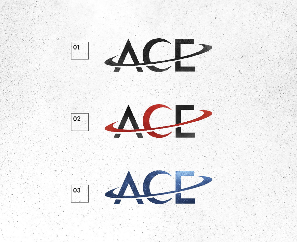
Logo
The ACE Astronomical logo is a seamless integration of iconic space symbolism in a streamlined letterform. The planet Saturn silhouette creates the letter “C” while the iconic planetary ring serves as the crossbars for letters “A” and “E”. As seen below, the logo can take various forms and choose to either further emphasize the Saturn icon element in a two-color system, or go for a more consolidated approach with a single color application across the entire mark.
Business Cards

Infographic Poster