![]()
GigTalent
Category — Branding
Date — February 2020
The modern work force is becoming an increasingly flexible landscape. Gone are the days where the only career option for individuals was a single job on a classic 9-5 schedule – enter Gig Talent.
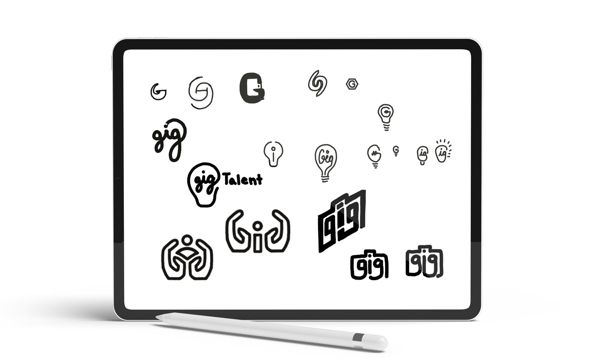
Logo sketches
When the Gig Talent team asked me to design their logo and brand identity, I knew they needed something fresh to attract young talent; something that visually resonated with the self employed workforce. Starting with a word-mapping exercise and moving into rough sketches, a few main concepts emerged.
Lightbulb: I liked the idea of a lightbulb encircling the word “Gig”. To me, this visual combination speaks to the bright opportunities and ideas forming in the gig industry.
Hands: I also tried some ideas that used an abstracted letter “G” as a pair of hands holding the shape of a person in the middle. To me, this abstraction spoke to the care and attention the Gig Talent team would take in placing their prospects in roles catered to their needs.
Briefcase: There’s strong symbolism behind the image of a briefcase. This piece of luggage has been used for decades to represent business, professionalism, and a working professional’s drive to take their career into their own hands. To me, the briefcase represents opportunity- the eagerness and anticipation of a job interview, the first steps into an unfamiliar and intimidating world, and finally the confidence in one’s abilities and the control of one’s destiny. I knew this briefcase idea was the one I wanted to pursue, but it needed a lot of refinement.
Logo finalized
Rounding the hard edges of the briefcase form, crafting a number of color variations, choosing a typeface that matched the brand energy, and most importantly, ensuring both the “gig” monogram and briefcase shape were clearly legible and easy to interpret. These are just a few of the adjustments that went into the final logo design. The Gig team instantly resonated with this design, requiring minor adjustments as we moved forward to finalize.
![]()
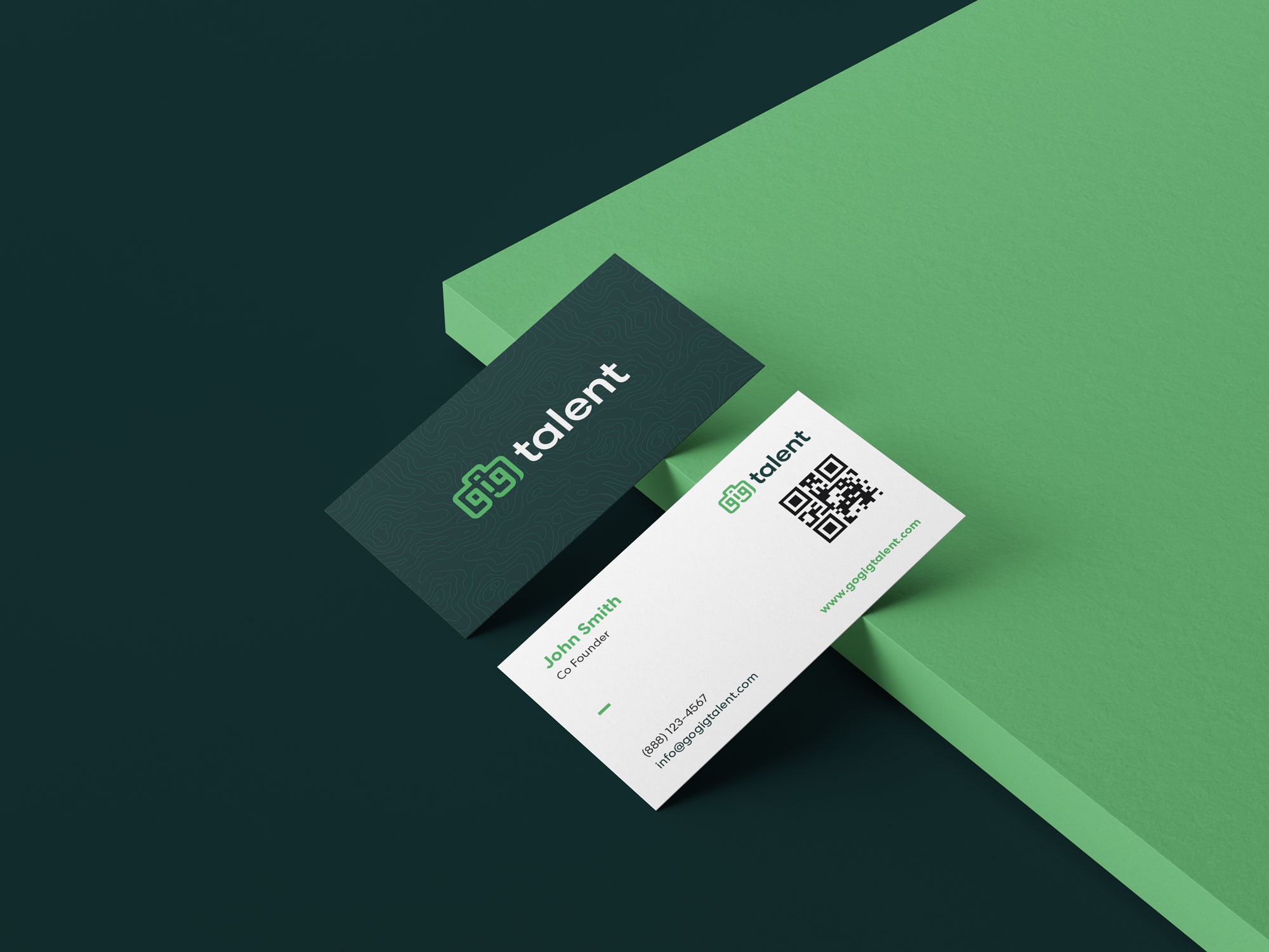
Business cards
With the launch of Gig Talent’s website and service offering, the team needed business cards that matched the brand aesthetic. Working with the team, I created business card for each employee, introducing a new brand element – the topography lines. This background pattern plays a visual design role, but also serves an important conceptual purpose. The topography lines represent the opportunity to explore an unknown landscape of career advancement. It’s uncharted territory, but Gig Talent is here to help individuals navigate and find the right fit for their career needs.
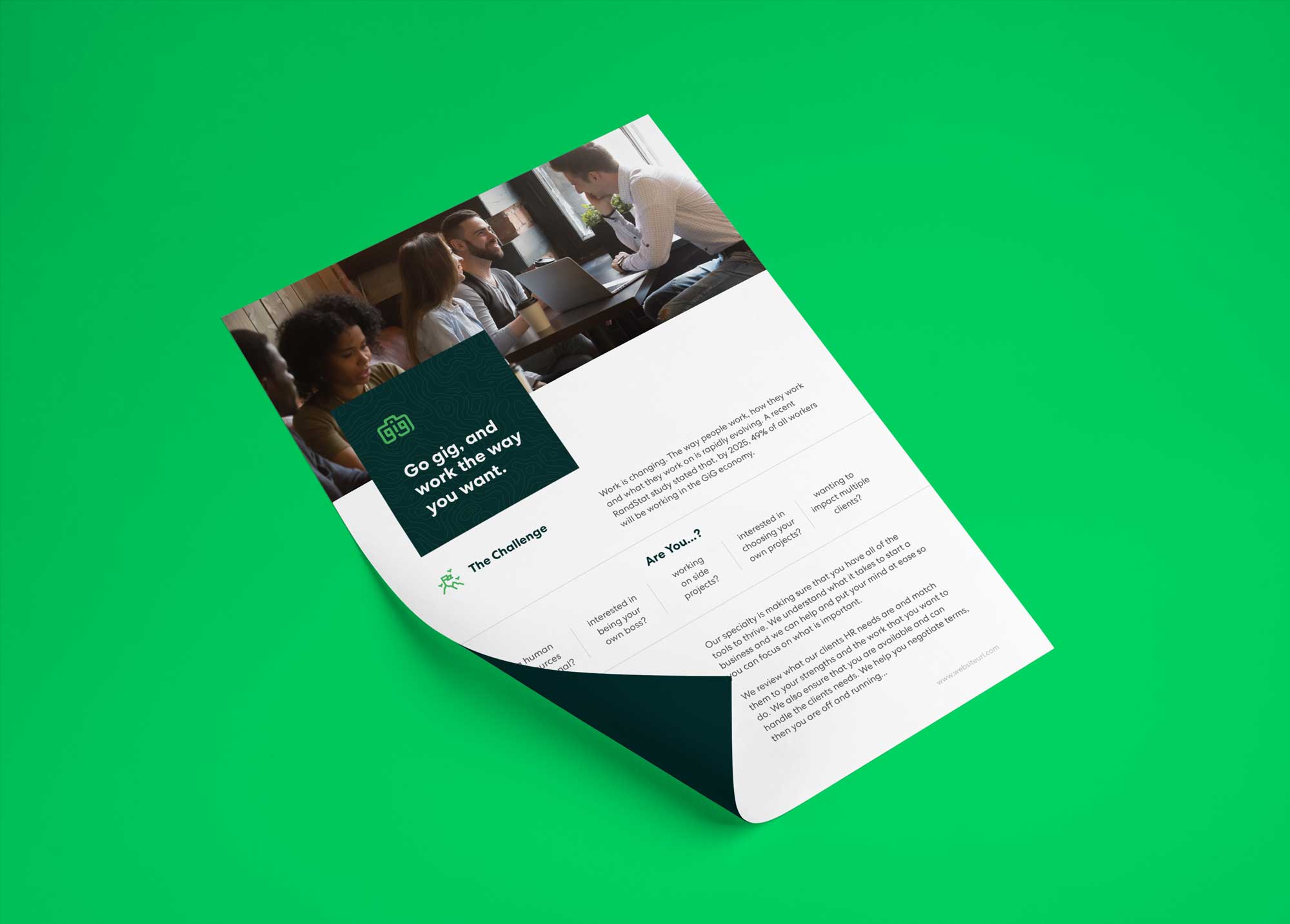
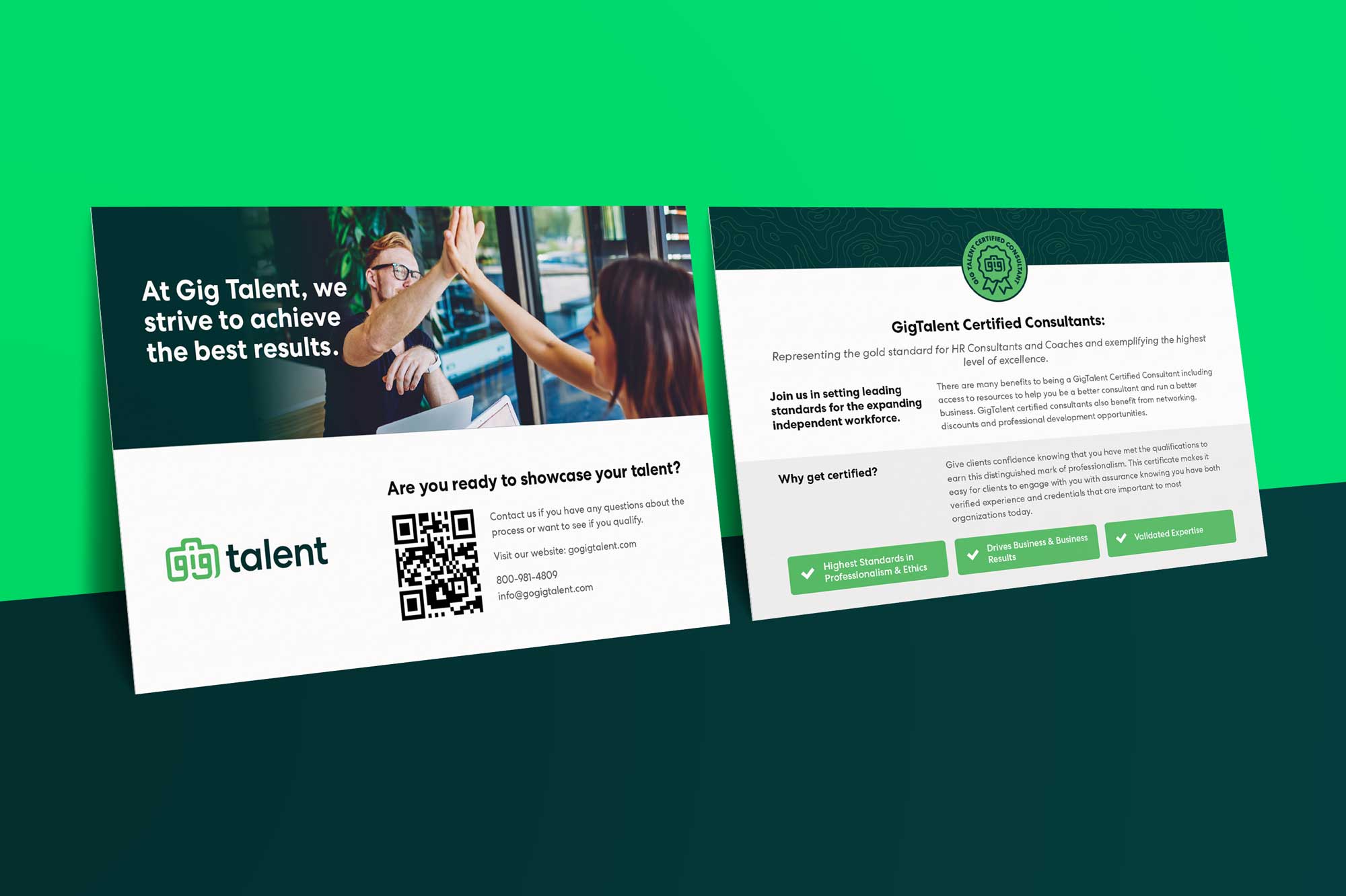
Marketing collateral
The first step in Gig Talent’s launch was developing a strong brand foundation. Step two was all about planting the seeds of awareness that would attract their client base. Transforming raw marketing text delivered in word-document form, into a marketing piece that was attractive, easy to read, and on-brand was no easy task. These sheets needed to clearly deliver a message, inspire the reader to action, and be visually compelling enough to warrant attention in the first place. Two examples below represent just a few of the many marketing deliverables designed for Gig Talent.