![]()
Intellihealth
Category — Product design, branding
Date — July 2020
Intellihealth’s Evolve is a powerful web app aiming to solve the national obesity epidemic while transforming the public perception of obesity as a disease.
Role & responsibilities
As senior product designer on the Intellihealth team, I was responsible for the initial parent and product brand identity design, design team leadership, UI and UX, market research, user interviews, user flows, user testing, information architecture, prototyping, design system creation/enforcement, and cross functional process improvement.
Branding
The project that connected me with Intellihealth was an initial branding exercise. Two companies (the parent holding company, Intellihealth and the product, Evolve) needed logo designs and a unifying brand identity system. Each company brand needed to be strong enough to stand on its own, but familiar enough to fit into the larger design system. The concept behind the company name “Intellihealth” is a synthesis of equal parts science and medicine. The final logo design for this company needed to be approachable, trustworthy, and capable of visually translating the “science+medicine” message.
![]()
Heart and lightbulb
This sketch used the form of a lightbulb and the shadow created from the bulb at an angle to construct the overall shape of a heart. The concept played at the idea of health by using the heart shape, while adding the lightbulb as a metaphor for science and breakthrough. Overall, this idea was difficult to execute properly and didn’t achieve the full spectrum of ideas required in the Intellihealth brand.
Shield, lightbulb, and human
This sketch drew on themes from the original heart+bulb sketch, but moved more in the direction of a corporate, trustworthy aesthetic. Using a shield (trust), a lightbulb (science), and the abstracted human form (empathy/health) in a celebratory pose conveyed much of what the Intellihealth brand was all about. This concept certainly had more of a “medical industry” look and feel, and even seemed to visually connect visually with the well known Rod of Asclepius symbol used frequently in hospitals and emergency vehicles. The downfall of this sketch however is the high complexity and number of elements used in combination. Too many elements in a logo tends to “muddy” the message and leave more questions than answers.
![]()
![]()
Atomic letters
Moving towards a more classic, scientific motif, this sketch combines the “Intellihealth” wordmark with the dynamic rings seen in an atomic model. There is some strong appeal of a modified wordmark containing stylized brand elements, but this direction seemed to only convey half of the brand message. Science was well represented in this sketch, but without a more succinct translation of the medical aspect, this logo design falls short.
Heart and atomic rings
After going the more complex design route, I felt the need to reduce. I wanted to boil down the Intellihealth mission and leave only the most fundamental design elements intact. Essentially, the logo needed to represent health and science, but how could this be done in the most direct and iconic way possible? As an answer on this quest for simplicity, I was left with two symbols – the heart and the atom. After countless sketches and variations on this simple approach, a clear path began to emerge.
![]()
![]()
Atomic rings and the human form
Something about that early sketch of the human form contained inside a light bulb really resonated with me and my understanding of the Intellihealth company mission. This was a group of people that truly wanted to help those struggling with obesity. Intellihealth understood the deep issues surrounding the obesity epidemic and focused heavily on the human connection required to create real, lasting change. In a society with little understanding of obesity as a disease and few resources to effectively help those afflicted, consumers needed the Intellihealth message – empathy, understanding, and a scientific approach to personal transformation.
This sketch fused my favorite elements of the previous concepts into a natural, intuitive form. Combining science (atomic rings), health (abstracted heart shape) and a celebratory human figure checked off everything on the Intellihealth value list and really nailed the science-based medical aesthetic I was after. After refinements, this logo moved on to become the Evolve product logo – the identity patients and providers would see each time they logged in and used the app.
Intellihealth logo
Of the presented logo concepts, the Intellihealth team saw the simplified heart with atomic rings as the best fit for the parent brand. Even with the concept simplified to the most basic elements, there was still a large number of tweaks required before this logo was ready to implement. In the original sketches, the heart shape was very dominant in the visual hierarchy. This dominance needed to be balanced and refined to the point where both atomic rings and heart were equally present. Refining the way the rings overlapped and intertwined also played a huge role in the logo finalization. A 3D effect was created in order to properly showcase the motion and depth of the logo. Of course, with this 3D addition came other challenges – how would the logo read in a black and white format or a very small space? A full series of logo variants were created to ensure the brand was feasible in any scenario.
![]()
Evolve logo
Evolve is the consumer-facing extension of the Intellihealth brand. When patients and providers interact with the Intellihealth software, it’s the Evolve logo they will come to associate with the powerful tool they use on a daily basis. The Evolve logo features a more complex representation of the atomic model and a human figure in the center of the logo. The figure is encircled by the atomic rings, giving the feeling of security and personal care. The energy and motion of these rings move the eye towards the center, promoting the idea of transformation through the Evolve program. The figure is posed in celebration – arms raised with an exuberant energy speaking to achievement and personal transformation achieved by using the product.
![]()
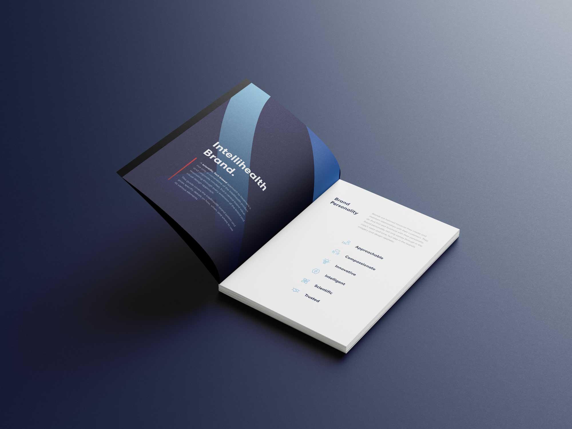
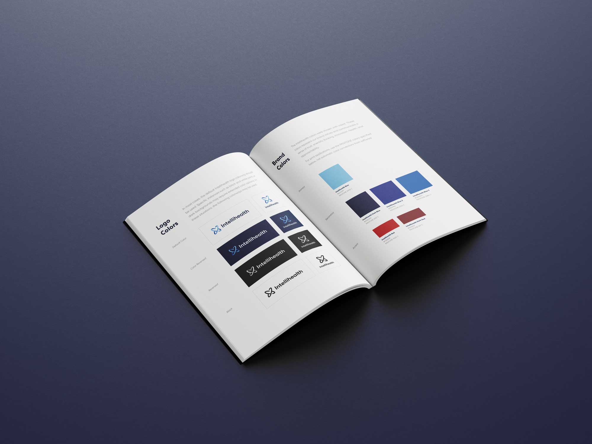
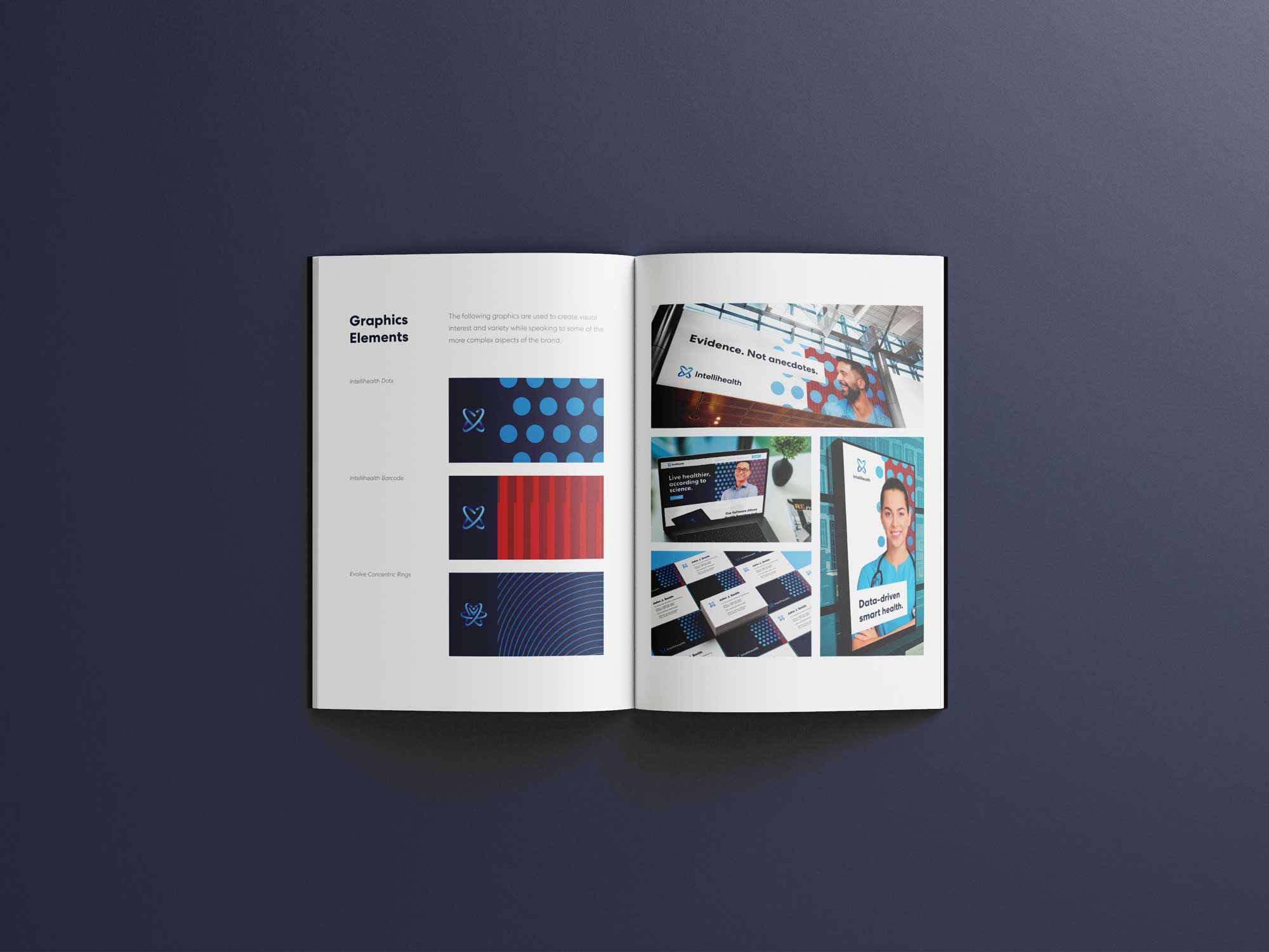
Brand guide
The final piece of the Intellihealth branding project was the creation of a full brand guide. The brand guide set up the visual design system for the company – giving examples of how, where, and when to use each logo variation, providing a full color library for the brand family, describing the brand personality and core values, detailing the sensitive approach to imagery in the context of obesity management, and enabling the Intellihealth team to properly and consistently use the brand elements throughout a wide variety of materials.

Product design
After my work on the Intellihealth brand was finished, the team was impressed with my thoughtful approach and detailed execution. This great working relationship transitioned into from a short term visual design engagement into a permanent product design role. Working originally as a hired hand for a contract company, I eventually was hired directly by Intellihealth to become the senior product designer on the product team.

Design process
With visual design, each project tends to take its own unique path and allows team members to operate somewhat independently. Product work however is a more logical beast and without a structured approach, the pieces can easily fall apart. An effective process includes not only the design team and how it generates their design solutions, but also dictates the way cross-functional teams work together to build an agreed upon solution.
During my time with Intellihealth, I worked to refine both the internal design process as well as the process between design, product management, and engineering to achieve faster build times, more accurate implementation, and a better user experience.
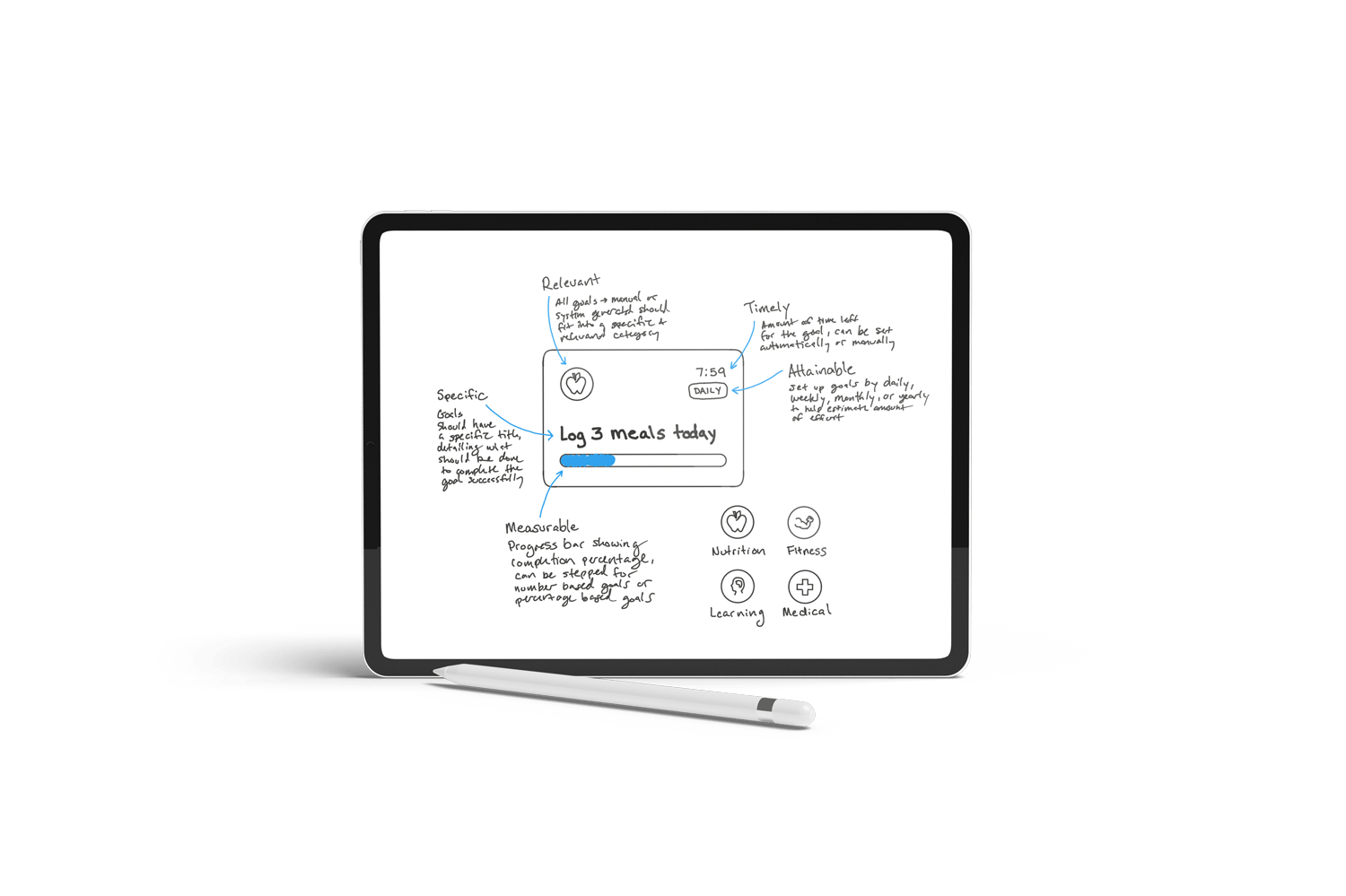
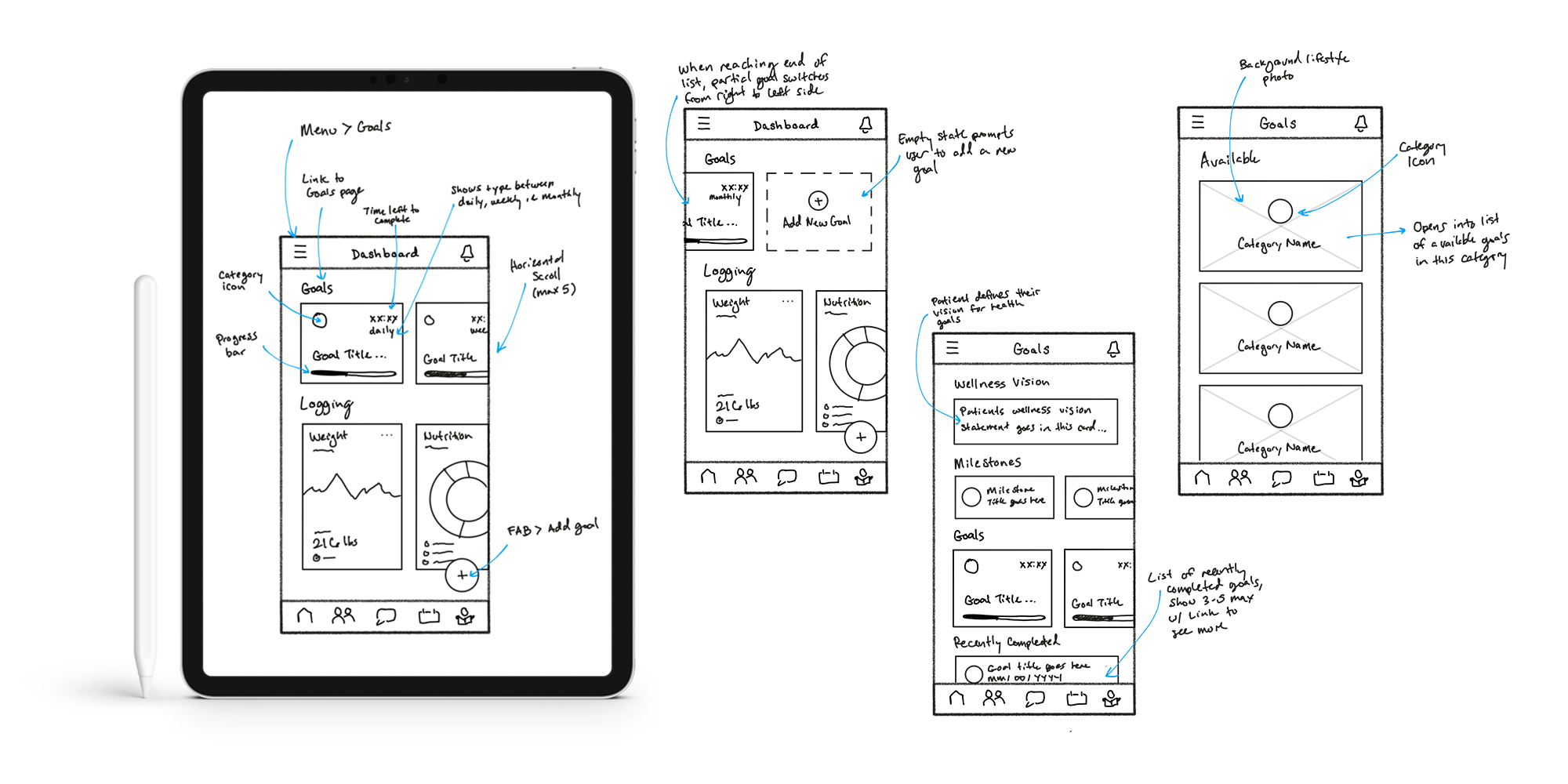
Ideate and validate
An early part of the design process includes sketching and wireframing basic solutions. After a round of initial discovery and documentation work where a problem statement is laid out and solutions are brainstormed, designers can kickstart the design process with this low-fidelity approach. Sketching solutions quickly allows designers to think through possible solutions, potential roadblocks, and find a working design path which can be validated with the larger team before moving into more time costly steps such as mockups and UI flows.
Refine and deliver
Once initial design solutions were reviewed with PM and engineering teams, designers moved into the refine and deliver phase, creating high-fidelity mockups and prototypes while accounting for both mobile and web versions of the designed feature. During this phase, special attention was given to details such as color, space, size, and full user flows were detailed for the major interactions within the feature.
A final review of the completed high-fidelity designs by both the product and engineering teams ensured any final usability issues were accounted for. Delivery of completed designs included a walkthrough video demonstration, walkthrough session with lead engineer assigned to the feature, as well as acceptance testing of the feature in the staging environment. This final design review happened at a key stage in the development process – giving enough time for the majority of the feature to be developed (about 75% completion) while also reserving enough space prior to deployment to allow engineers to accommodate any final design requests.
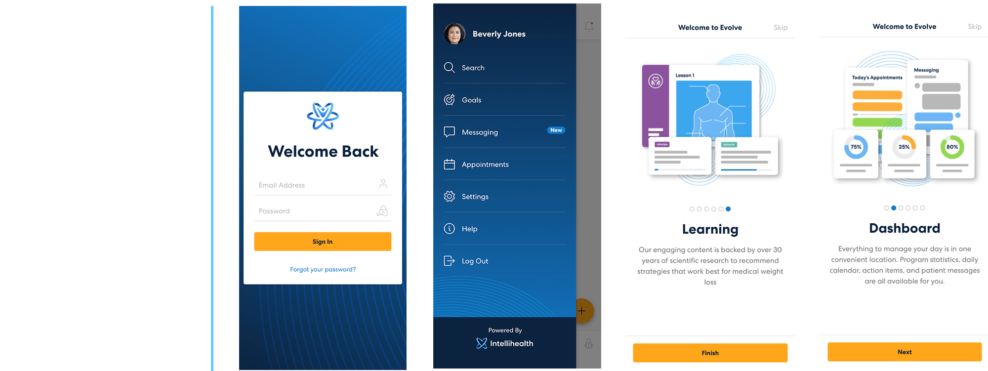
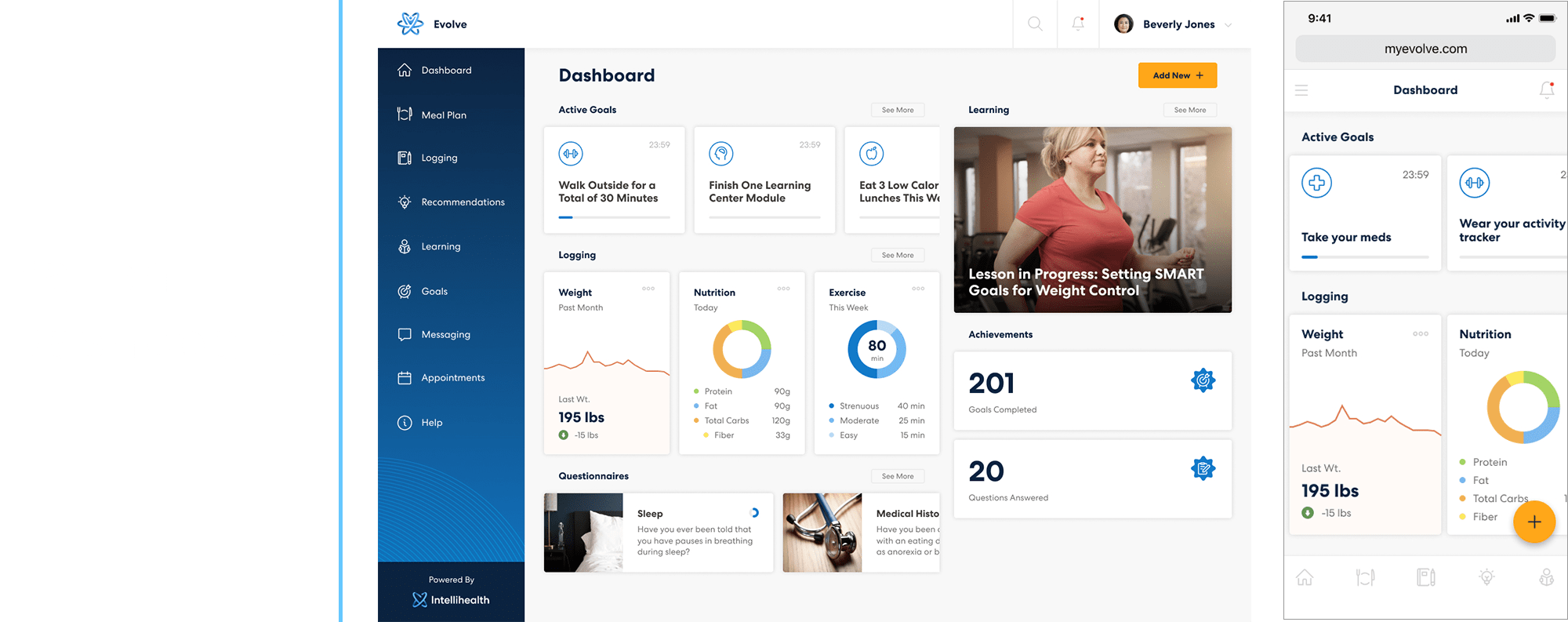
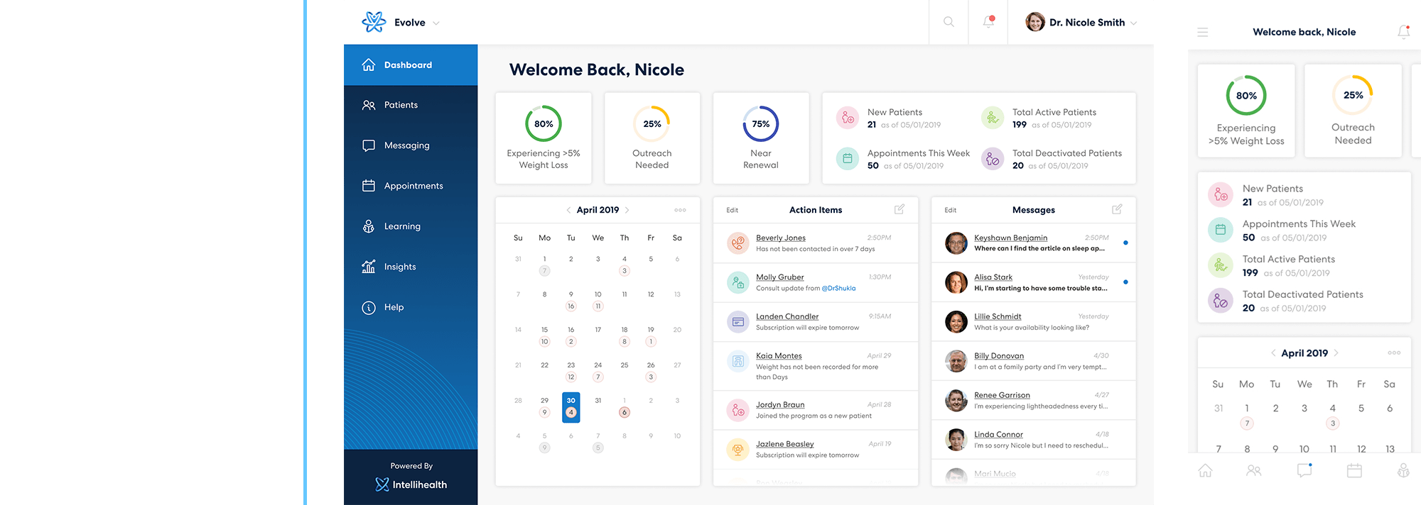
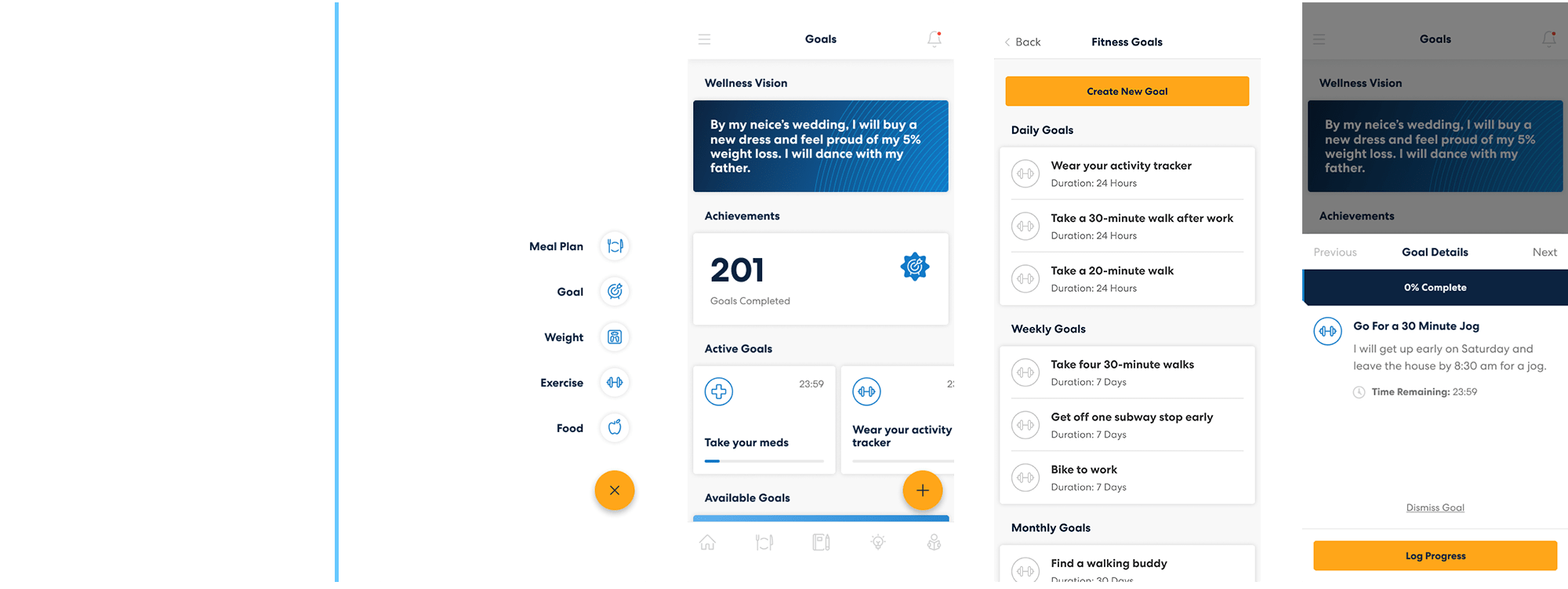
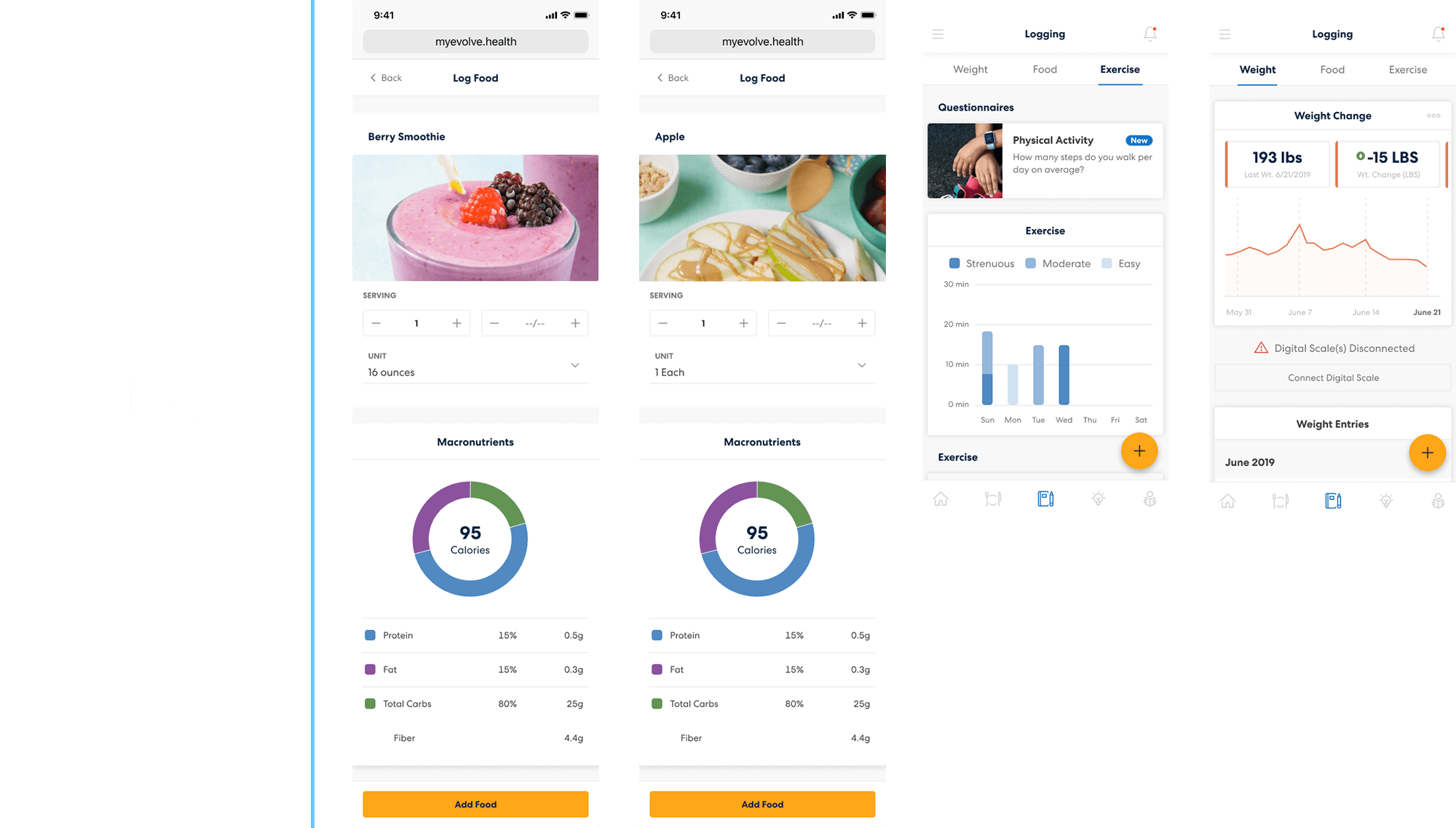
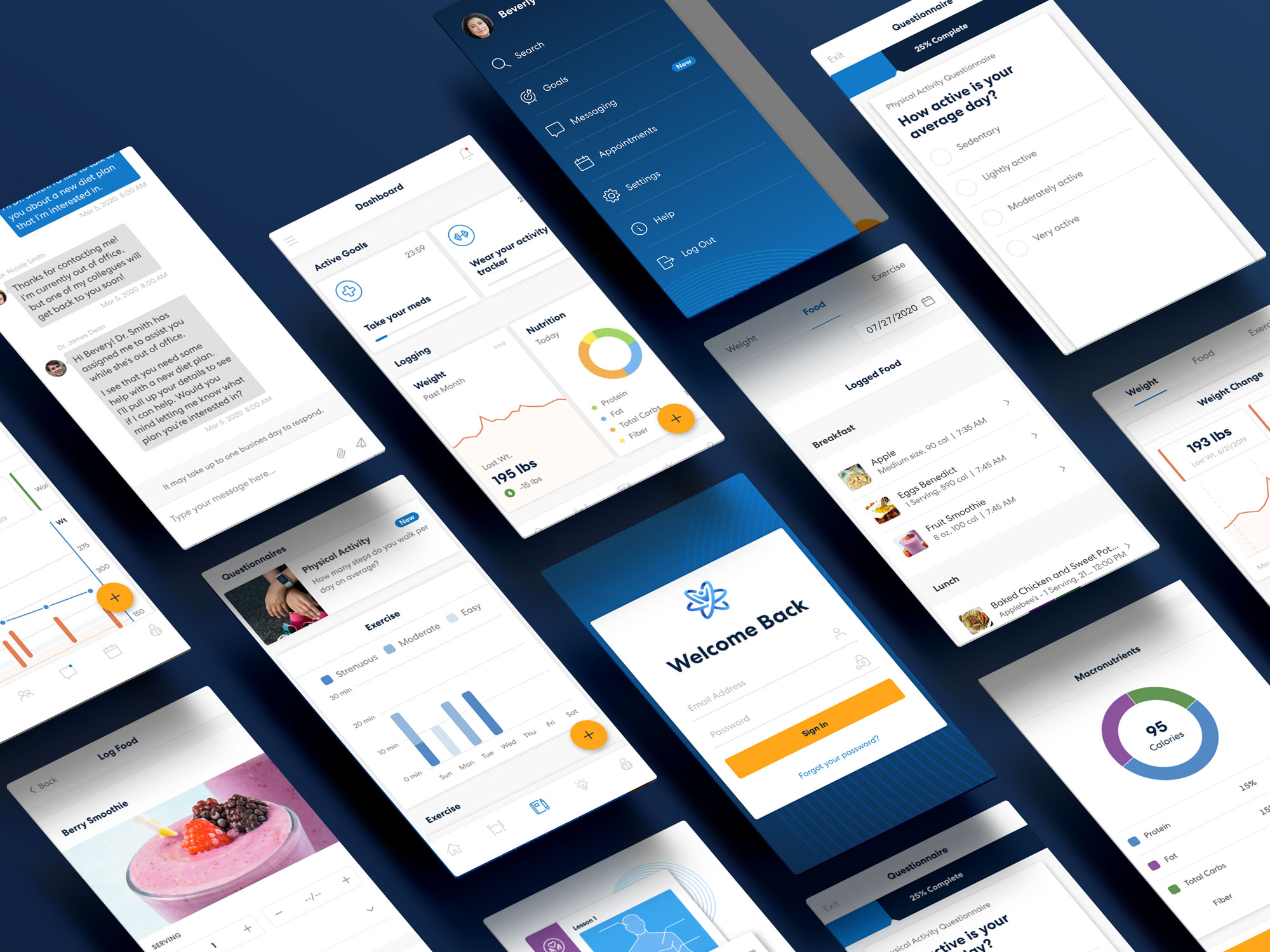
Scope of work
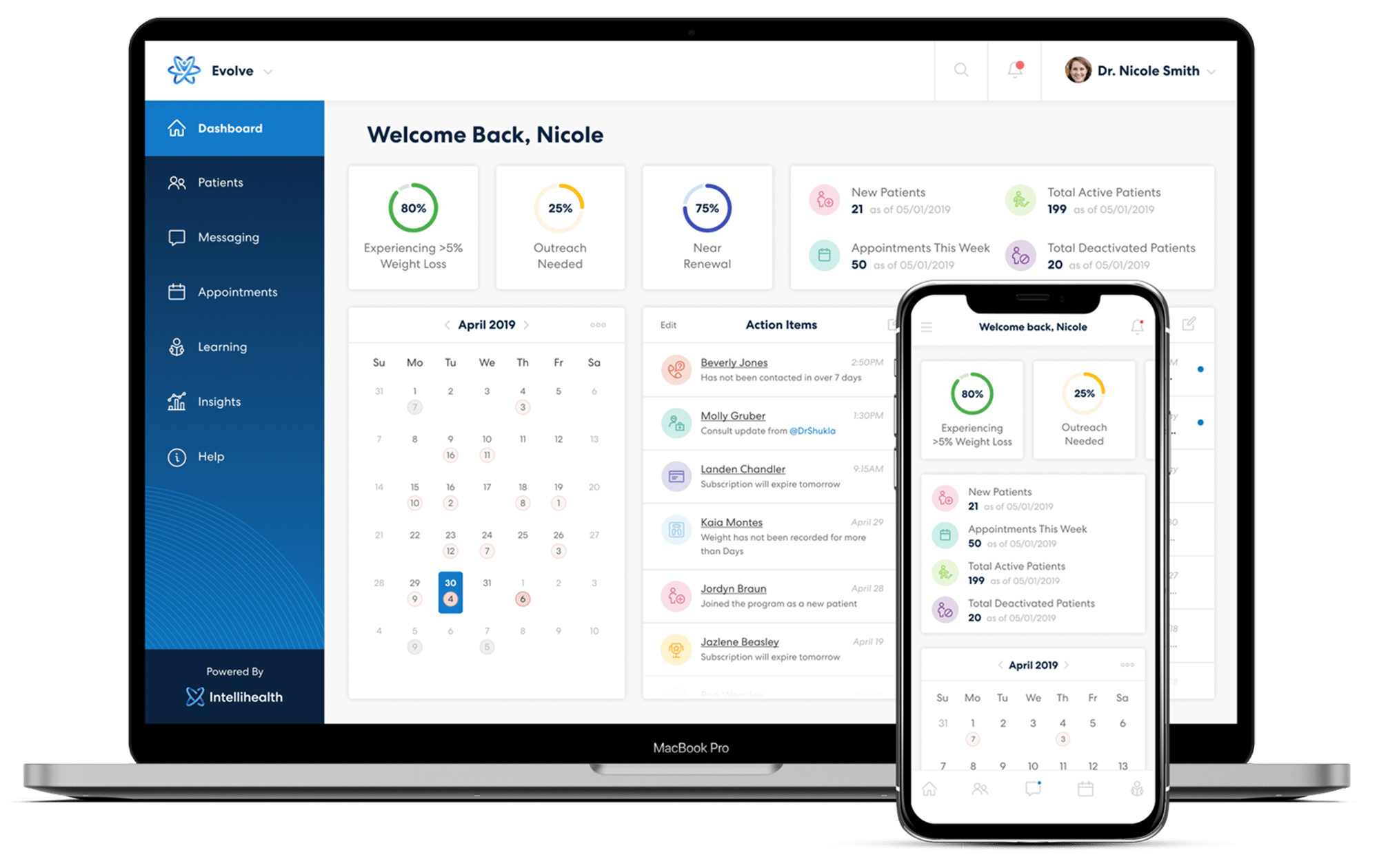
When I describe my time working with Intellihealth, I often mention how it felt like I was building ten different products at one time. The Evolve product was so ambitious in what it hoped to achieve, with such a wide range of capabilities and features, the number of screens and interactions I was able to work on provided me with a truly amazing experience. Working on Evolve, I touched features such as appointments and scheduling, calendars with complex systems of availability and clinic working hours, patient and provider messaging, a health recommendation engine, goals and gamification, notifications, learning management system, and so many others.
The complexity of this work is multiplied when considering the different user types in Evolve – patients, providers, admins, and super admins each had a unique view of each feature, along with a specific set of controls and permissions. The example screens below highlight some of these complex features, but fail to translate the immense value and incredible learning experience I received through working with Intellihealth.