Designed and painted abstract artwork for home display.
Client
Pokrant Family
Year
2021
Services
Paint
Timeline
2 weeks
Expressing my adoration for the West Coast
During the chaos of 2020 and the Covid pandemic, my family and I found ourselves seeking shelter from the chaotic and uncertain California landscape. We had lived in San Diego for about 6 years at that point, and I had become very accustomed to the West Coast lifestyle, beach vibes, and surfing frequently for exercise and a form of connecting with nature.
The pandemic changed a lot, for a lot of people. For me, it resulted in us moving back to Arizona for a few years while the world settled down. During that time spent in Arizona, I found myself really longing again to be back where I felt like I belonged – California. This painting was an expression of that restless, longing energy and marked the beginning of my plans to return.
Letting my hand guide the design
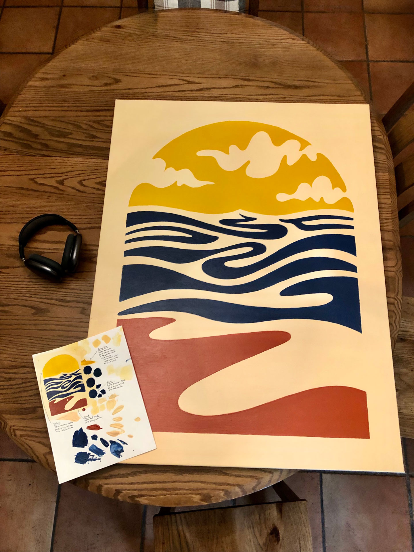
A core principle behind this self-initiated project was to let it be imperfect. I wanted to come away with something that felt like a raw, natural expression of how I was feeling – something that captured the emotion in a physical form. I started the work by sketching an abstract sun, sea, and sand that mirrored my longing for the coastline.
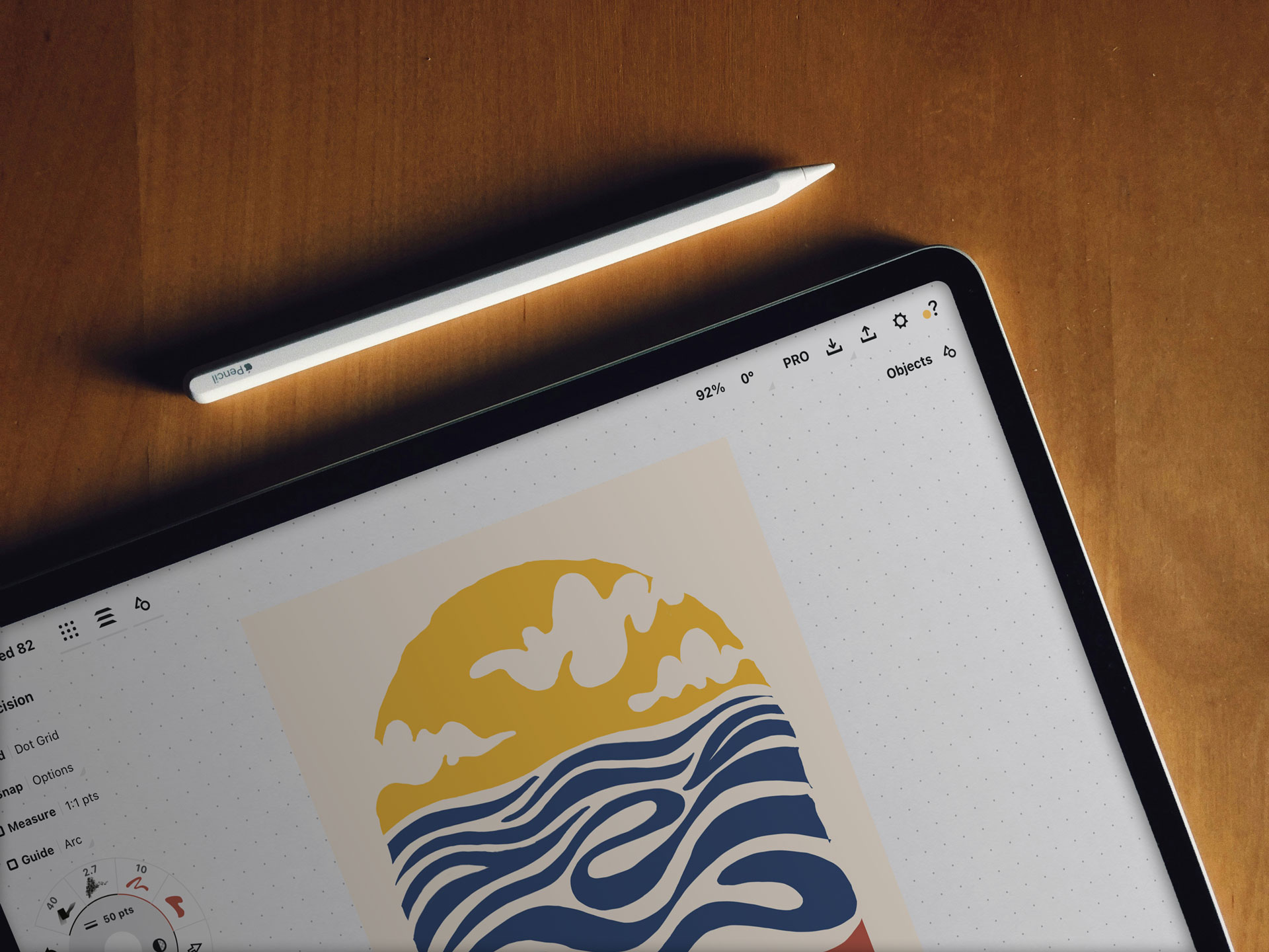
After a few rounds of raw-sketch iteration, I moved the design into a vector format and tweaked it a bit with Adobe Illustrator. Despite wanting the artwork to come across as raw and imperfect, there were some curves and flow lines that I just couldn’t quite execute by hand without some help from Adobe Illustrator.
Refinement and execution
As I moved the sketch from my iPad into Adobe Illustrator, I was able to clean the concept up from the original raw sketches and nail down a bit more of the negative space aesthetic I was shooting for with the sand dune shape at the bottom of the design.
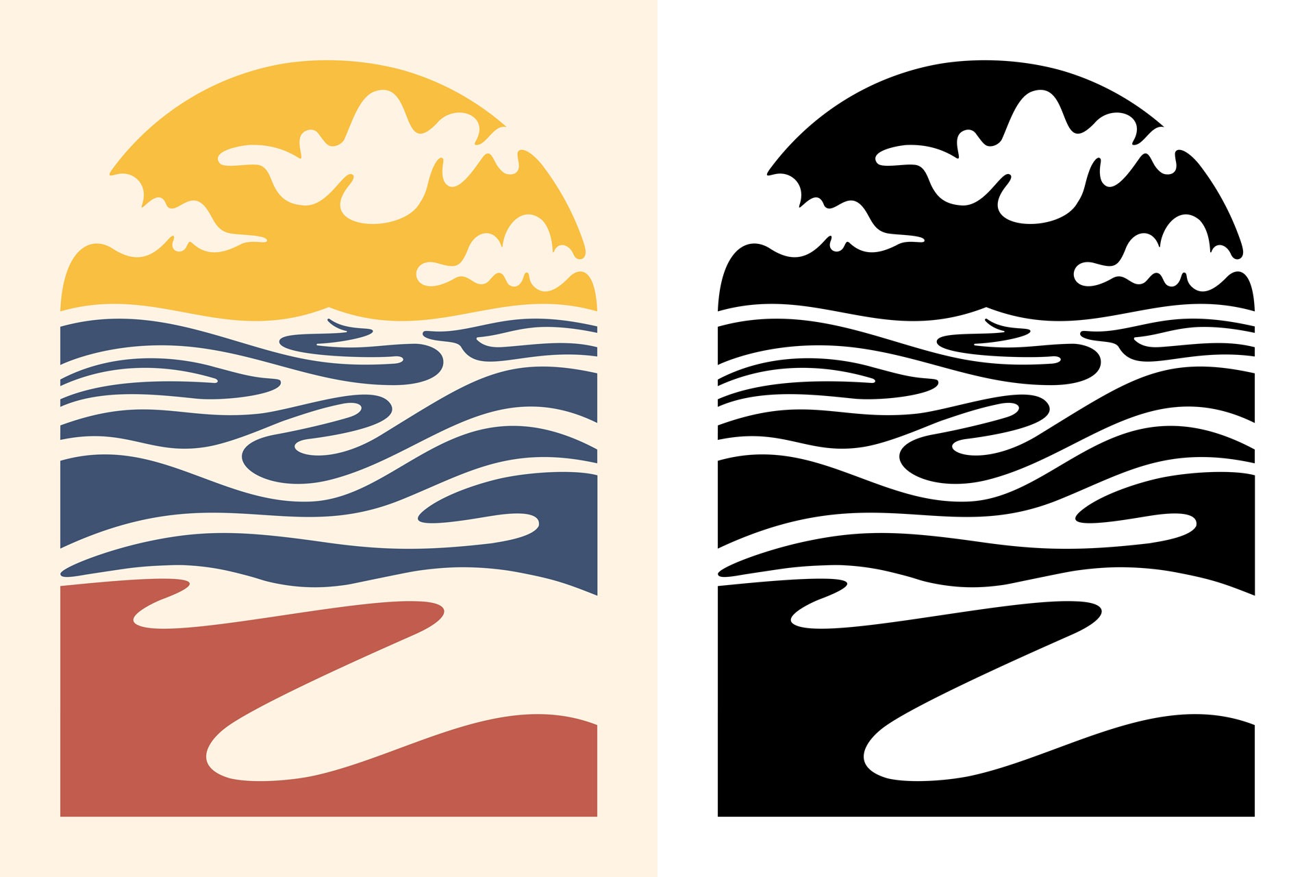
The final digital step was to convert the refined shapes into a black and white stencil that I would ultimately cut out and use as a template, painting within the lines to match the digital concept as closely as I could in the physical end product.
Conclusion
The painting process was largely focused on color matching. I wanted the entire painting to have a harmonious color palette, but yet have colors that stood out as distinct and bold. I spent a considerable amount of time refining the off-white background color, the dark orange sand color, and finding a blue hue that didn’t look “too blue” compared to the other colors in the system.
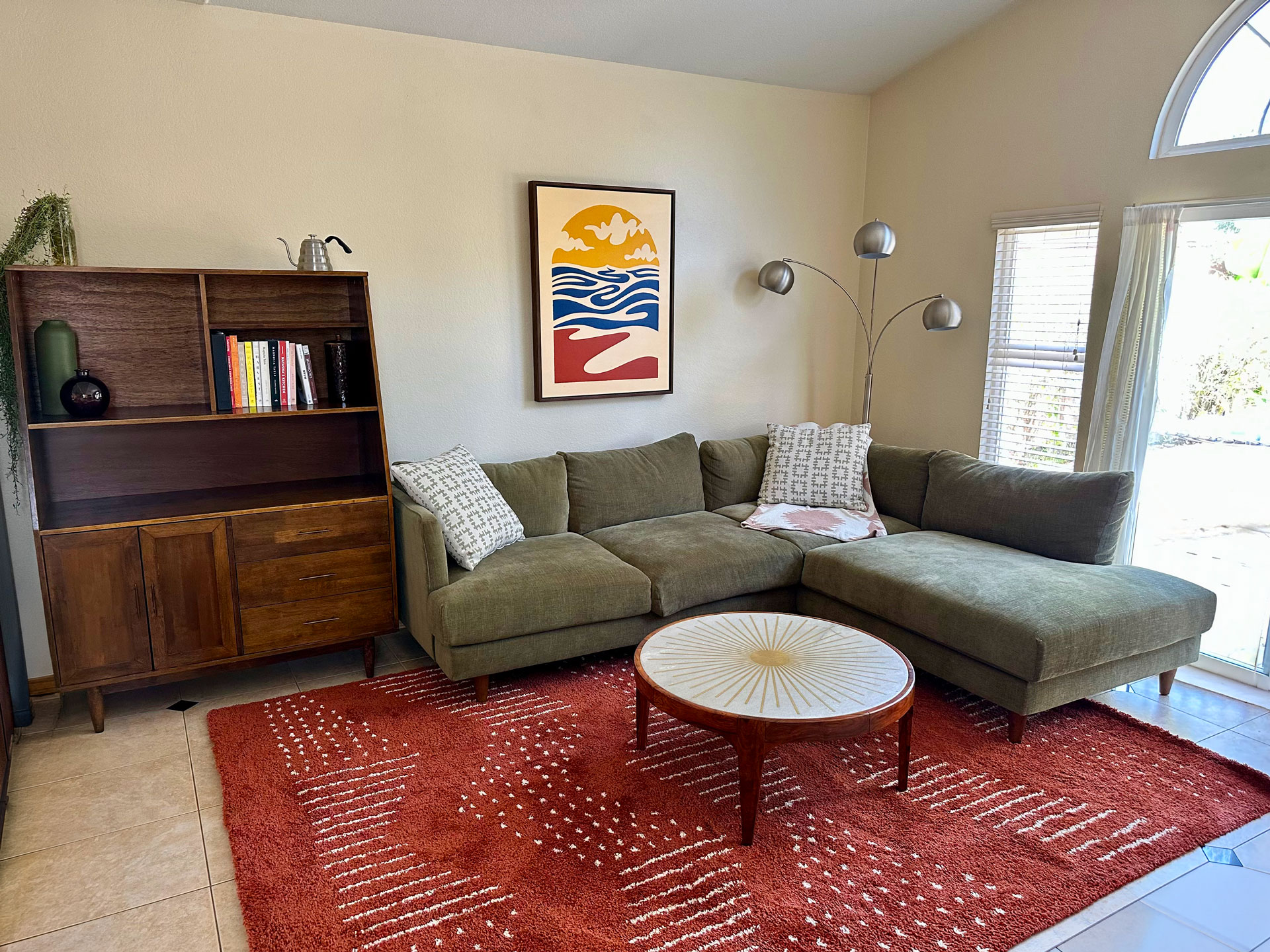
I’m super happy with the final result. This painting moved with us as we uprooted our lives from Arizona and moved back to beautiful California where I picked up my weekly habit of surfing once again. It serves as both a stylish, decorative piece to accent our living room and a personal memento to a transitional time in my life and the story that brought me back to the place I love.