![]()
Aspen Grey
Category — Brand Identity
Date — Dec 2015
Brand identity, website, and print collateral created for Interior Design firm, Aspen Grey. Heavy emphasis on a feminine, natural aesthetic, relating to the design style of the company.
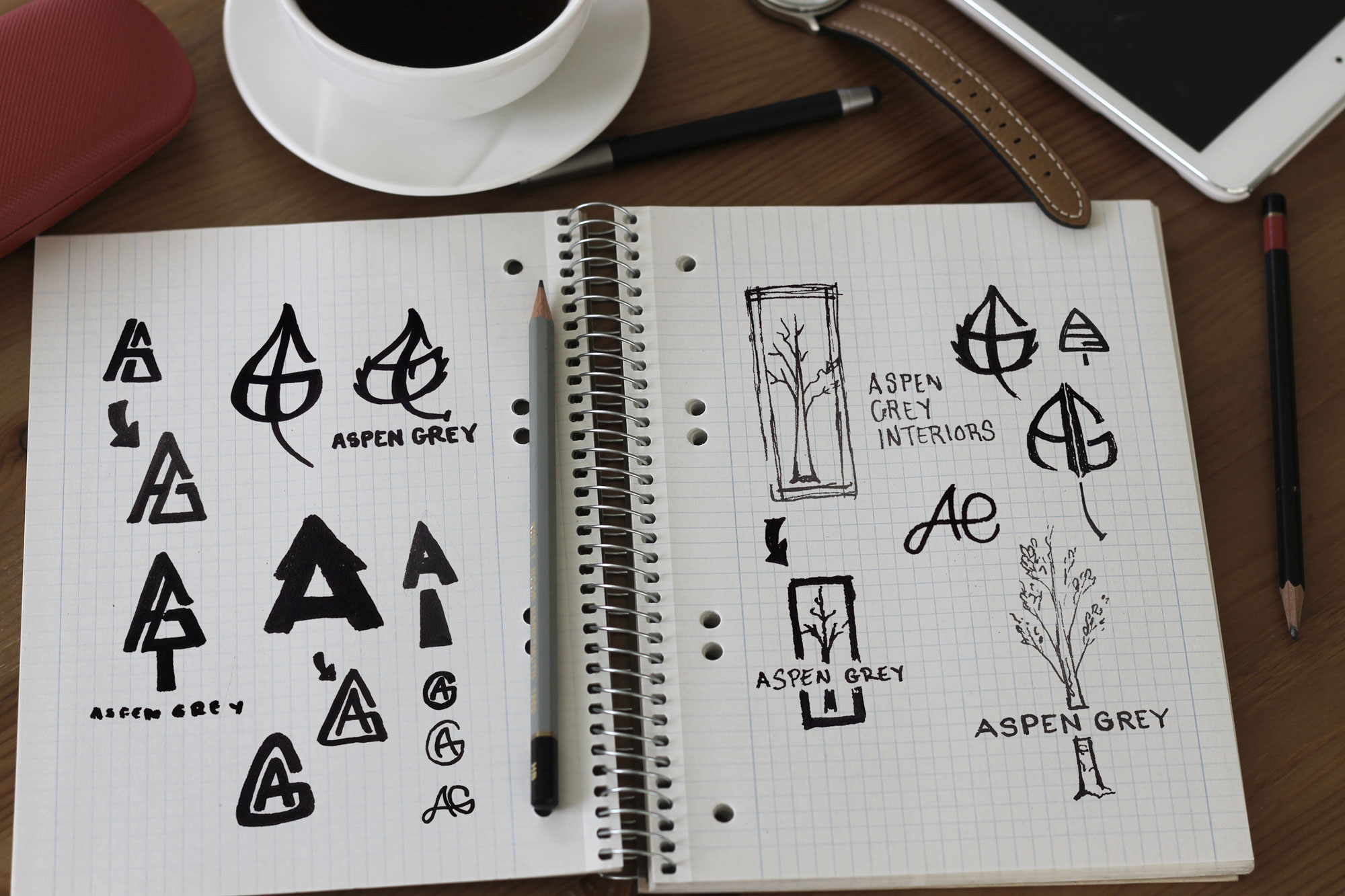
Logo
The Aspen Grey brand needed to convey structure, order, shape, and line while also appealing to a soft, feminine sensibility.
Initially, the logo direction took the form of an aspen tree, formed by an iconic merging of the letters A and G. While this concept was clever and certainly made an attractive mark, client feedback moved the logo in a more fashion-forward direction, playing to the heavily an illustrative and nature-based style
Execution
Two very different logos emerged from the design and iteration process. While only one of the two logos made the official “cut”, I still believed in both concepts and enjoyed how each logo had its own unique flavor and personality.
![]()
![]()
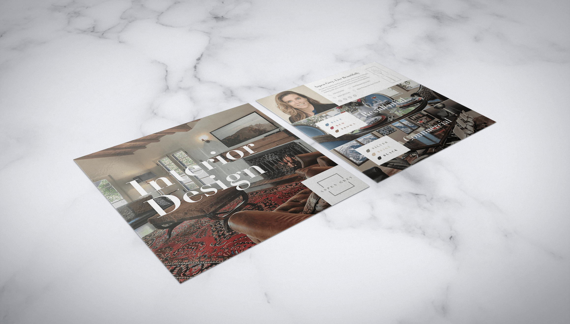
Marketing Collateral
This brochure was designed to market Aspen Grey’s services, showcasing the personality behind the brand and emphasizing the ability to provide both commercial and residential services. A playful aspen leaf color pallet was also used in tandem with the portfolio photography, exposing the harmony and methodology behind the interior design shots.
Website
The Aspen Grey website was designed to match the bright, beautiful design approach of the AG interior design process. The result is a beautiful piece that resonates with the brand and services while informing potential clients about the services, aesthetic, and the benefits of working with Aspen Grey.