Designed a unique, significant logo for local punk rock band.
Client
Chance to Steal
Year
2017
Services
Branding
Timeline
1 week
A partnership formed through local connections.
In my younger years, I played music across multiple local venues in the small town of Tuscon, Arizona. These shows led me to meet the members of another local band – Race to the Bottom. When the singer from this band moved on to start a new project called A Chance to Steal, he needed a logo and I jumped at the chance.
Being a punk band with songs and themes very relevant to the modern political landscape, the band wanted their logo to reflect political themes without being too on the nose. They needed something that visually represented the ideas of flipping the power struggle”and toppling systematic oppression.
Inspiration
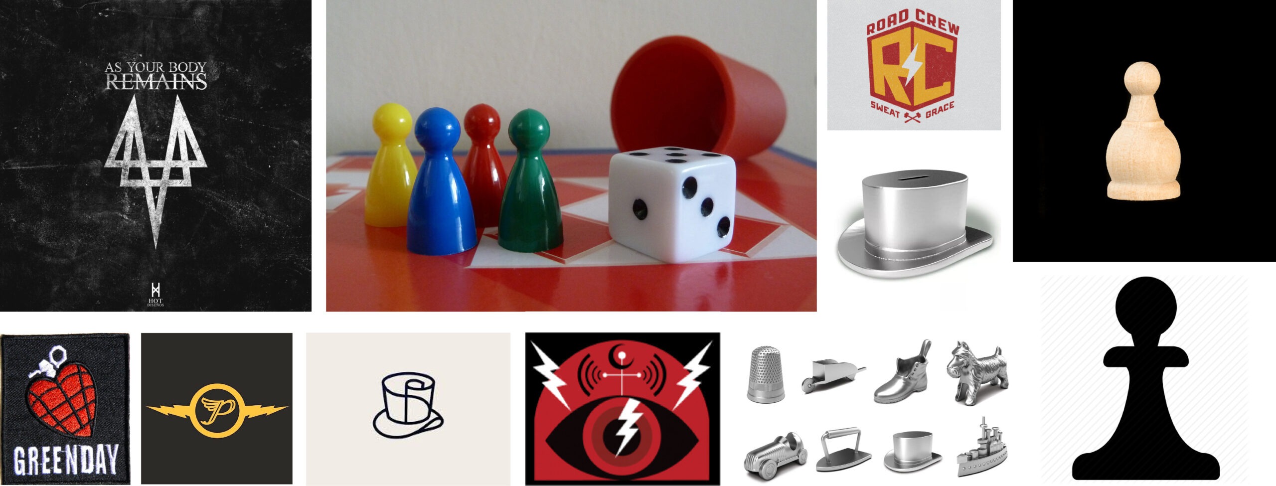
The client wanted their logo to very specifically include elements of traditional board games such as kings and pawns, representing the power hierarchy between the government and the governed. There was also this theme of "big money" they wanted woven into the design. These visuals were meant to be symbolic, signaling that money and corruption were intertwined in the establishment and enforcement of power.
Outside of the conceptual elements, the band also referenced other modern groups such as Green Day and All That Remains as visual examples of styles that they liked and would like to align with visually. I did my best to weave these various themes into something that not only looked like it belonged in the modern punk scene, but also sent a clear visual message.
Conclusion
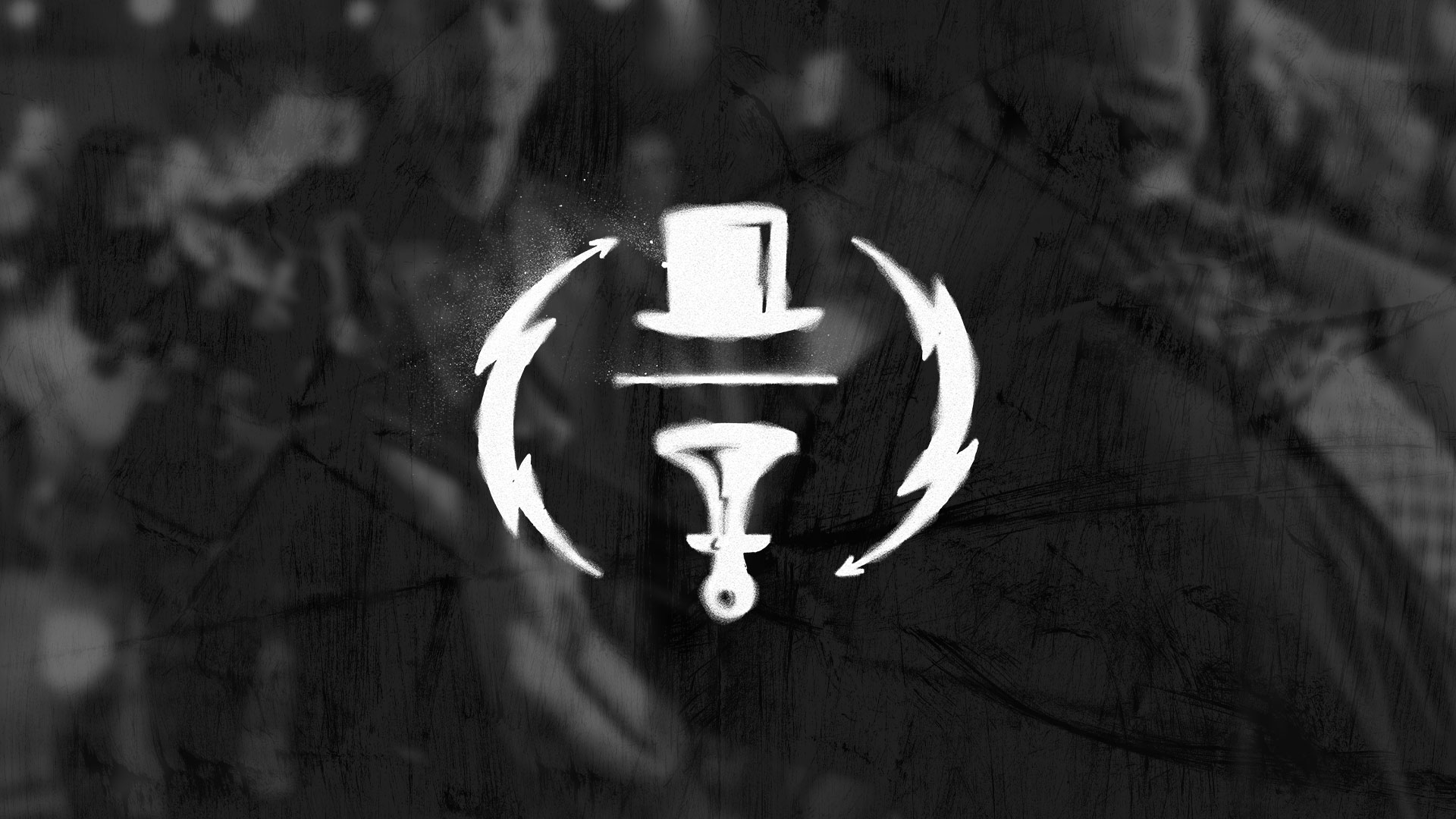
The Chance to Steal logo really nailed both the conceptual as well as visual aesthetic I was aiming for. The lighting bolts on either side are a throwback to classic rock, while framing the center contents and providing a sense of motion – hinting at the theme of “flipping the power dynamics”. The Monopoly hat on top of the pawn reinforces the idea of oppression with the pawn representing the average individual – turned upside down and forced down by the powers above.
The font chosen for the band name wasn’t an aesthetic decision, but more of a conceptual alignment where the typeface is intentionally, very similar font to a mainstream banking company. This design choice once again hints at the band’s theme of money, power, and corruption. The overall symbol acts as a flag against the status quo and sends a message of hope where the individual can one day reverse the power dynamics and regain control.