![]()
Convex
“Reinventing a mobile app, refreshing a design system, delivering stellar tools for sellers. Scott’s work at Convex was a a heart-pounding, non-stop thrill ride that refused to quit delivering value.”
– Some guy on the internet
Have you ever stepped into a beautiful, well-maintained building and found yourself wondering “Wow… who does the janitorial work for this place and how did they get the job?” No? Well I bet after reading this case study, there’s a chance these types of questions might pop into your mind. The truth is, behind the façade of every safe, temperature controlled, government compliant building is a commercial service contractor.
Air conditioning, security systems, elevator maintenance, fire and safety – these services don’t attend to themselves, but providing the service is only half the battle. My work with Convex enabled the sales staff within commercial service companies to find new leads, execute their sales funnel, and win business, ultimately providing the services that keep our cities functioning and thriving.

Cool, but what did you actually do?
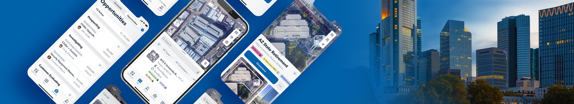
As Senior Product Designer at Convex, I was basically the “right hand man” for all things design. Design-engineering process improvement, cross-team design strategy, design mentorship, direct feature work, random T-Shirt graphics… I did it all! Most significant, however, was my work on the mobile redesign project.
This project had a little something for everyone. It was the first time design conducted a hands-on user research project, the timeline was aggressive, the scope was enormous, and I even found myself playing the role of project manager due to a strange turn of events.
Read on for thrills and chills as we reinvented Convex’s mobile offering.
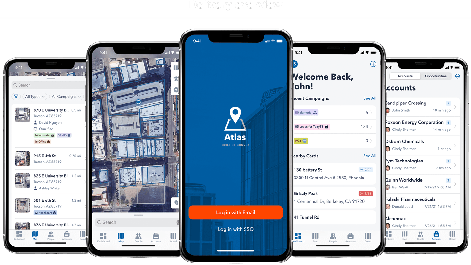
Mobile redesign
Shiny new designs are fun, but what was the real problem?
By the numbers, the Convex mobile app had an extremely low daily active user count. How low? About nine active users per day (averaged over a month period).
To put that number into perspective, the desktop solution saw numbers in the hundreds of users per day. Seeing this discrepancy between mobile and desktop meant there was something very wrong with the mobile experience. Our goal for this project was to increase usage metrics on the mobile app.
Ok, so nobody used the mobile app… why did this matter?
To give some context to the macro-dynamics behind this decision, Convex recently made a pivot in their business model and built tools that enabled direct competition with sales software titans such as Microsoft and Salesforce.
To create a competitive advantage, Convex saw their opportunity in owning a specific corner of the market – this corner was the prospecting sales user. The problem here was that prospecting happened largely out of pocket, not at home on a desktop device. If customers weren’t using the mobile app, that meant the company wasn’t truly owning their segment or competing effectively in the market.
Challenge accepted. Now what?
The obvious answer here seemed to be “build a better mobile app”. This was the request from product and it made sense, especially considering we didn’t have any research to support contrary conclusions. If we built it, the users would come… right?
This plan sounded solid in theory and our team geared up to create the better offering, but *spoiler alert*, there were deeper, more concerning issues lurking under the surface than a poor app design.
Research, inside and out
I mentioned before that this was the first time design had ever spoken directly with users in a research capacity. This research was an exciting and game-changing initiative, but also represented a significant challenge.
Gathering the list of participants and carrying out the sessions required heavy support from both members of the engineering and customer success teams. Not only was external, customer research essential, but internal research with members of our team delivered surprising and crucial takeaways that redefined our vision for success.
Below are the key takeaways from both our internal and external research:
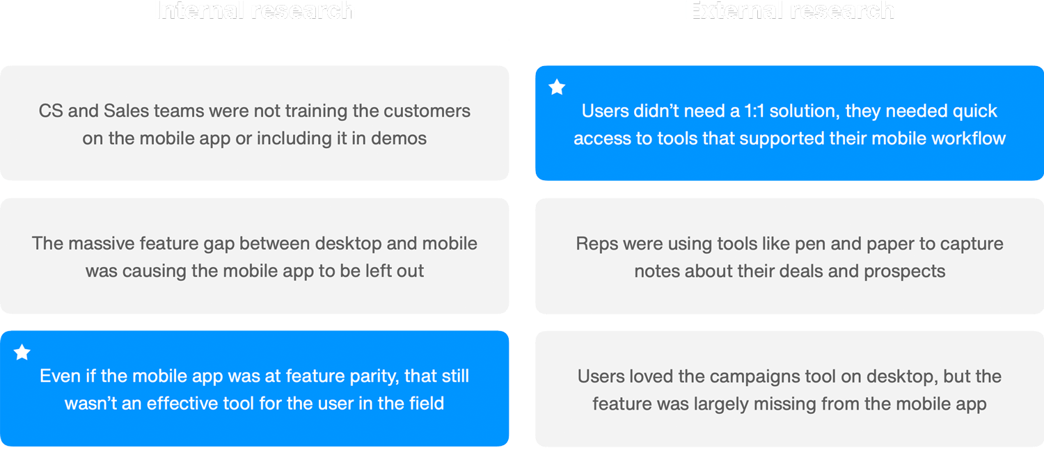
A nuanced understanding
As we synthesized the findings of our internal and external research, the full picture of our mobile problem began to emerge. The low usage wasn’t just stemming from a bad design or lack of feature-completeness, the biggest problem was that our user base was simply unaware the mobile app existed!
This lack of awareness was driven by the fact that our internal team (who was largely responsible for how the customer used the product) had completely abandoned the mobile app. This lack of internal support was based on two factors – the app was missing core features available on desktop but most importantly, failed to deliver an experience that supported the specific needs of mobile users.
The most resounding takeaway from this research was “even if we were able to achieve full feature-parity with desktop, the mobile app would still be largely useless to prospecting users in the field”.
Ouch! The truth hurt, but also set us on a targeted path to greater success.
Calling an audible
Empowered by key user insights and motivated by a clear path forward, our team prepared to execute the vision. It was about this point in the project that we unexpectedly lost our project manager. Answers to questions like “What is our timeline?” and “How do we prioritize features?” suddenly went out the window.
I don’t consider myself a project manager, but I did step up to the plate during this time of crisis and enable our team to move forward until a suitable replacement could be found. As I took hold of the project, I realized our timeline was extremely short and the undertaking was monumental. In order to achieve our deadline, we needed to trim some fat somewhere in the process.
It was this realization that led our team down the path of “hi-fi iteration”.
Kids… don’t try this one at home.
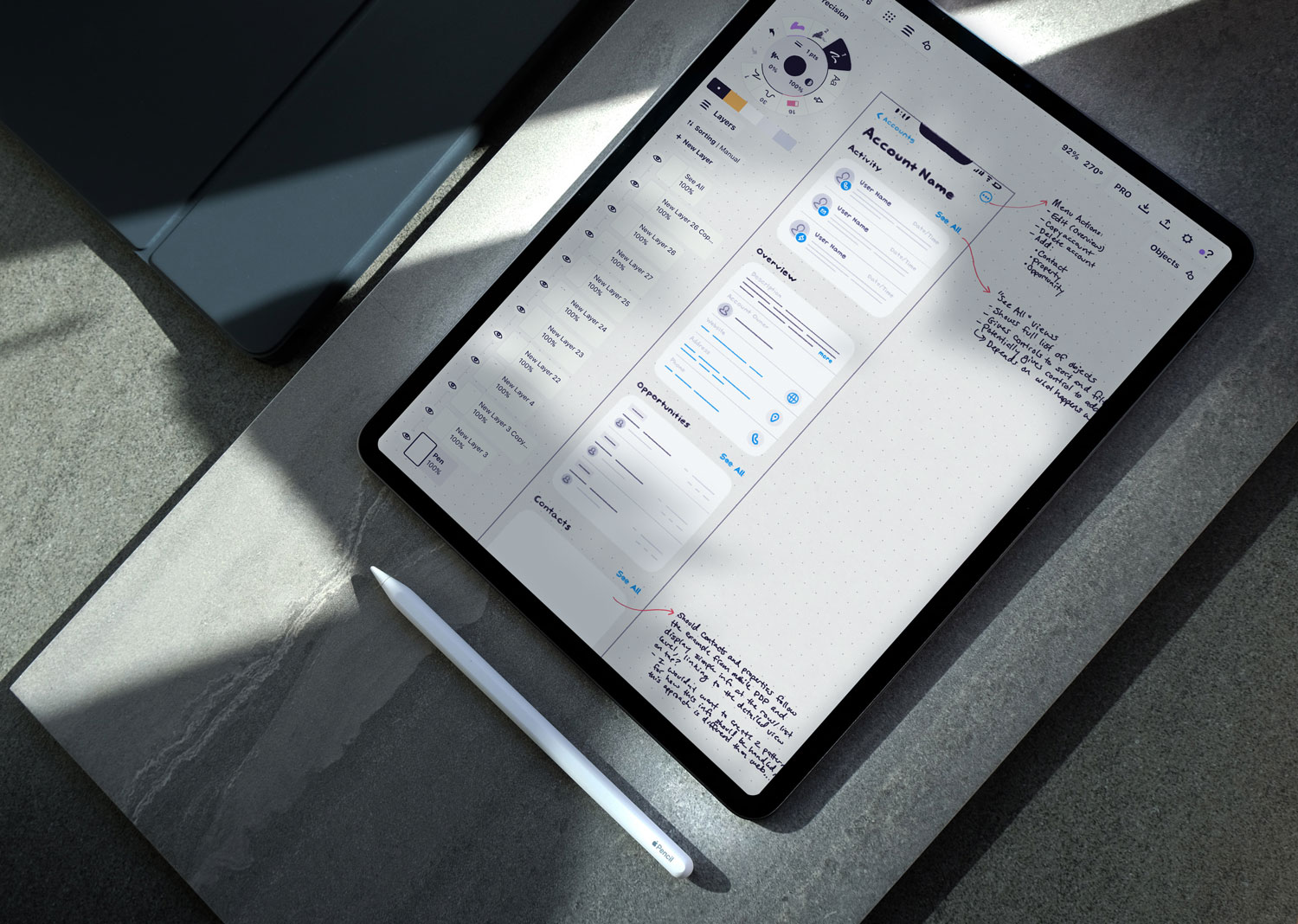
Riffing in real time
You may be familiar with the typical design process. It goes something like “research, wireframes, mockups, delivery”. There’s a good reason designers work this way, but the process our team adopted during this project was anything but typical.
Because of our short timeline and massive scope (14 total features within 6 sprints), the team made some key compromises to ensure our success:
- The team agreed to use Apple’s Swift UI Toolkit as a starting framework.
- Design iterated and validated concepts in full-fidelity.
This approach enabled us to start with existing elements instead of designing and building elements from scratch, speeding up the workflow dramatically. The above image shows an example of this hi-fi iteration, delivering three different design directions for a single feature.
Delivering value
Earlier I mentioned that we completed 14 feature designs during this project. Yes, you read that right. The complete effort included redesigns for ten existing features, touching both UX and UI to varying degrees, along with designs for four features that were completely new to mobile.
But let’s be honest, you’re probably already tuning out at this point. Instead of boring you to death and showing every feature we built, I’m going to highlight some of the most important work that most directly delivered on the needs we discovered during our research. I’ll also dive deep and show some of the critical functions of these key features.
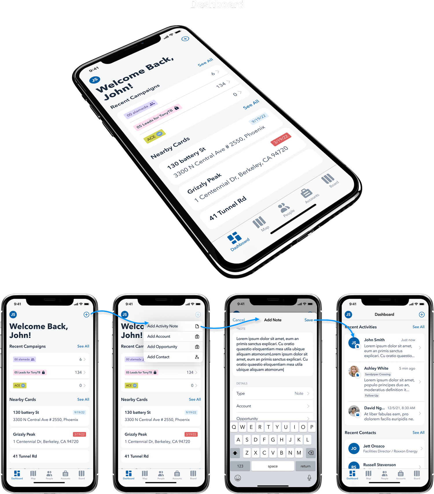
Dashboard
A brand new screen for the mobile app, the dashboard was a direct solve for the highest-priority takeaways we collected during our research. Two of these key takeaways involved immediate access to the Campaigns feature, along with an intuitive and lightweight entry point to add key information such as activity notes, contacts, and deal details via accounts and opportunities.
Through our research, we understood the sales user’s pain in dealing with required fields. Required fields, although helpful for keeping the sales system clean and organized, acted as a barrier for sales individuals who simply didn’t have time to fill out lengthy information. As a result, many sales professionals simply found ways to work around the system or abandoned it altogether.
Our workflow to add activity notes (shown below) almost entirely removes required and the associated friction, delivering a lightweight note system that supports mobile workers and their unique needs.
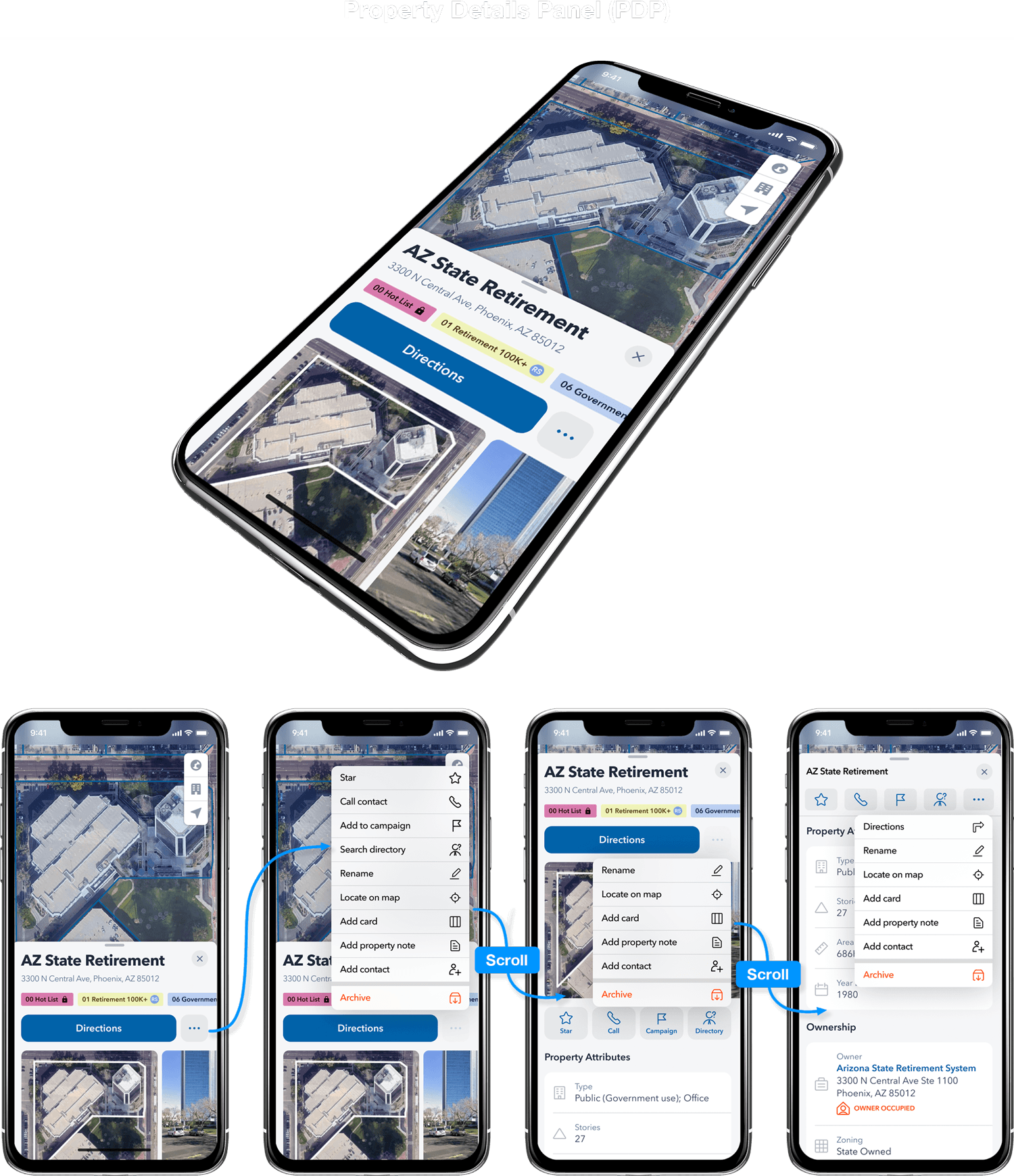
Property Details Panel (PDP)
The PDP was a core experience within the Convex product and our design treatment of this piece required the utmost diligence and respect. This redesign effort was extensive and covered a ton of ground, but one of the most significant improvements was the expansion of the page’s control system.
The previous PDP design included a set of semi-useful controls at the top of the page which disappeared as the user scrolled down into the more dense information. If the user needed to reference page information and then perform an action, they found themselves trapped in a labor-intensive, up and down scrolling nightmare. Our design understood this pain and addressed it directly.
The control system in the redesigned PDP ensures users have a complete set of controls at any page position within the PDP. Not only are the controls extensive, but they are dynamic – prioritizing visibility and space usage depending on the most frequent actions within each scroll point on the page.
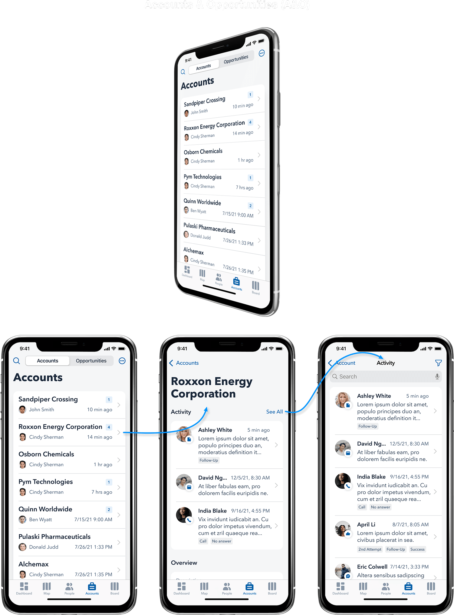
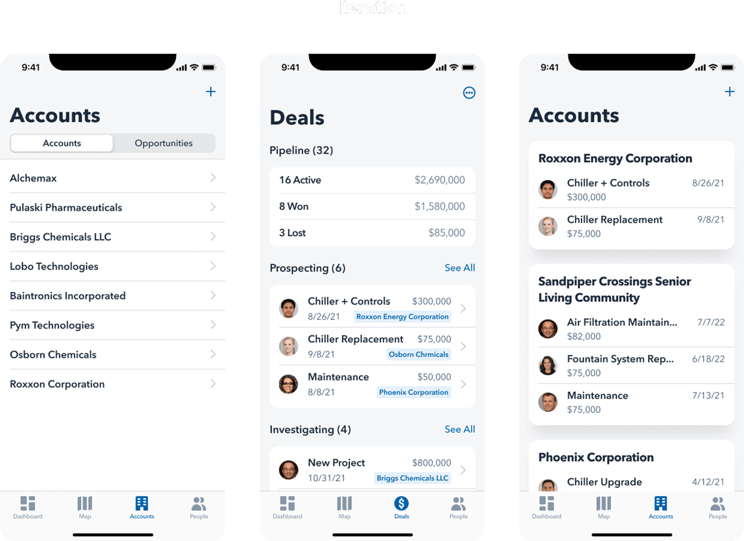
Accounts & Opportunities
Finally, we come to the Accounts and Opportunities feature. This was another “new to mobile” experience and required extensive design iteration based on feedback from our internal team. This was for good reason – the A&O feature represented Convex’s first, true entry into the sales market. If the feature was to be strategically successful, it needed to solve known problems in the sales software space, while also capitalizing on the interests of the company’s target demographic.
This feature delivers a rich and highly flexible framework for sellers to execute their work. A&O understood that “one size doesn’t fit all” and provided the customizability that sales users needed to work in the way that fit their process. While the tool was flexible, it still made a bold statement about how sales work should be done. Finding the right balance between rigidity and flexibility took some finessing and an expert-level understanding of the user. After everything was said and done, the feedback around this feature was a resounding “Woah… now we need to go and make desktop look like this!”.