VizExplorer
Category — Product, Branding
Date — March 2017
VizExplorer is a software company operating in the casino gaming industry. As senior designer, I developed the VizExplorer brand, produced consistent marketing materials, and designed dashboard interface solutions for the VizMosaic product.
VizMosaic Product Design
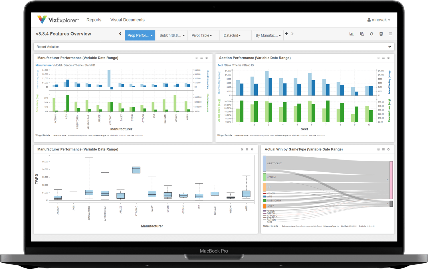
While my main role at VizExplorer was visual design on the marketing team, over time with the company, I developed an interest in the VizExplorer product design. The Viz product suite delivers impressive data visualizations and insights for their customers, but these benefits were often dwarfed by a non-intuitive user interface. Midway through my time at VizExplorer, I was asked by the customer success team to design a dashboard interface for the VizMosaic product, alleviating deal-breaking concerns from one of VizExplorer’s anchor clients.
The dashboard design included simplified charts and data-rich graphics, giving users a comprehensive overview of their operation while providing drill down pathways for additional insights. Navigation tabs were added across the top of the dashboard, allowing users to access the most relevant areas of the product, while also allowing customizability of which tabs/pages were included.
Brand Guide
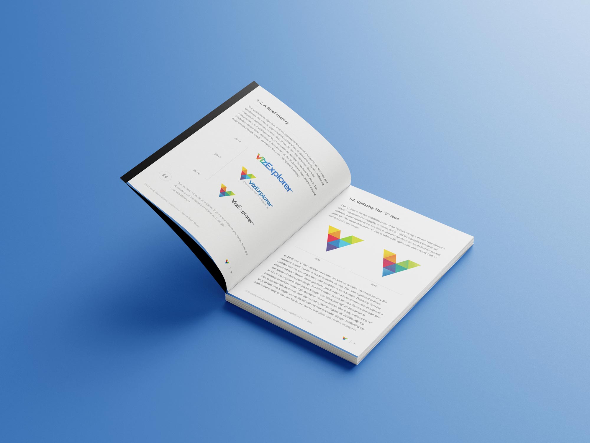
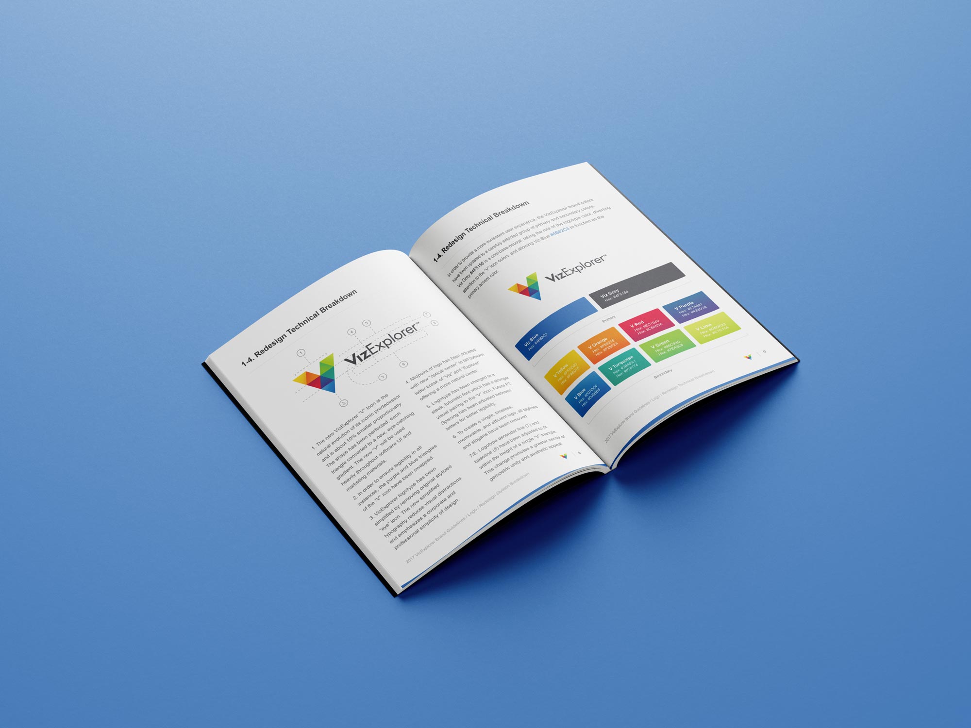
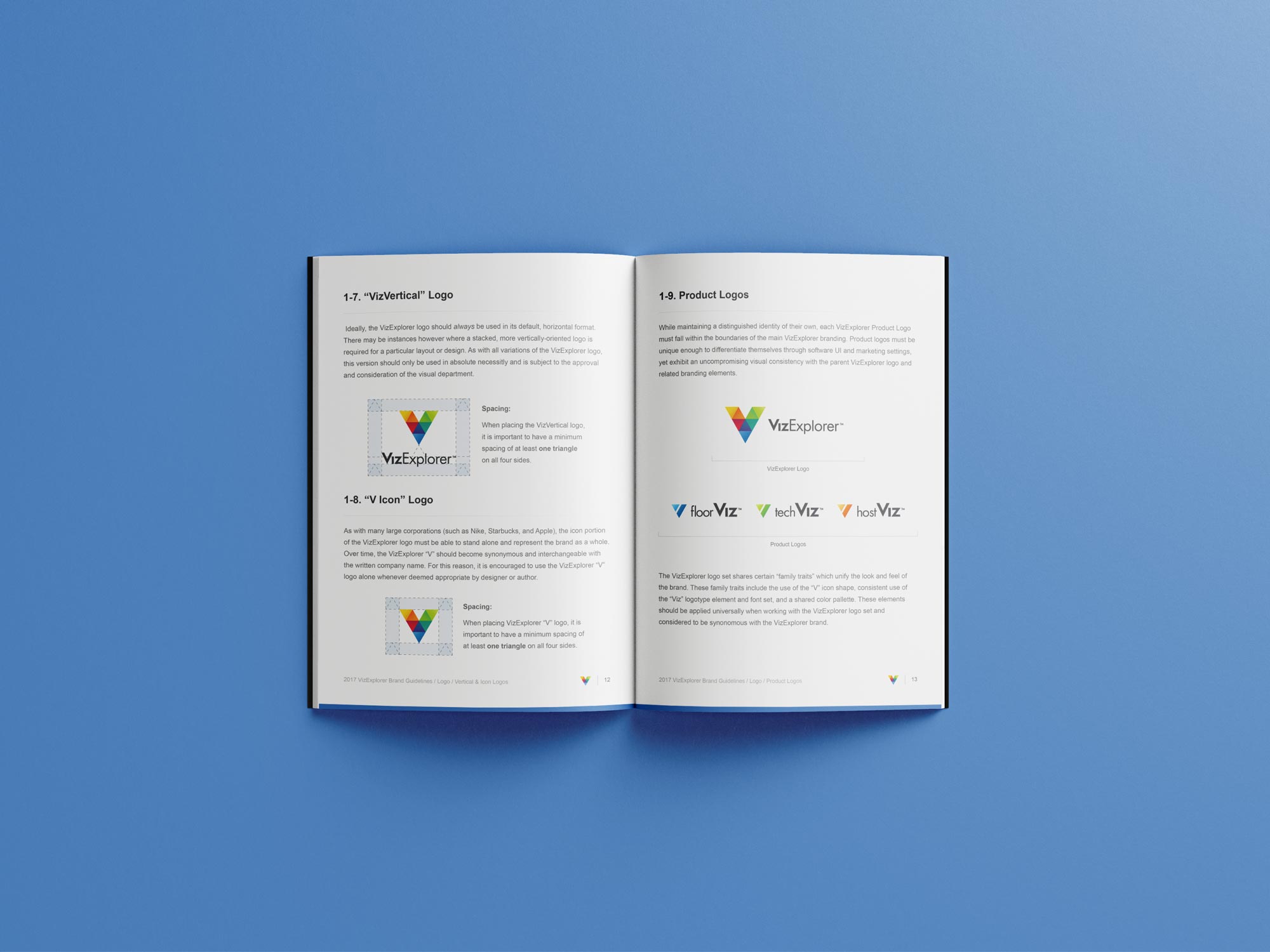
Upon joining the company, the VizExplorer brand was very loosely enforced. Colors, fonts, logos, and the brand aesthetic varied widely depending on the output and team involved. Misuse of the brand was common, especially when comparing branding between multiple office locations and departments.
The challenge given to me upon hire was to unite these various departments under one consistent brand and to set guidelines for how the brand should be appear in every visual medium. Writing this brand book was both an exciting opportunity and a rewarding challenge.
Brand Collateral
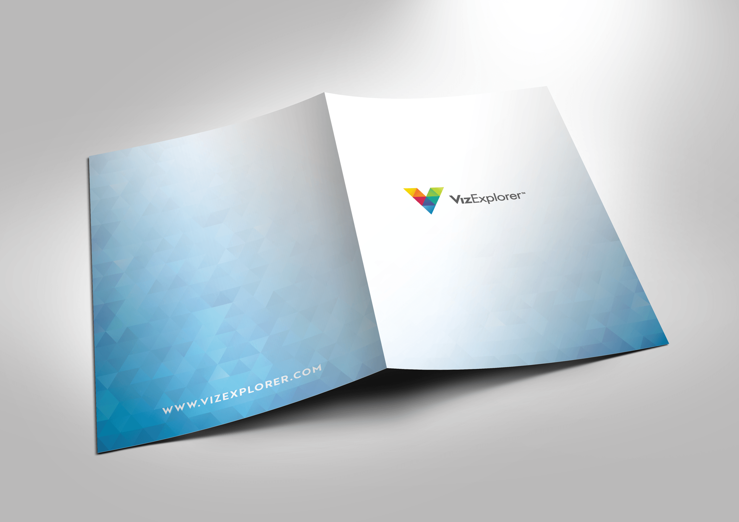
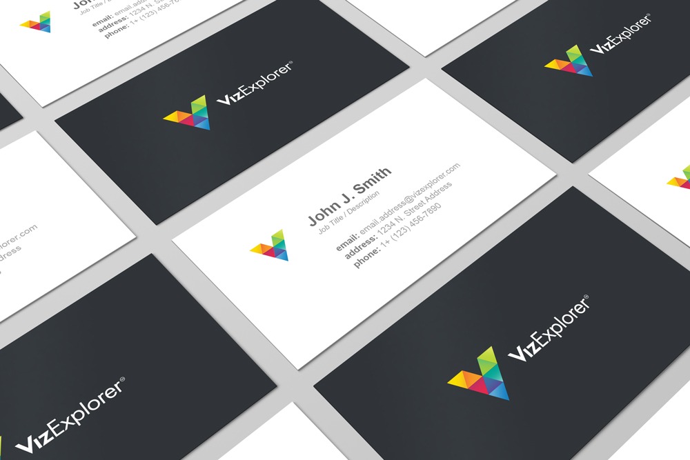
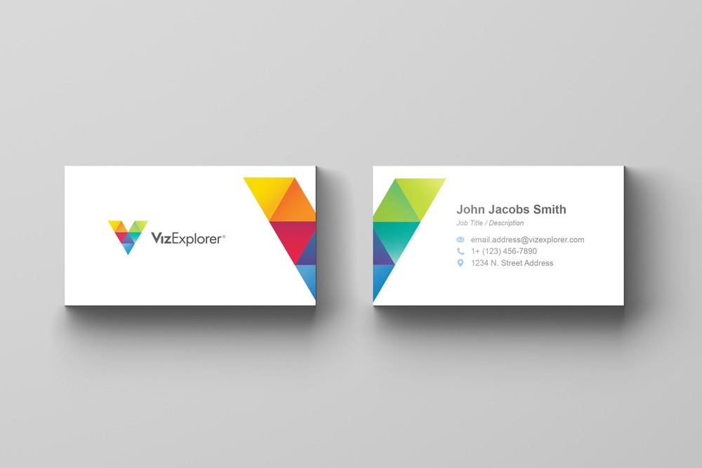
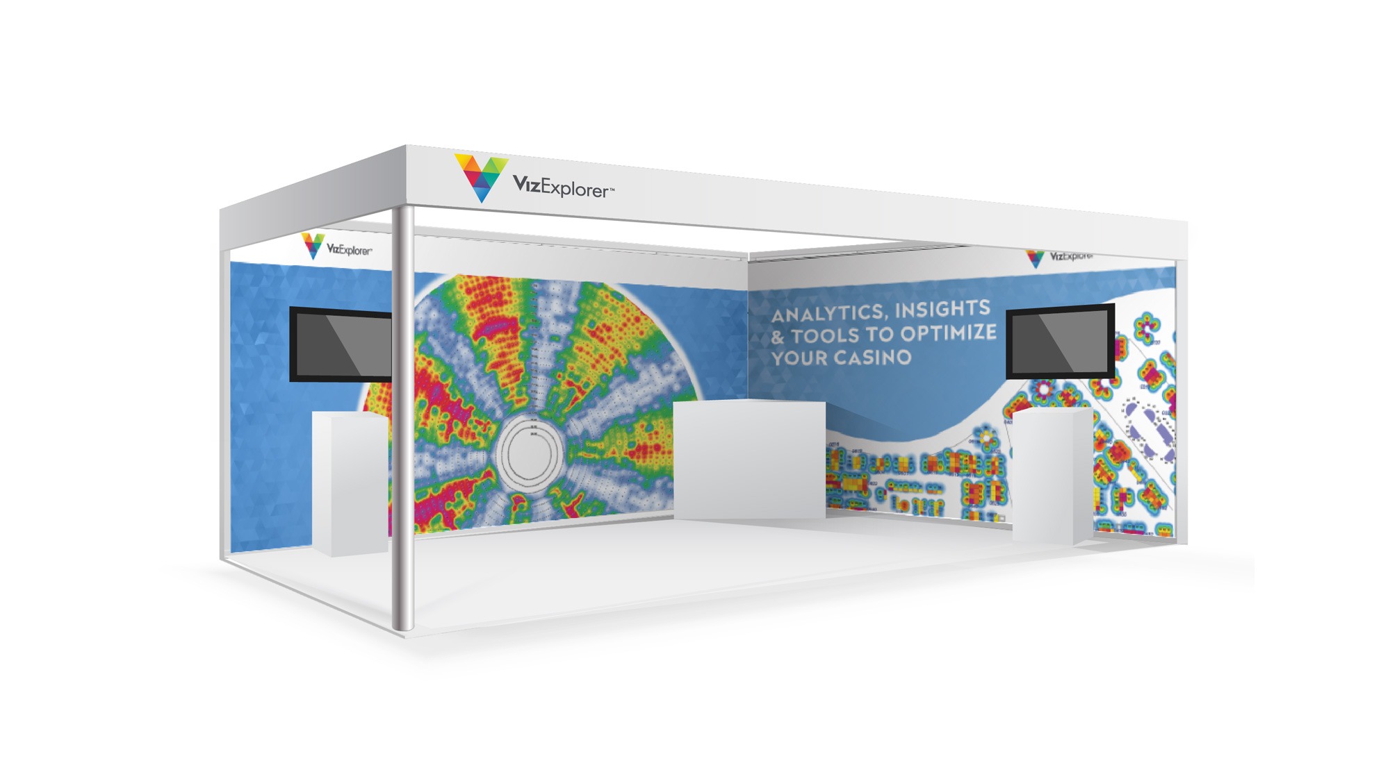
As with any new brand, every piece of visual design needed to be refreshed across the company. This included business cards, folders, letterhead, email templates, trade show graphics, and many more pieces. In creating these new designs, maintaining consistency with the new brand guide was the primary focus. Through this process, a uniform face of the brand began to emerge from a previously inconsistent exterior.

