Transformed a neglected mobile app into a purpose-driven, user-focused solution.
Client
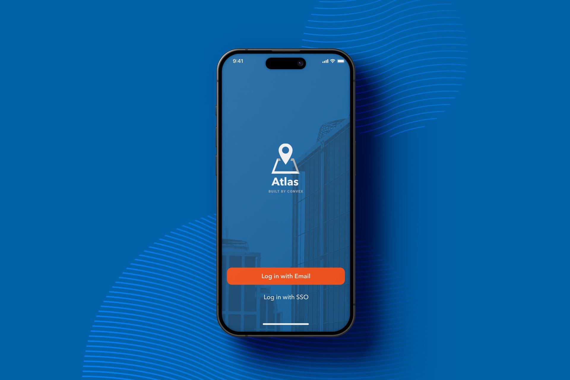
Convex
Year
2022
Services
Project management
User research
UI/UX design
Timeline
3 Months
The challenge
A small team (one project manager, two engineers, and myself) was tasked with redesigning the mobile app. With a 3-month launch timeline, I had just four weeks to research, design, and iterate.
Stakeholder goals
Leadership wanted feature parity between the mobile and desktop apps, believing it would boost mobile usage. While I understood their desire, I wasn’t convinced that more features would drive engagement.
User needs
Instead of feature parity, I suspected mobile users needed a more focused set of features tailored to their workflow. To confirm this, I needed evidence. My next step would be conducting a series of customer interviews.


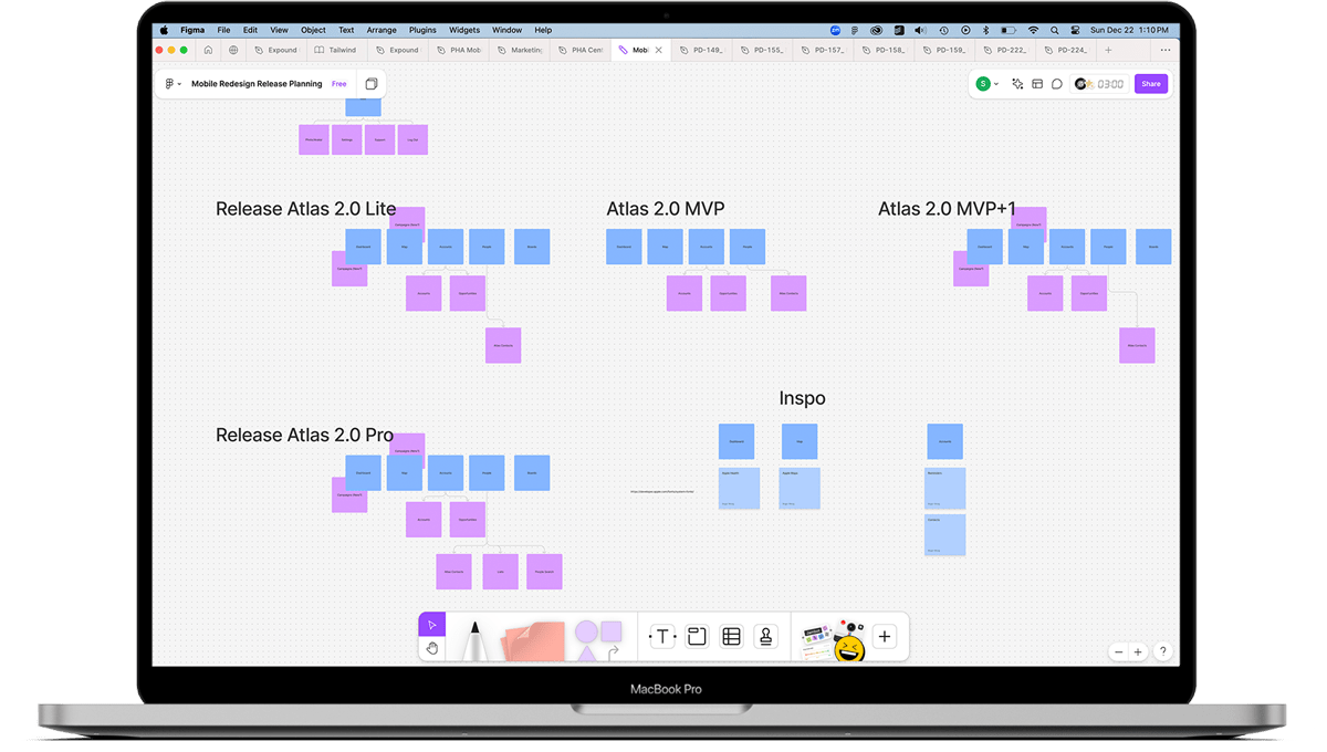
As we transitioned from research to hands-on design, I realized time was our biggest challenge. With just four weeks to deliver, I organized a collaborative release planning session including design, engineering, and product leaders to align on the timeline.
We knew compromises would be necessary if we were to hit our targets. The first compromise was scope. As a team, we listed and sorted all known mobile features, then trimmed that list down to the absolute essentials for a lean MVP feature set, adding cut features to subsequent follow up releases.
The second compromise was cutting down the design process by completely eliminating wireframes and low fidelity from the process. This decision had potential to be disastrous and we were certainly breaking a few rules but… drastic times call for drastic measures.
Collaborative corner cutting
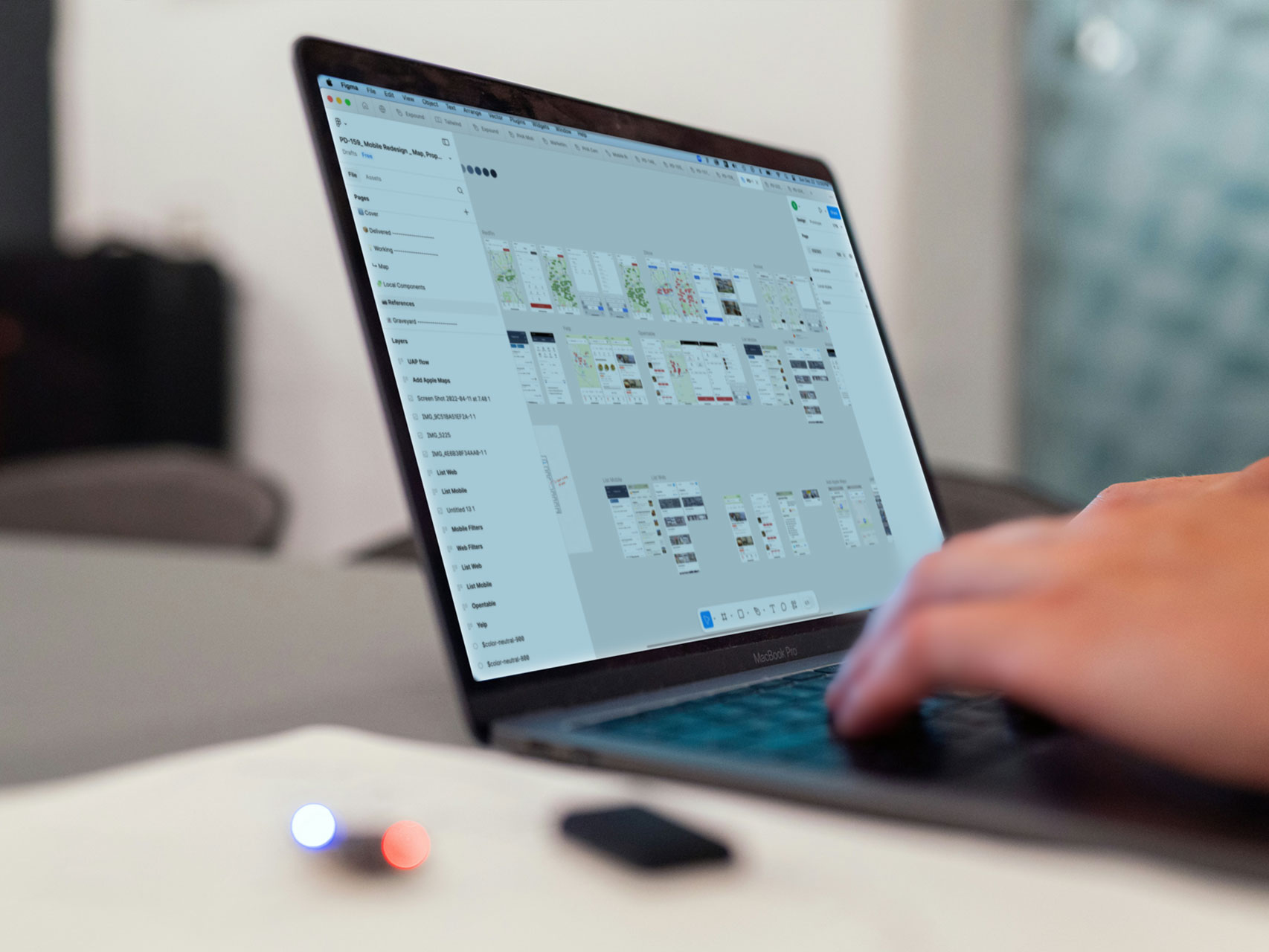
To deliver a redesigned app in three months, I worked closely with mobile engineers to create a streamlined design process.
Designers identified feature needs and matched them to the closest SwiftUI components, leveraging Apple’s design system to skip low-fidelity iterations and go straight to high-fidelity mockups.
With a unique combination of strong cross-team communication, the iOS 15 Figma Library, UIKit, and Human Interface Guidelines, we were able to cut the design timeline by 4–6 weeks.
Collaboration, communication, and quality execution.
With a timeline that was tighter than my high school jeans after Thanksgiving dinner, the UX team delivered polished high-fidelity designs while working in parallel with engineering. To ensure the project stayed on track, we prioritized handing off complete or near-complete designs whenever possible, continuously delivering and enabling engineering to maintain momentum.
Despite the compromises we’d made in both process and scope, our delivered designs were laser accurate in addressing the user needs we had discovered during our research. We delivered a brand new homepage, quick and efficient access to key mobile features like the map and notes, and all within a style that felt both like a natural translation of the desktop app and also perfectly at home on an iOS platform.
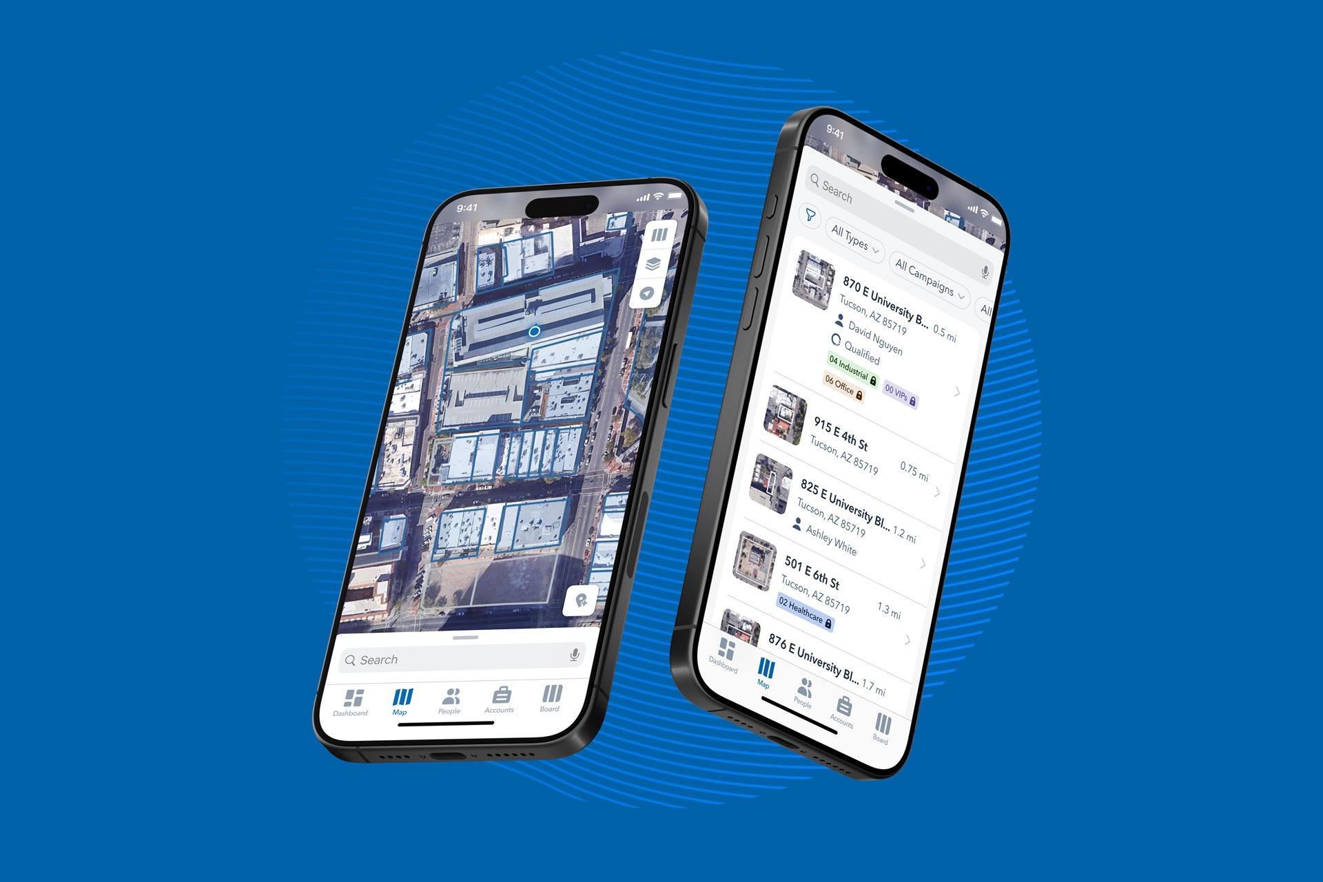
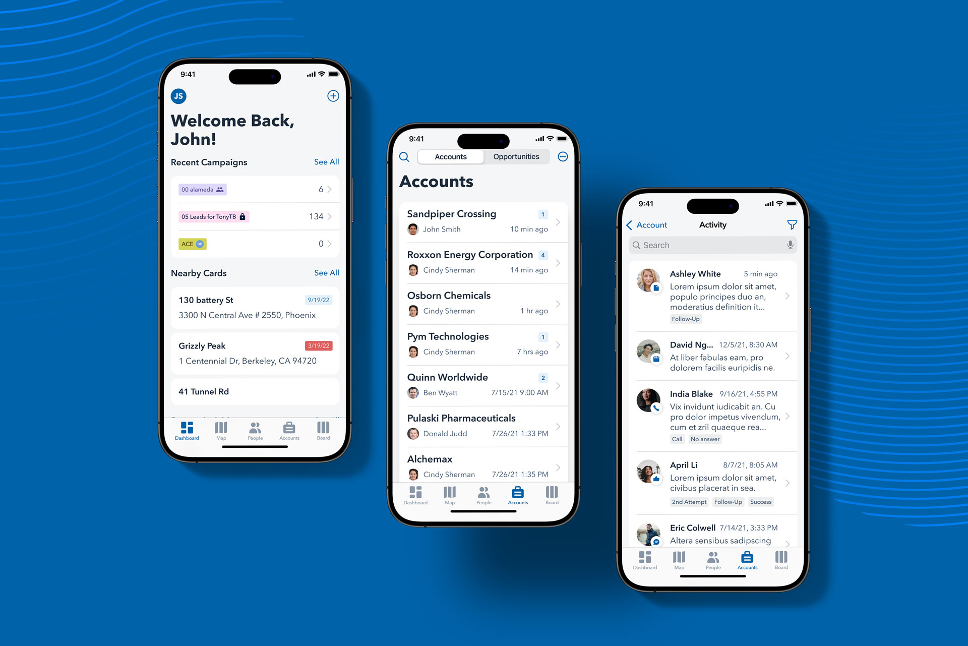
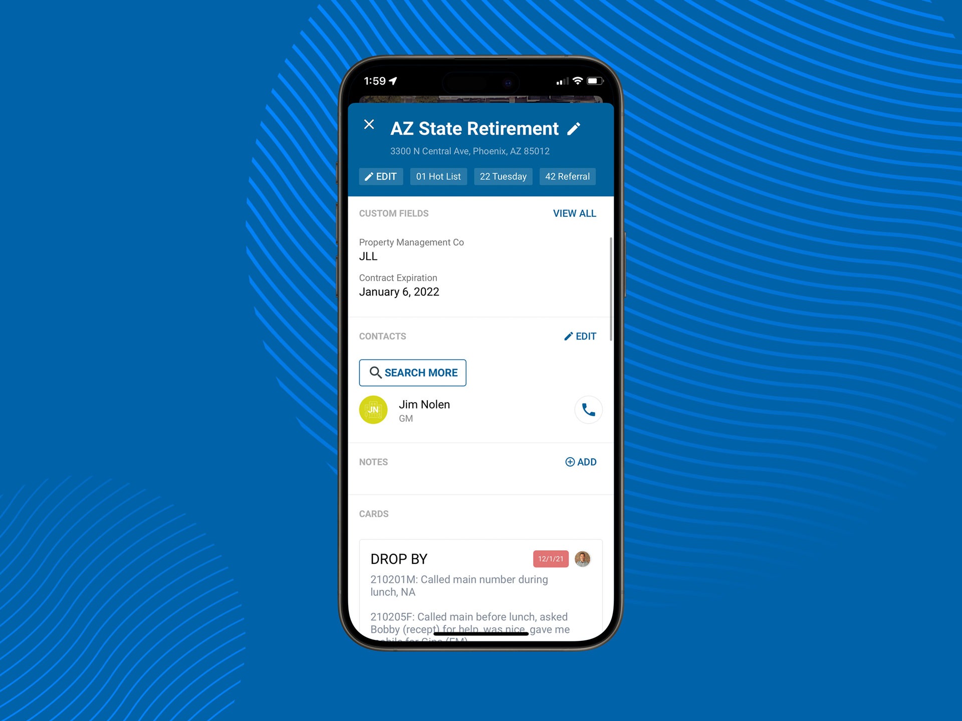
Dashboard
The original Atlas mobile app lacked a dashboard, making this a new initiative for the mobile team and our users. Research showed that quick access to features like notes, used for capturing contact details and lead updates, was essential. However, the original app required multiple clicks to access notes, prompting many users to rely on pen and paper instead.
To solve this, we introduced a “quick add” button in the redesigned dashboard, enabling immediate access to notes. This streamlined the process, reduced friction, and encouraged users to fully adopt the app for their workflows.
Accounts & opportunities
During the mobile redesign, the desktop team was developing a new feature set for Atlas called “Accounts and Opportunities,” designed to provide advanced tools for managing sales pipelines. Recognizing its importance, we were tasked with using the preliminary desktop designs as inspiration and leading the direction for the feature on mobile.
The result was a mobile solution so well-designed that it influenced the desktop team’s approach to building the rest of the feature on the web. Our work on Accounts and Opportunities delivered clarity, improved visibility, and powerful workflow optimization, benefiting not just mobile users but the entire Atlas user base.
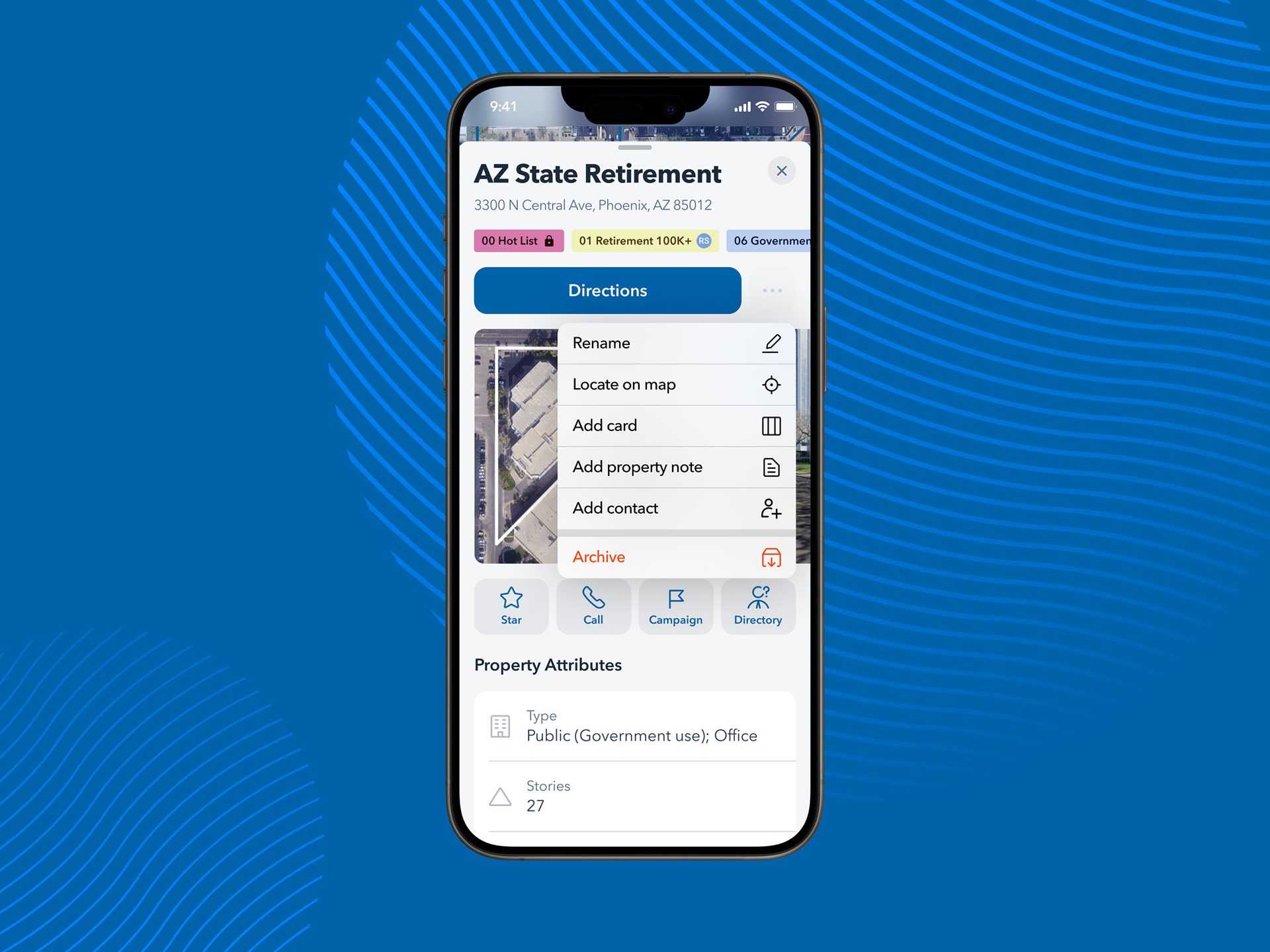
Property Details Panel
The Property Details Panel (PDP) was a central part of the Atlas experience, allowing users to view property details, add notes, and connect with contacts. Optimizing it for mobile was critical to the app’s success.
Instead of simply porting the PDP to mobile, we redesigned its controls to fix a major issue: essential buttons would disappear as users scrolled. The new design introduced “sticky” controls that stayed accessible at any scroll position. We also improved the layout with better visual organization, section headers, and accordion functions. These updates were so effective that many were later adopted in the desktop version, demonstrating the impact of the redesign.
Before and after
Above, you can see the original mobile PDP (left) compared to the redesigned PDP (right). In the original version, key controls like getting directions, adding a note, and adding the property to a campaign disappear as the user scrolls. In the redesign, a persistent sticky action row and a contextual menu ensure these actions remain accessible at all times.
The new PDP is not only more functional and accessible but also features a redesigned information layout. Sections were reordered based on priority, and the presentation was re-styled to make information easier to scan and more visually appealing.
Outputs and outcomes
With 14 MVP mobile features delivered and nearly 240 UX design hours saved through our “direct-to-high-fi” approach, this project was both highly efficient and remarkably impactful. In the month following release, mobile usage soared, with daily active users increasing by an impressive 120%.
4
Brand new mobile features
10
Redesigned mobile features
240
UX design hours saved
120%
Increase in daily active users
"Just wanted to record some praise here for Scott on the mobile redesign work...
Thank you for all of the work you’ve been doing on this epic workstream. Literally redesigning an entire platform in our footprint singlehandedly. Hopefully we have done a good enough job acknowledging the massive lift you have been doing here over the course of the project – but if not, thank you. It’s been really impressive, and way faster than I expected.
I also just wanted to just acknowledge the dual role you’ve been playing on this project as product manager and project manager in addition to your day job as a designer. I know many companies of our stage don’t always have those roles fully developed and many people share the work of product / project management on the side at our stage. But I just wanted to acknowledge what a huge side job you’ve been carrying here and that was probably not what you expected. Thank you stepping up on that and we are sprinting to relieve you of that work ASAP with our PM hiring.”

Blake Meulmester
VP of Product, Convex
Reflection and lessons learned
The Atlas mobile app redesign was a gargantuan effort, made possible by the hard work and collaboration of our small but dedicated team. This project allowed me to deepen my expertise in user research and step into aspects of product and project management—a space I discovered is closely aligned with UX design.
While I look back on this project with pride, I recognize there were areas for improvement, particularly in fostering internal support. During our research, we discovered a lack of alignment across teams. The sales and success teams were not equipped to communicate the value of the mobile app, which often led to its omission from sales and marketing materials.
Although our redesign significantly improved mobile app usage, I believe a more integrated, company-wide effort could have amplified its impact. A release of this magnitude requires coordination across marketing, sales, and customer success teams. Deliverables such as updated marketing materials, sales scripts, website content, and email campaigns could have driven greater customer awareness and adoption, elevating the results even further.
Ultimately, this project was a memorable and monumental entry in my quest to deliver incredible user experiences that delight and empower users.