Clever brand design for a local California robotics team.
Client
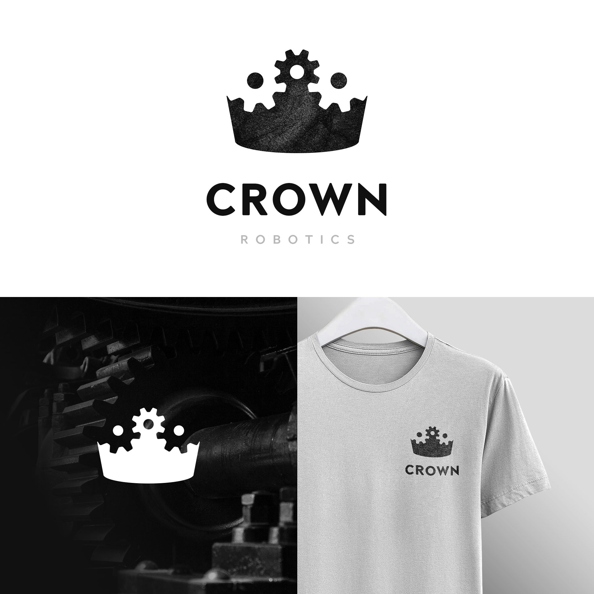
Crown City Robotics
Year
2017
Services
Branding
Timeline
1 week
Memorable, meaningful, and full of style.
I was approached by the Crown City Robotics team from Coronado High School as they needed a logo to represent their robotics team. They wanted something that visually translated the ideas of complex robotics but also shared the historical identity of Crown City, Coronado.
Beyond the visual connections to robotics and the Crown City, they wanted a logo the team could rally behind – something they felt proud to wear, something that represented them as they went to compete. I knew the logo needed to be both visually meaningful, as well as stylish and memorable.
Conclusion
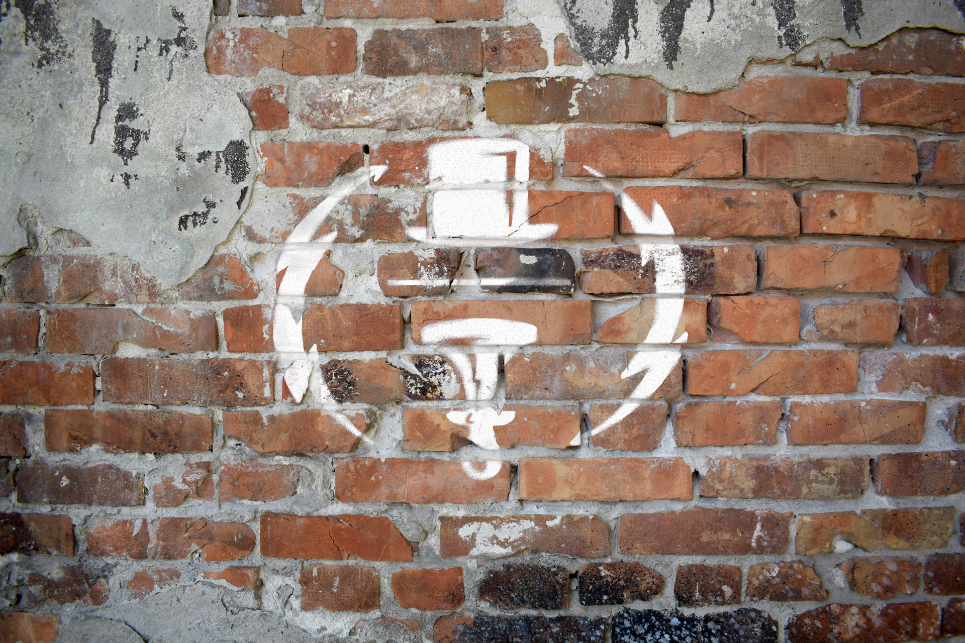
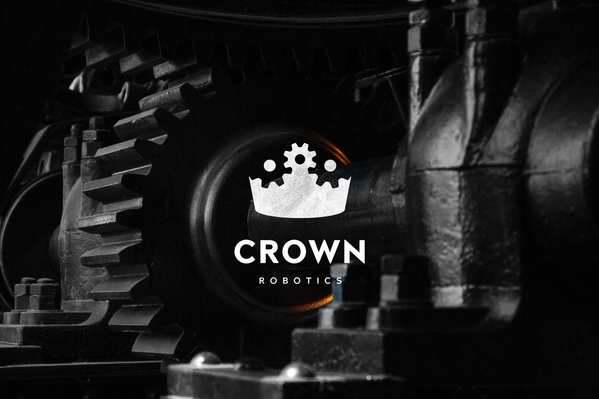
The Crown City Robotics logo holds a special place in my memory. It achieves a really unique balance between conceptual execution and visual synthesis. The positive and negative space in the upper portion of the logo perfectly communicate both robotics and the crown motif.
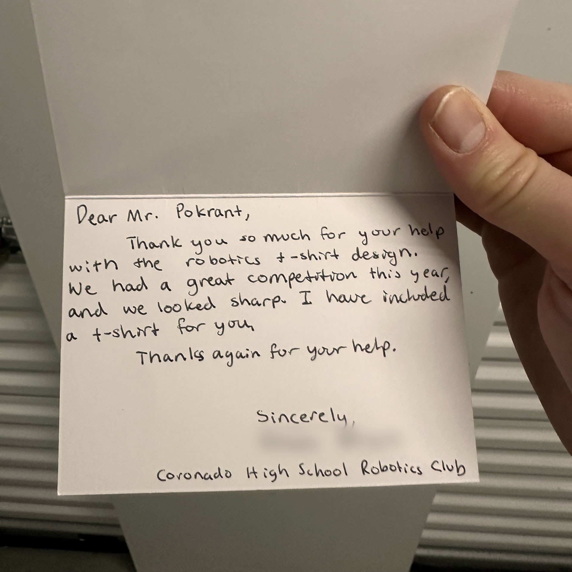
It was a real treat to be able to see this logo used on team shirts for the robotics club. I was fortunate enough to also be sent one of these shirts along with a very thoughtful note (see below) which I keep as a memento to the partnership and execution of this logo design.