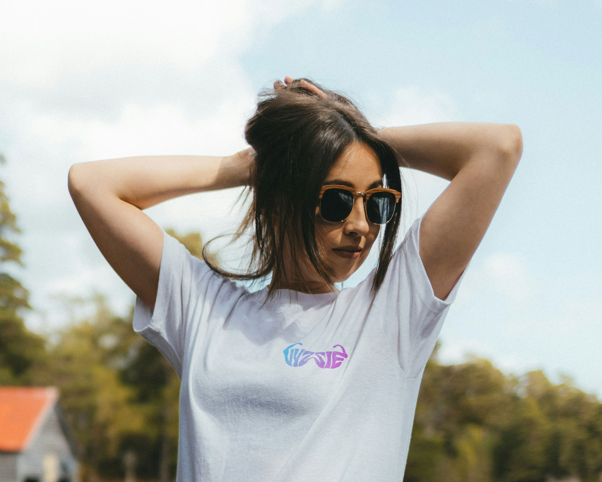
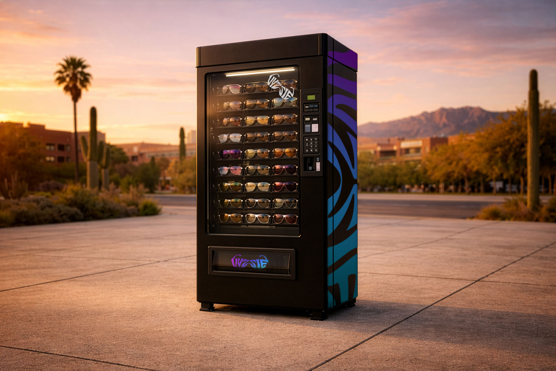
Funky, flashy, retro logo and art direction for sunglasses vending company Vyzzie.
Client
Vyzzie Sunglasses
Year
2023
Services
Branding
Logo Design
Timeline
1 week
Something bright and different.
When I was contacted by Vyzzie, the idea of a sunglasses vending machine sounded a little silly. But the more I thought about it, that was sort of the point – playful, original, affordable, and incredibly convenient.
I knew the logo design and art direction for Vyzzie needed to match that energy. Something eye catching that also nailed the concept from a distance. You should be able to see this branding and instantly say “YES, I need a pair of those!”.
A delicate balance
As I put pen to paper, I started to see a theme emerging. I knew I wanted the brand to immediately "say" sunglasses, summer vibes, and youthful energy. What better way to nail this aesthetic than using a literal pair of sunglasses?
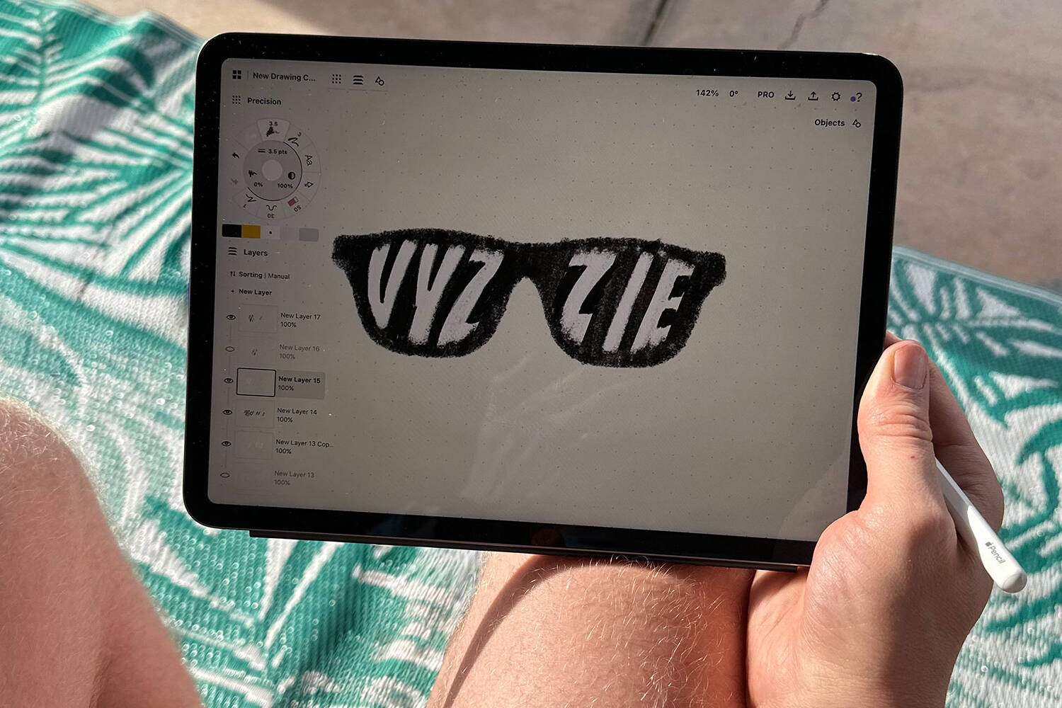
I began to experiment with the overlay of the company name upon the sunglasses background. I felt an opportunity to use the letterforms as "reflections" on the lenses of the glasses, but I ultimately felt like this association was a stretch and might be difficult to execute convincingly.
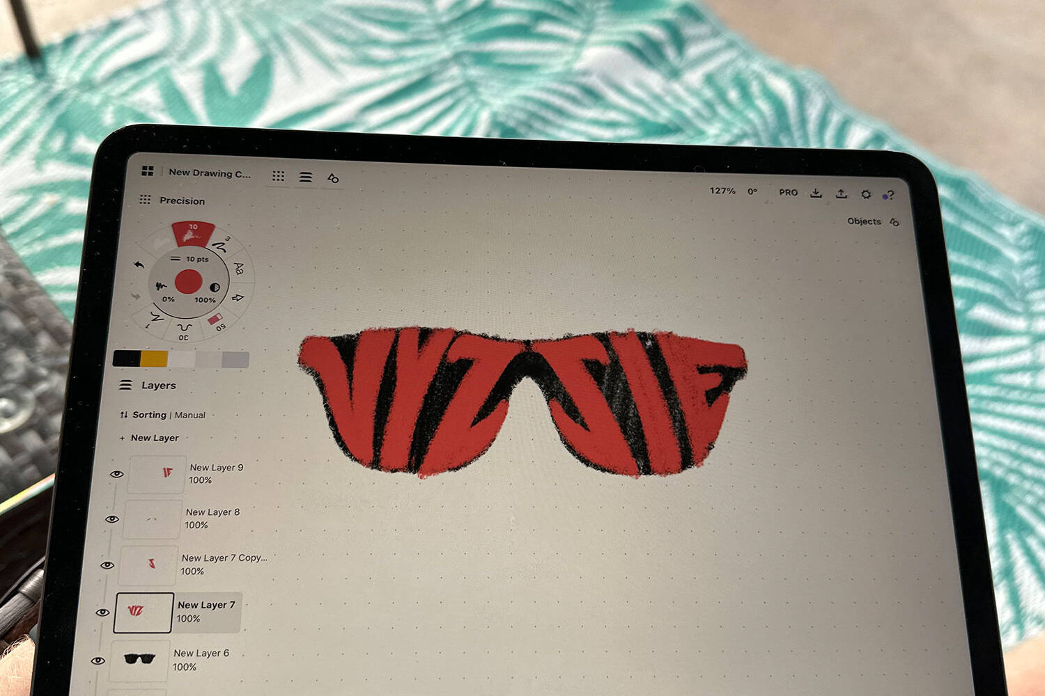
I began to move in the direction of the letterforms from "Vyzzie" transforming into the actual physical elements of the sunglasses. As I stretched the traditional and physical limits of these letterforms, I started seeing something that captured the emotion I was chasing. I realized the challenge here would be finding the right balance between two distinct elements - the brand name and the sunglasses visual.
Refinement
As I moved from raw sketches into the digital and refinement phase, I continued to reference images online of sunglasses. I wanted to ensure that the form I delivered for the sunglasses shape was instantly recognizable and matched the shape most people had in their heads when they thought of a pair of sunglasses.
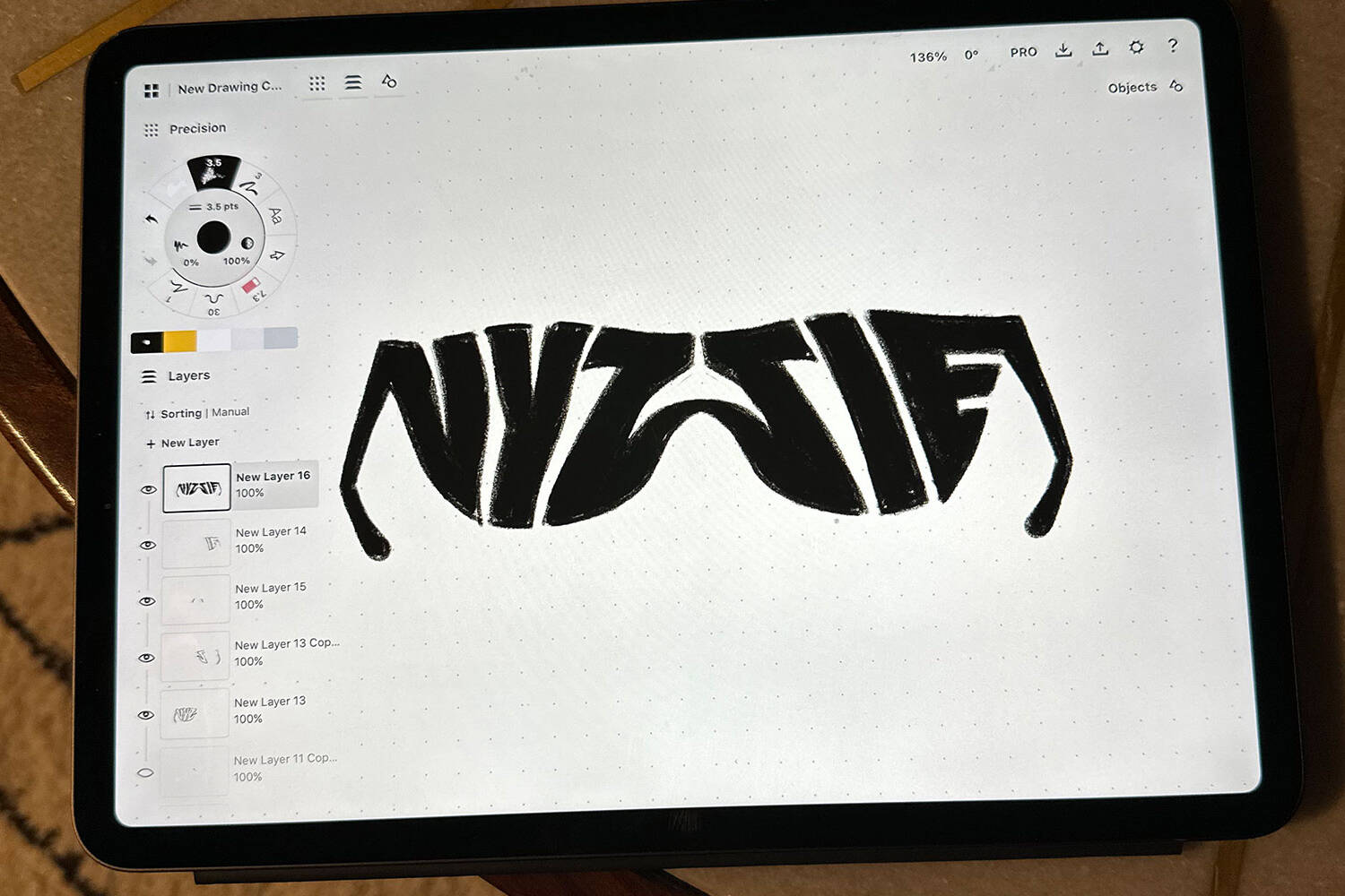
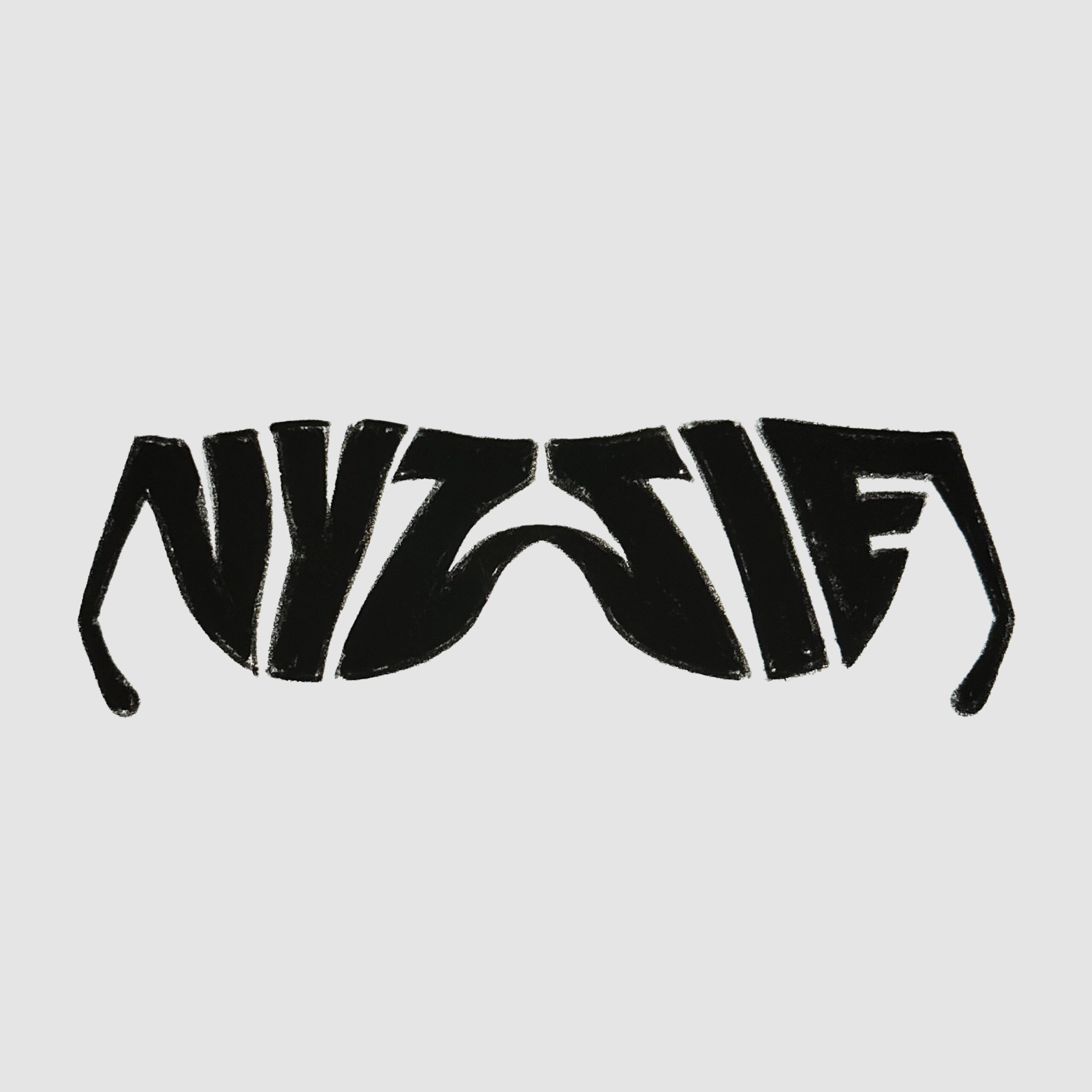
More often than not, when looking at sunglasses online, product images tended to show the arms of the glasses in an upward position as opposed to downward (like my original sketches). I also felt like the downward arms in my sketches added a layer of cognitive processing that somewhat obscured the letterforms from properly and quickly registering.
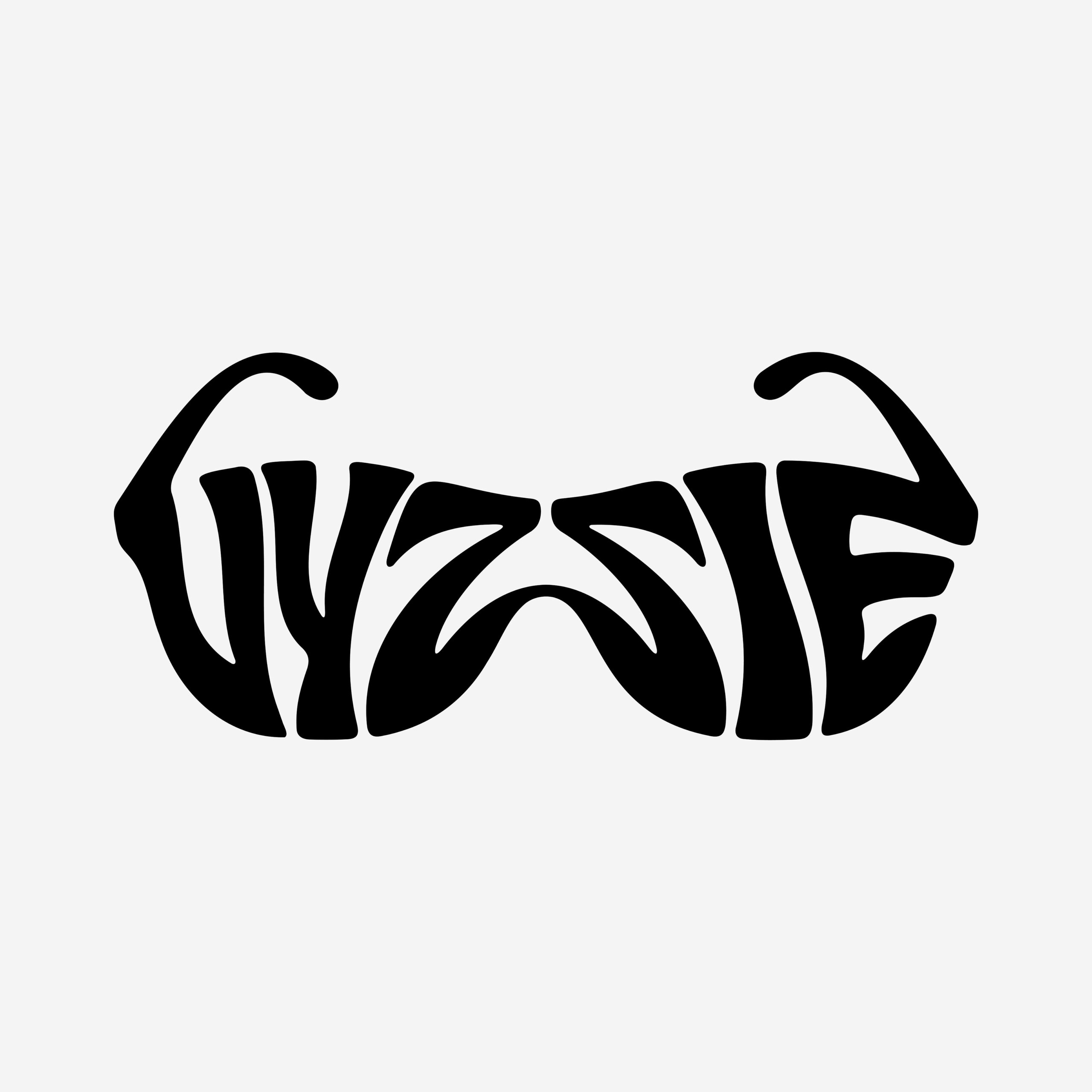
Along with reworking the arm position, I spent a good amount of time refining the flow, spacing, and balance of each letter in the typography. There was also this "psychedelic" aesthetic that the sketches hinted at, but didn't fully realize which I shifted towards heavily in the final design.
Conclusion
Ultimately, this Vyzzie logo wasn’t selected or formally used as the company rolled out their sunglasses vending machine solutions. The team ended up going with a simpler “shutter shade” design that they believed more directly reflected some of the glasses they sold in their machines and hoped would resonate with their target audience.
While it was a little disappointing to see such a beautiful logo go to waste, I learned a lot throughout the process and I’m quite satisfied with where the design, form, and art direction landed. I still believe the logo nails the concept and would have made a stunning and attractive piece of the company’s campaign to deliver affordable, fun, and stylish shades on demand.