Delivering powerful new tooling in the cyber security space.
Client
GreyNoise Ingelligence
Year
2022
Services
UI/UX
Project Management
Timeline
4 weeks

Helping the good guys connect the dots
It’s an understatement to say cyber security is a complicated industry. Threat actors, IP addresses, vulnerabilities – it’s a lot to wrap your head around! It was this complexity that made my work with GreyNoise Intelligence that much more significant. Helping the intelligence community see through complexity, connect the dots, and tell a story behind what they were seeing on the defense platform was a righteous mission.
The specific challenge we faced with the IP Similarity feature was enabling threat intelligence users to see the connection between a singular malicious IP address attempting to breach their network and larger, more coordinated activity connected to that event. Seeing one bad guy acting in isolation triggers a very different response than knowing a flood of of bad guys are attempting to breach your walls.
Setting the scope
The requirements for this project out of the gate were ambiguous and left a lot to be discovered. We knew that advanced defense users needed to understand the connection between malicious actors, but we didn’t yet fully understand the user, their needs, or what this entire experience should include. To help drive the project forward and add clarity, I coordinated a number of user journey mapping sessions.
These sessions were designed to pull together the cross-functional team as well as subject matter experts from across the internal organization and help paint a broad picture of what the feature should include and how it should work together. The results of this session gave us a solid foundation on which we could begin more detailed design work, as well as begin to set scope and project timing expectations across the company.
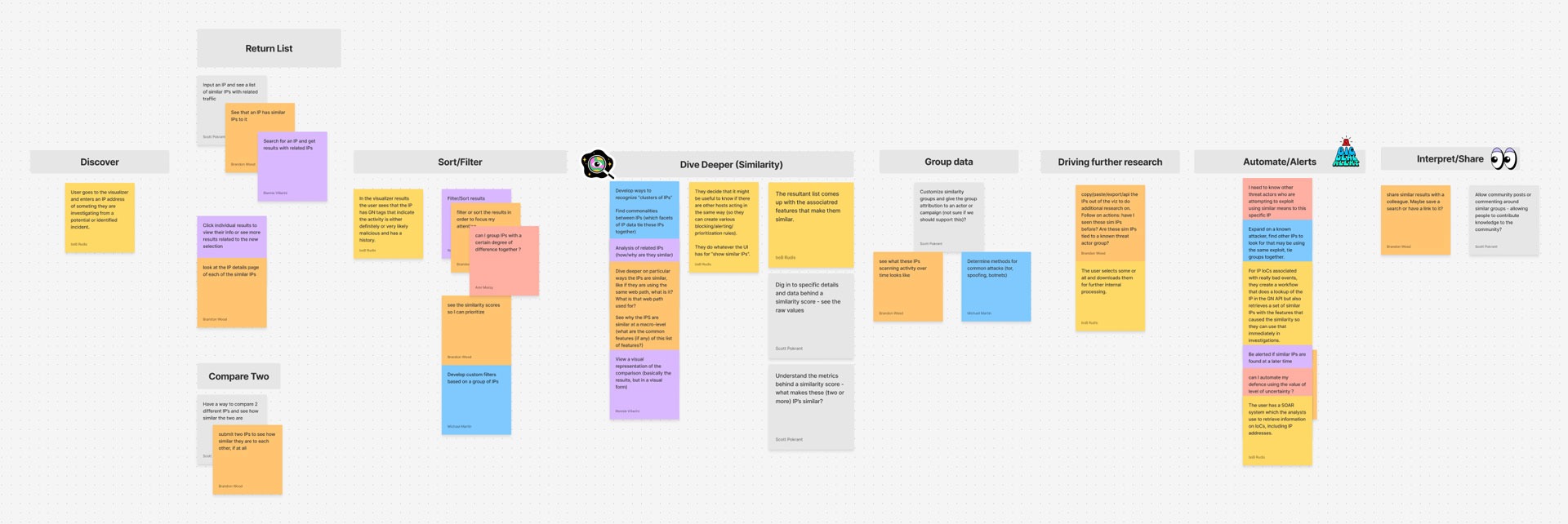
The flow that emerged from our user journey mapping session involved nine distinct steps in the experience, each with its own list of functions and features. Users first needed to Discover the feature by clicking on an IP address of interest and seeing a link to “see similar IP’s”, launching further investigation. Once the workflow started, the user should be presented with a List of similar IP addresses that matched the original’s behavior.
From the list, the user should also be able to Compare the actors in a granular way to see exactly how similar they really are to the original. This similarity “scoring” could then be used to Sort and filter the list, adding increased levels of targeting. These first few steps represented the initial feature foundation, where the remaining steps built upon the functionality adding increased value such as Deeper Dives, Grouping, Automation, Alerts, and Sharing.
Dialing in the release plan
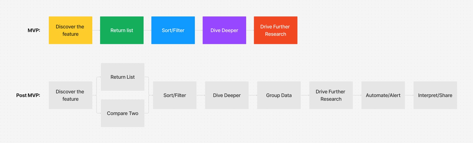
Once we had our core set of functions established and a macro view of the feature from end to end, I began having conversations with cross functional partners and the leadership suite about scope – aiming to understand how we could deliver a viable version of this tool within the desired desired timeframe.
We ultimately decided to postpone a wide set of the feature’s functionality to a future release and launch with a core set of features, getting the essential value into users’ hands faster. The core features allowed users to discover similar IP’s, triage the list, and produce meaningful reports to enhance their workflows.
Branching out into user flows
Despite having the scope and flow defined, it still felt like there was something in the way of jumping directly into screen design. We needed more detail and clarity around the interactions, options, and pathways through this experience. Iterating on these details in screen design would be too costly. There were decisions to be made and technical conversations to have up front.
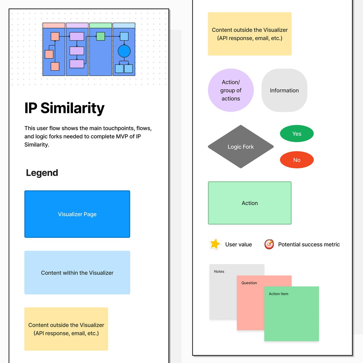
These user flows may not look appealing at first glance, but they were absolutely essential as we moved into higher fidelity execution of the feature. The flows included everything from a helpful legend to explain what each node and shape represented, to the identification of potential product/analytics focus areas for the feature’s success validation and performance tracking.
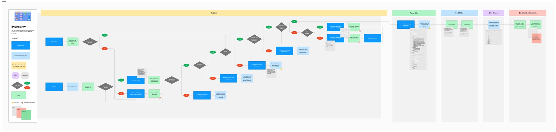
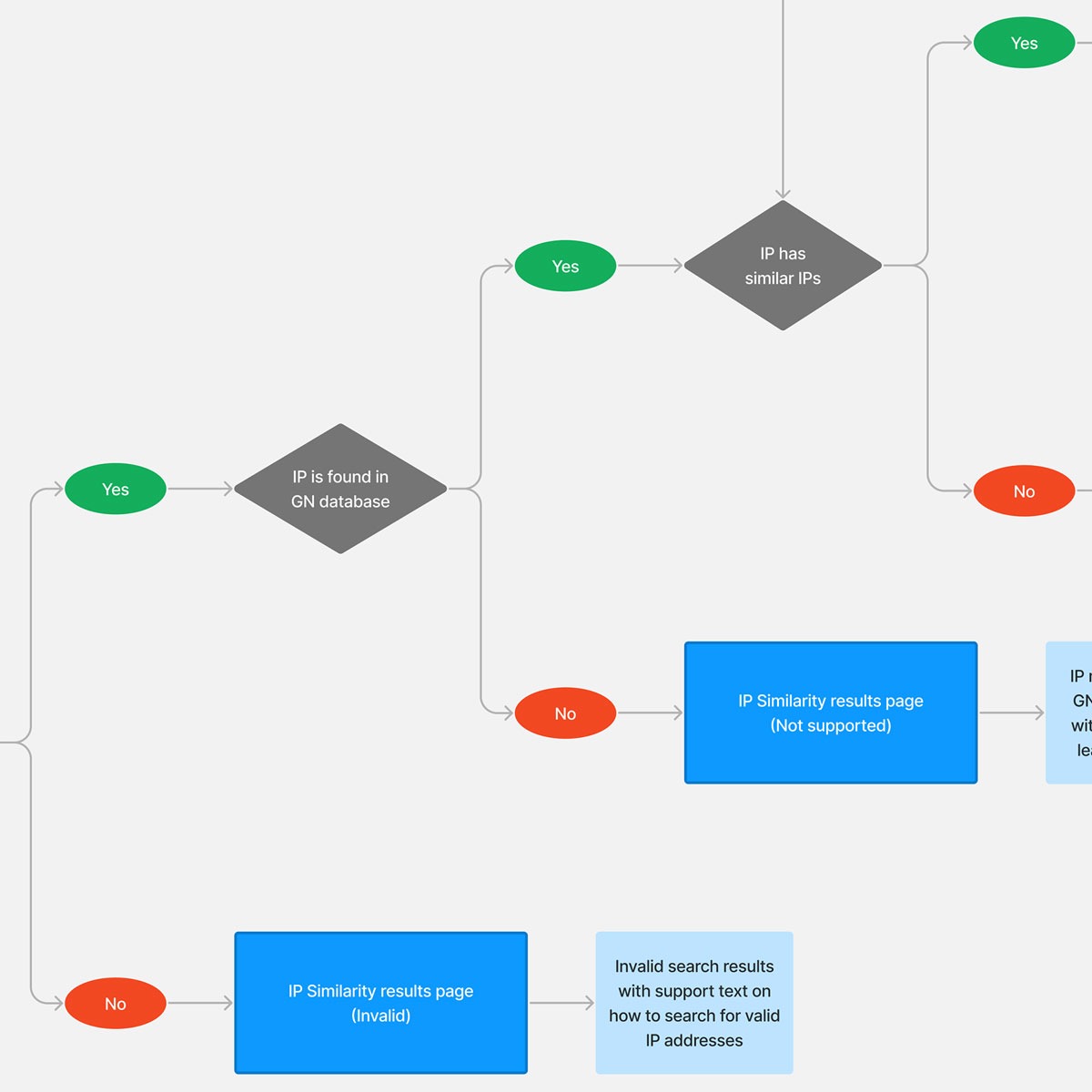
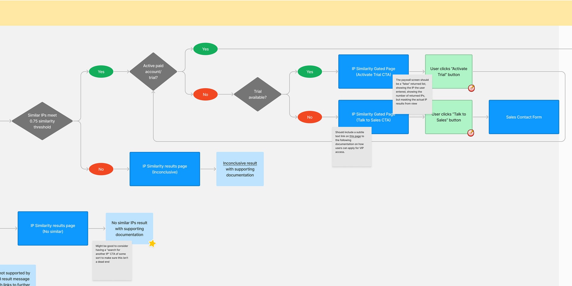
Beyond showing the feature scope in greater detail, these user flows also proved to be highly successful in uncovering and resolving hidden complexity in an efficient and lightweight point in the product development process. As we mapped out the user’s decisions, actions, and journey as they moved along the happy path towards the feature’s goal, we also uncovered error states and choke points in the experience that would have likely been identified too late in the design process had we skipped this step.
Another key benefit from this user flow exercise was the ability to strategically plan the paywall approach this feature was intended to spearhead. The GreyNoise team was great about offering their platform largely free of charge, but this feature marked the first step in deviating from the “freemium” model, only allowing access to the rich feature set with a paid subscription. We needed to ensure we carefully executed this strategy and did so in a functional and respectful way.
Moving into visual design
Moving into low fidelity visual designs was a very seamless transition once we had discussed, iterated on, and finalized the user flows in the previous step of our process. The amount of detail delivered in the user flows accelerated the visual design workflow as the majority of our questions had already been answered.
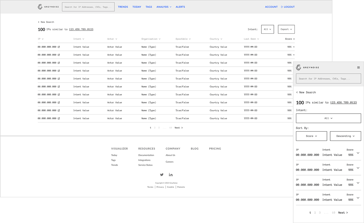
The user flows acted much like a schematics mapping, and the wireframes became the illustrations – detailing out exactly where and how this experience materialized in the platform. Wireframes also gave us an opportunity to think through how the detailed, tabular experience would translate down to a mobile screen.
High fidelity
As we sped forward to the project finish line, we recognized that a large chunk of the product development cycle was spent on research, requirements gathering, and detailed diagrams. These were, without a doubt, the right areas to focus on and the success of the project is largely due to the timely execution of these artifacts which served as a resource to the entire team. That being said, we didn’t have much time remaining in the cycle to produce fully detailed mockups for every flow or screen in the experience.
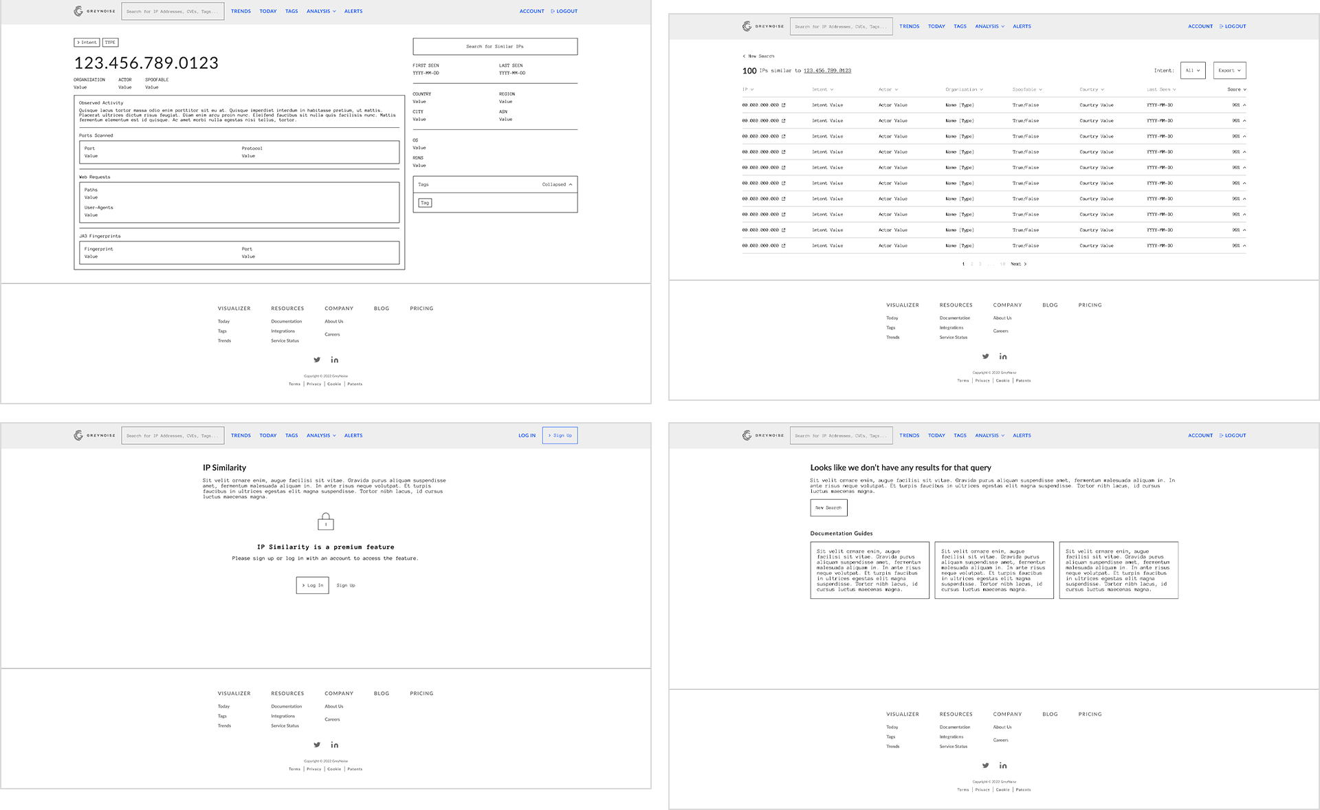
Given the constraints we were up against, design made a process pivot – a combination of high fidelity mockups for specifically chosen screens and verbal guidance for engineering as they translated allowed the team to skip a few steps near the end of the process and deliver a full feature within the targeted timeline. The silver lining here was that GreyNoise had a robust and well-maintained design system which made it simple for the front end engineering team to translate low fidelity concepts to production.
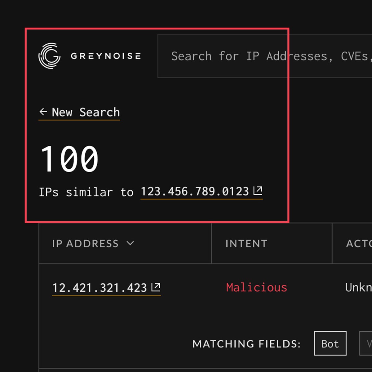
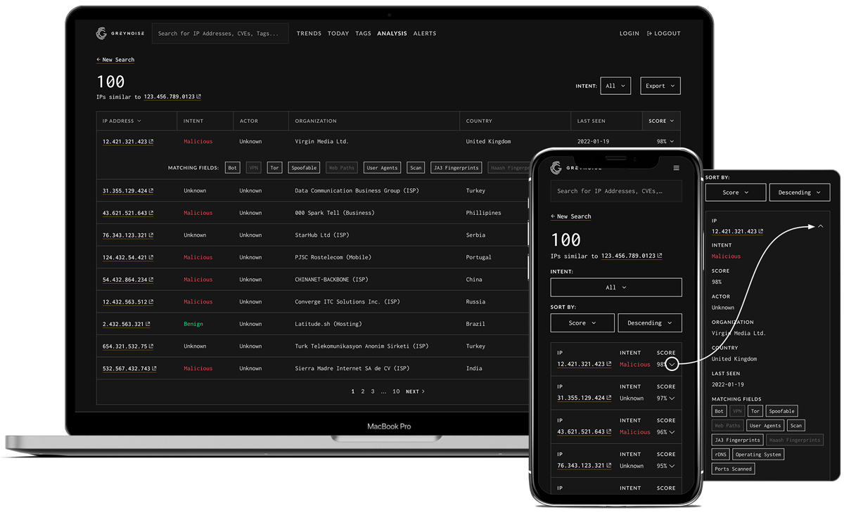
The IP Similarity feature naturally integrated into the standard GreyNoise online experience. It included a clear readout of the number of similar IP addresses and quick access to jump back into the IP details page or into any of the detail pages of similar IP’s.
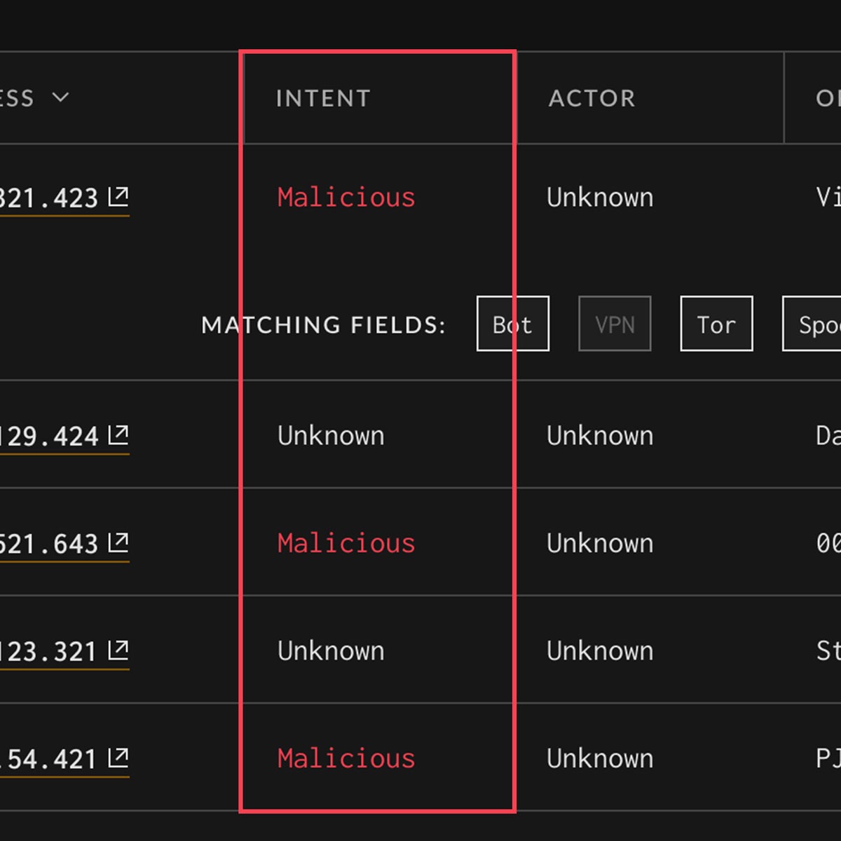
To make it even easier for operators to quickly scan the list of related IP’s, we added an “Intent” column which categorized each IP as either benign, malicious, or unknown. Users could also sort and filter the list with this intent criteria.
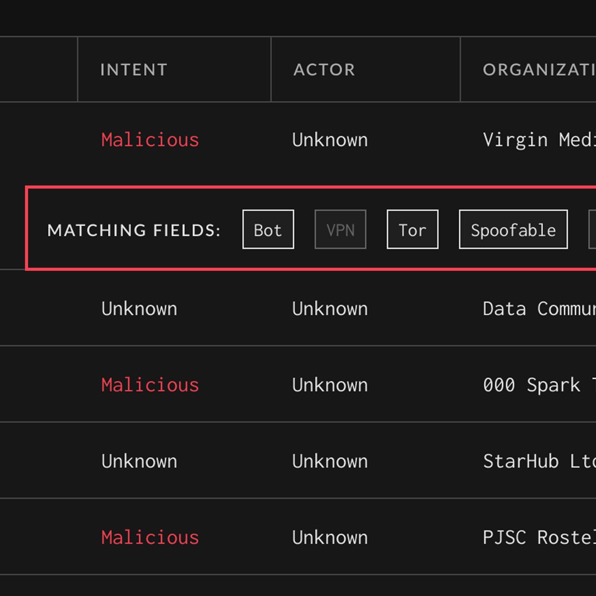
Knowing that an IP address is similar is often not enough context for advanced users. For these detail-oriented tacticians, we included an expandable row of properties which clearly answers the question of “why?” each IP is classified as similar to the original IP.
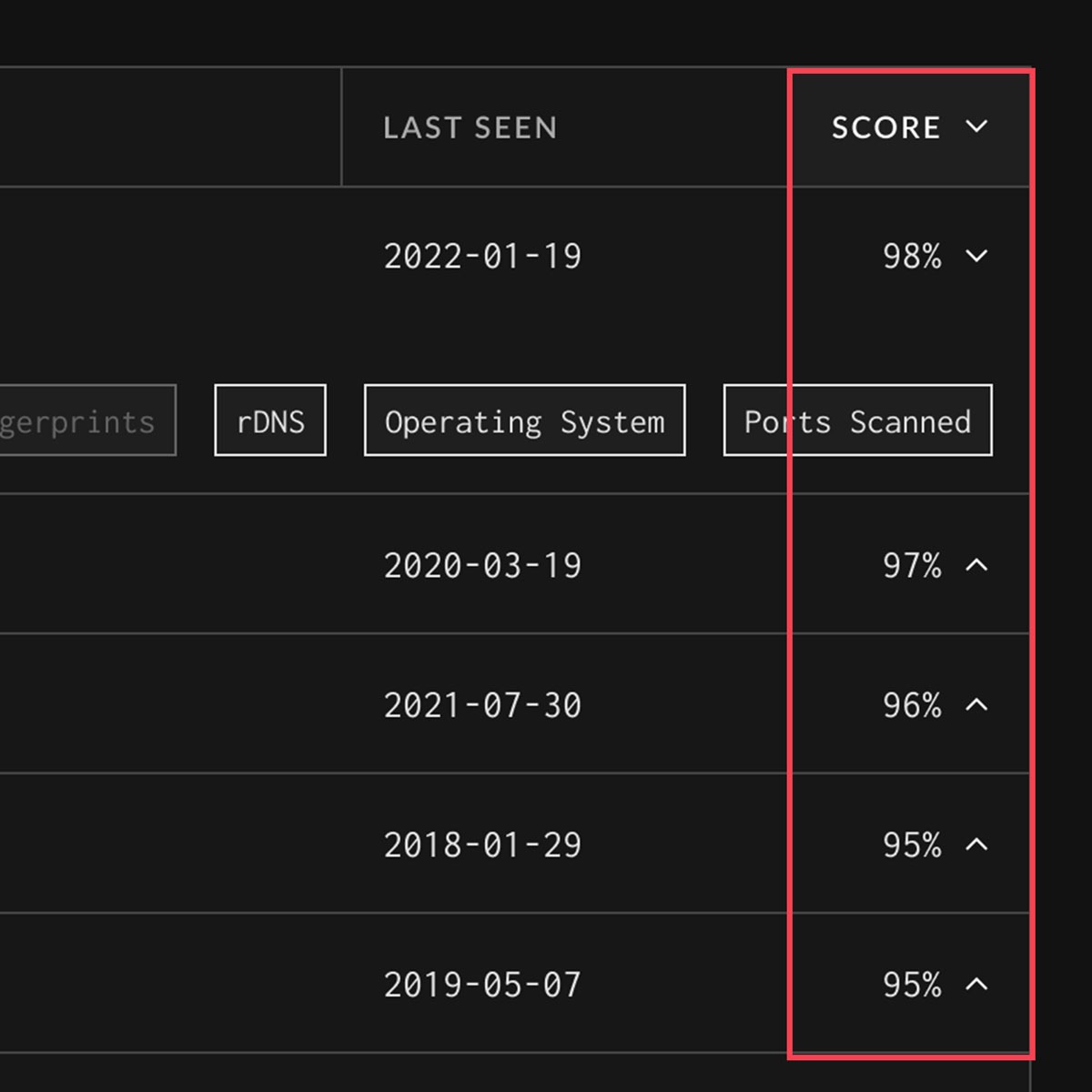
To help quantify exactly how similar another IP is to the original IP, we added a “Score” column that gives a percentage of similarity. This column can also be sorted on, giving the user extra control to see closest matches first in the list.
Conclusion
As this project rolled out to production, we collectively began to see the incredible value we had delivered and the new workflow possibilities we had unlocked for the GreyNoise users. This feature was highly successful – not only within itself at highlighting similar IP’s for threat intelligence users, but also at driving forward a new business objective for GreyNoise and adding additional revenue for the company’s subscription model.