Colorful, engaging print designs for a workforce management company.
Client
Target CW
Year
2018
Services
Timeline
2 weeks
Transforming the mundane into the memorable
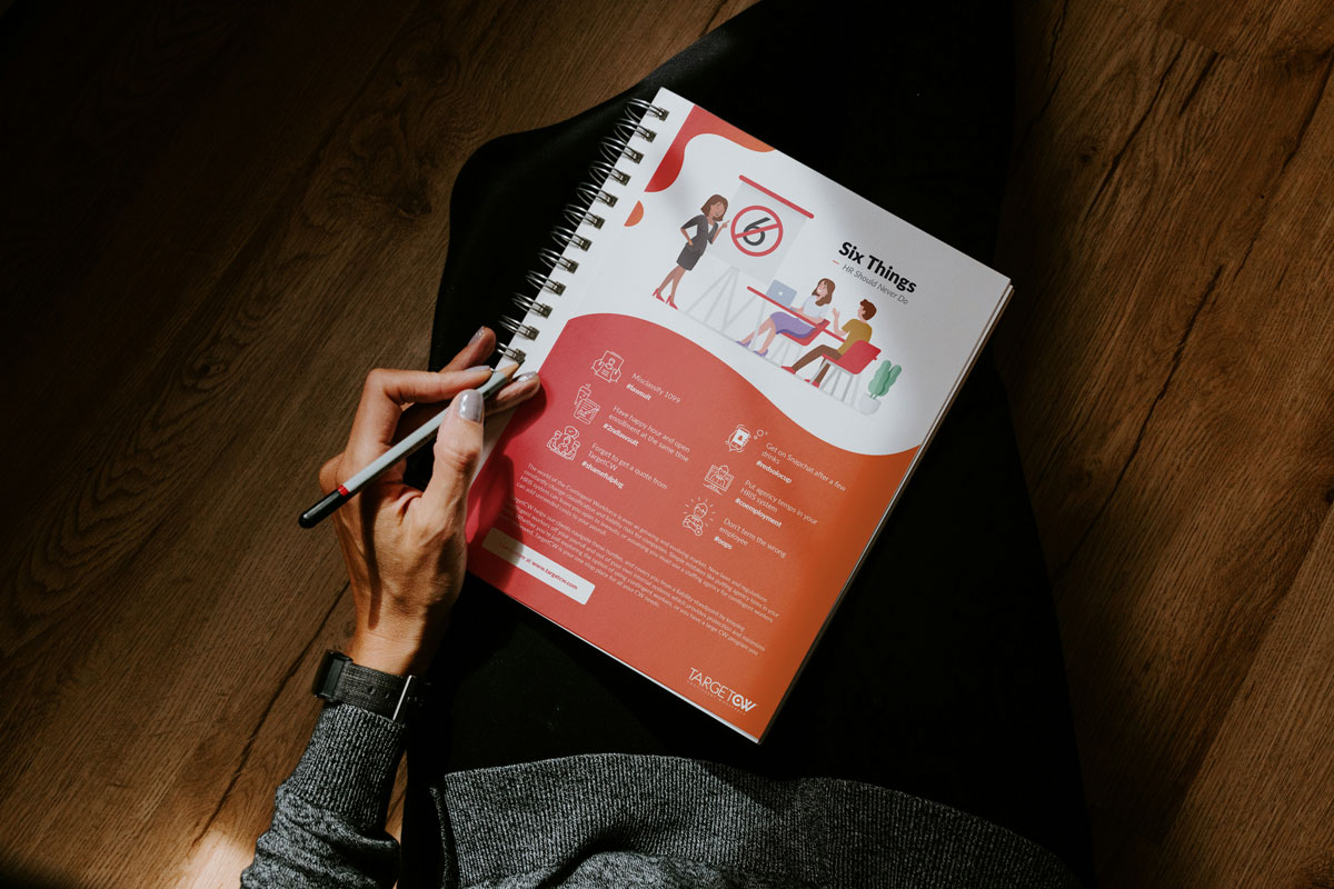
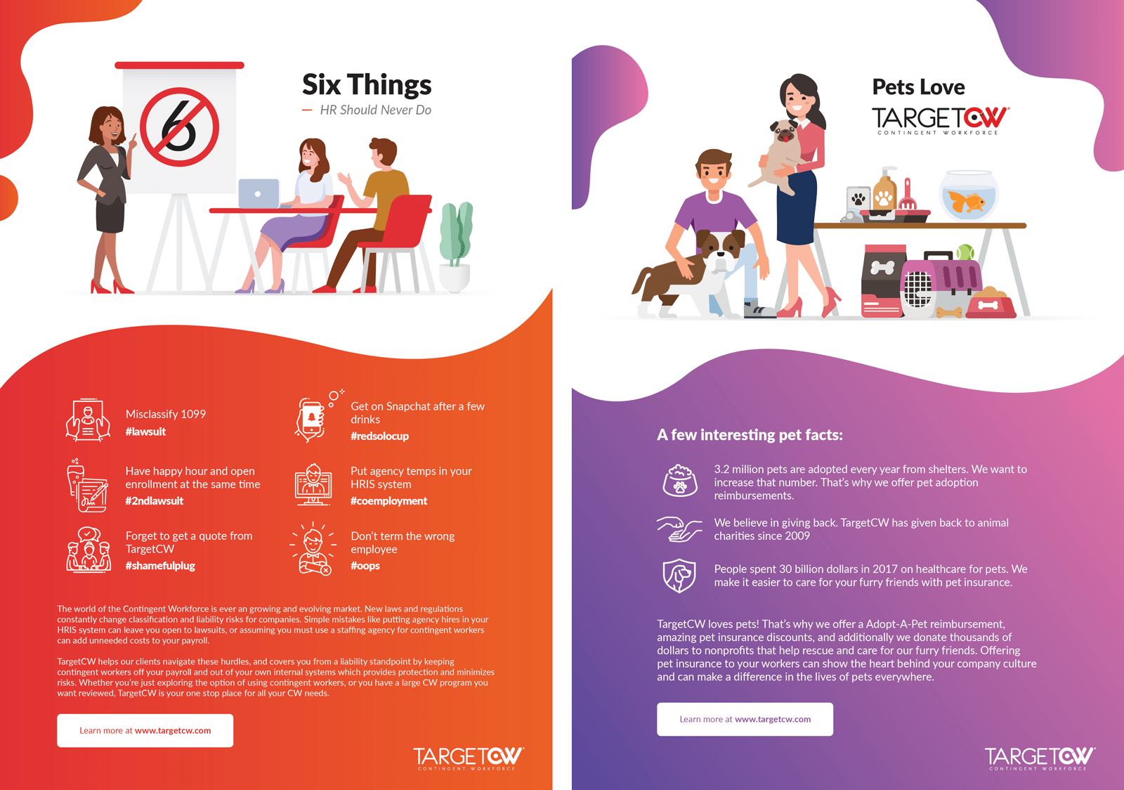
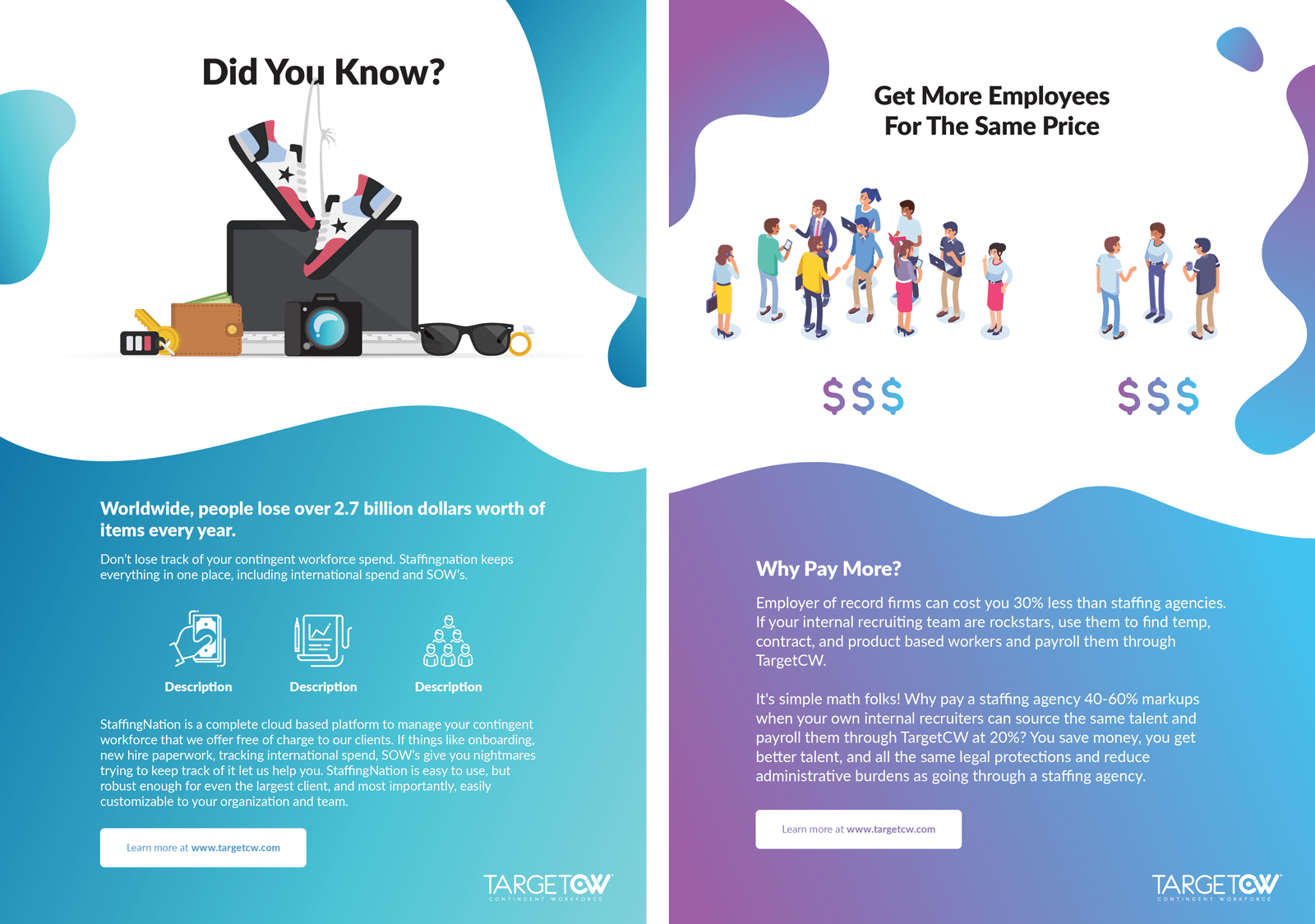
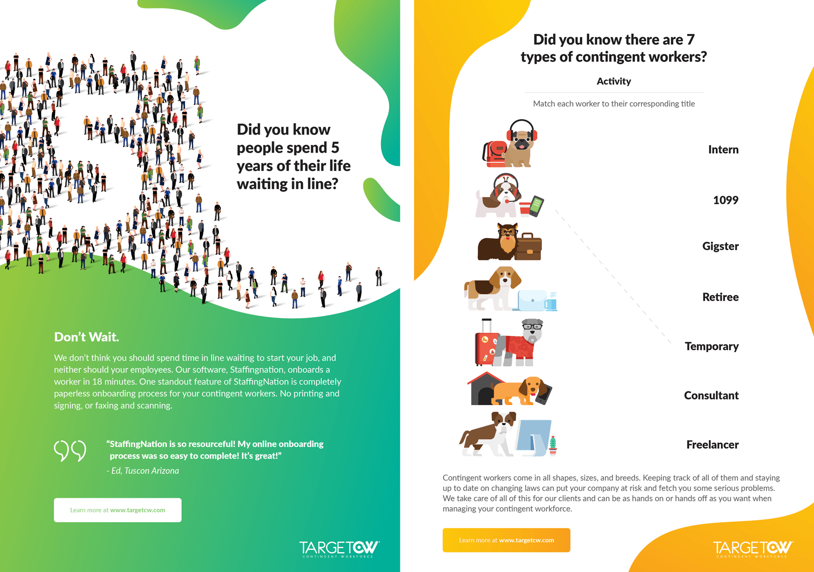
I was contacted by Target CW, a local workforce management company, to help them design out a series of branded print materials. The team needed a colorful, engaging workbook and a branded company folder design that matched the company’s energy and identity.
The real challenge wasn’t the deliverables themselves, but the transformation of human resources information and worksheets from dull content into something fun, vibrant, and memorable and doing so in a way that felt unique and fresh with every turn of the page.
Translating brand personality to visual design
To kick the project off, I was given basic content for each page and very little in the way of visual guidance or instruction. It was up to me to digest the brand aesthetic and come up with a fitting visual that fit each page, matched the content, and the brand as a whole.
As I approached the design for each page, I used a combination of abstract shape, color gradient, and fresh, fun infographic elements to help bring the content to life and create an engaging employee experience in the workbook.
Wrapping it all up
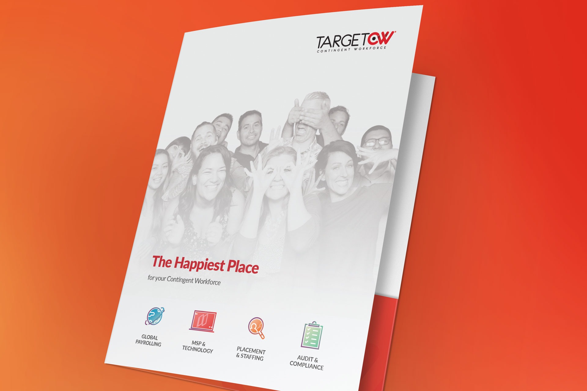
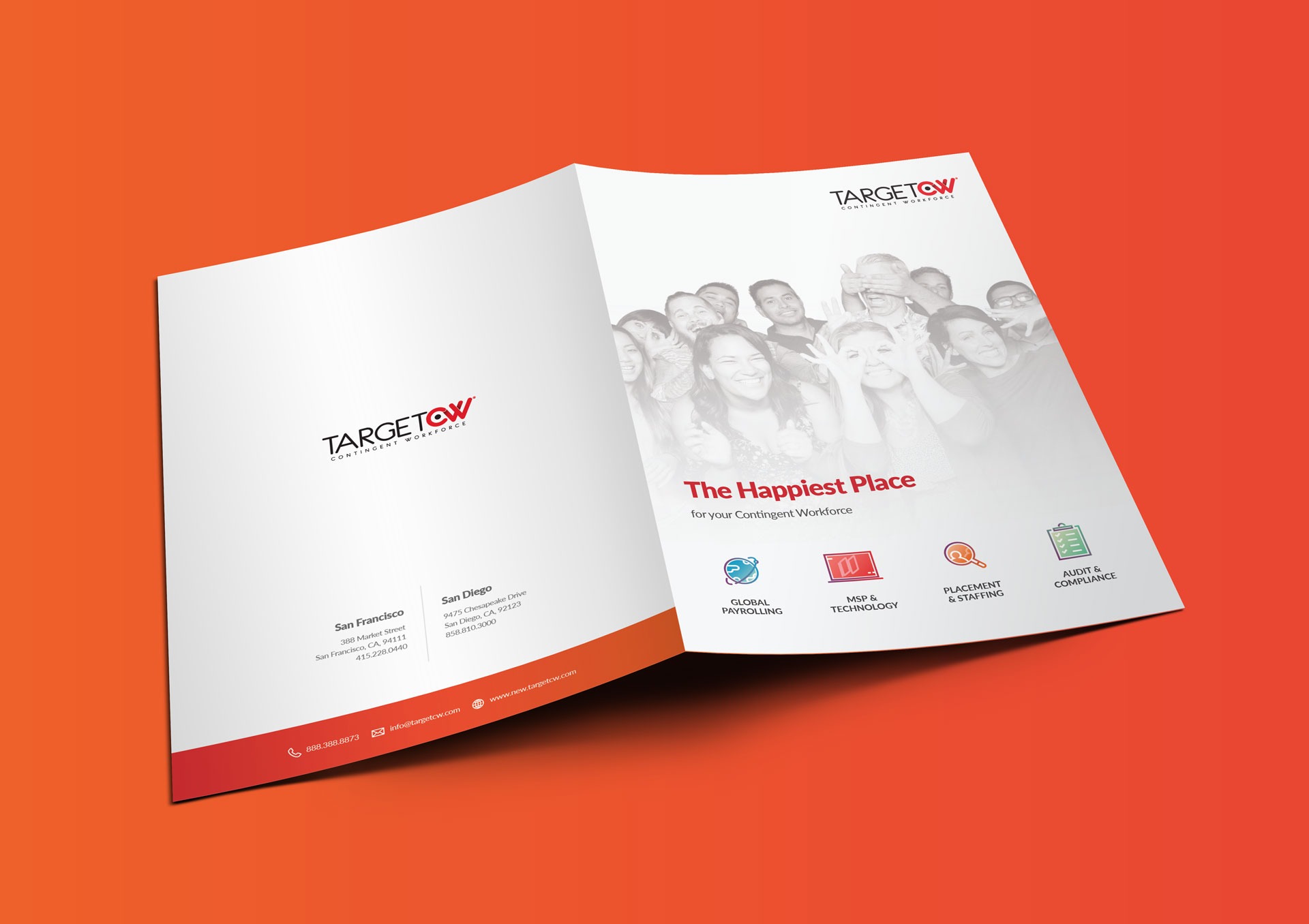
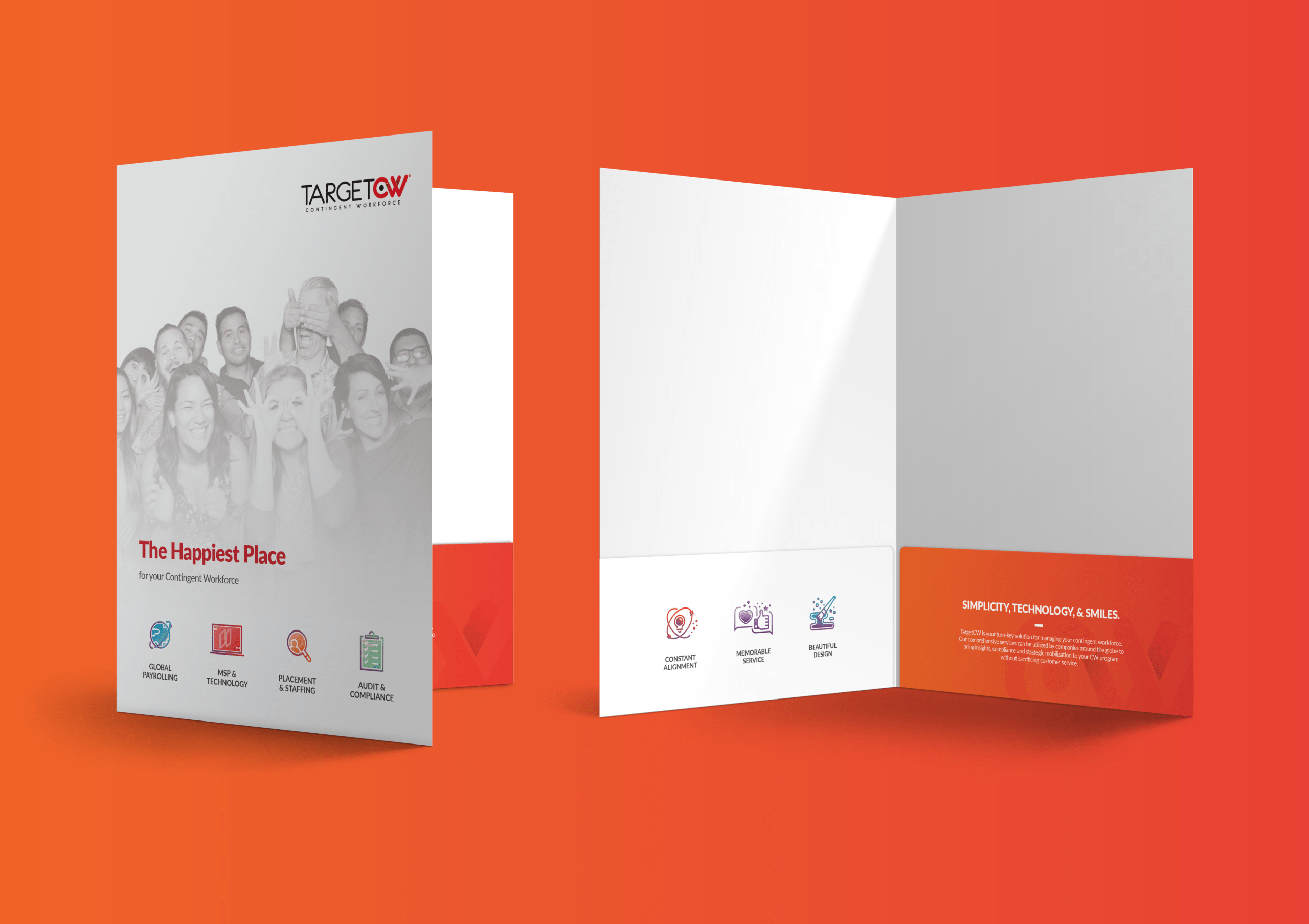
As I handed off the finished workbook page designs, Target CW realized they needed a branded folder to help them package and deliver a professional solution for their clients. I worked on creating something that would match the recent workbook pages, but also lended itself to a more formal brand application.
The folder design incorporated multiple fun, vibrant icons that highlighted the company product offerings. It also modeled the same color and gradient strategy as seen in the workbook pages, while balancing this aesthetic using lots of white space to keep the design clean and appropriate for a corporate setting.