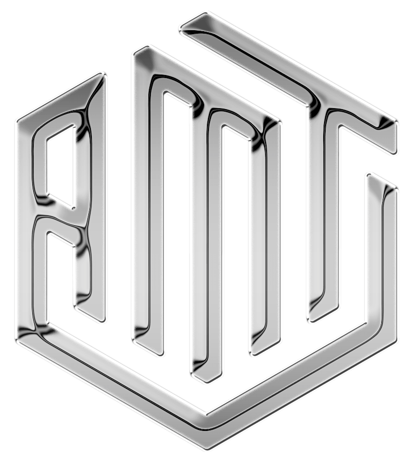
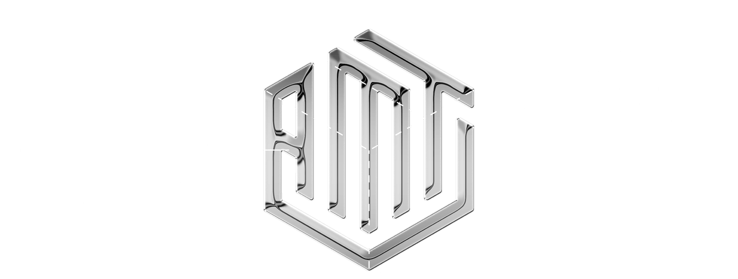
AMT Logo
Category — Branding
Date — December 2019
Advanced Move Trucking is a new California based trucking company. With 17,000 trucks visiting the ports daily, standing out in this business isn’t easy. The AMT logo seeks to make a bold entrance on the scene, retaining classic industry aesthetics while making a bold branding choice to break away from the competition.
Logo sketches
The client knew he wanted the letters A, M, and T featured prominently in the logo design, as the entire company name was quite a mouthful. After the initial sketching phase, some clear winners surfaced – two using steering wheel visuals with the monogram letters interwoven, and one playing off the “cardboard box” theme that resonated well with the business purpose.

Polishing the concept
The client fell in love with the cardboard box theme, but wanted something a little more in-tune with the look and feel of the trucking industry. Pulling inspiration from the shiny chrome parts used on big rig trucks, the logo finishing details really nailed the aesthetic.
Final Logo Design
The final design is a balanced, brilliant combination of image and idea. The cardboard box theme is subtle, but evident and the chrome effect is… not so subtle but nonetheless powerful.