![]()
Carbodylab
Category — Branding
Date — April 2020
Carbodylab is an on-demand body shop service that meets clients in their driveway, taking the hassle out of vehicle repair. With competitors quickly entering the market and home-service in high demand, Carbodylab needed a new look. The goal was to turn a fairly traditional service brand into something playful, affordable, and approachable.
Logo sketches
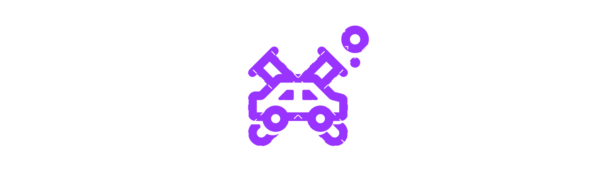
To me, Carbodylab represented a fusion between things; the traditional services offered in a modern business model and the brand name combined with the idea of a laboratory. I wanted these concepts to merge into a single natural form yet still visually jump out at the consumer as separate elements. Through the brainstorming process, a few main concepts emerged – beakers/test tubes (science), car body (obviously), and the tools of the trade (screwdriver, wrench, and paint gun).
![]()
Logo Concepts
At the end of the sketching process, I had two solid logo concepts. One concept focused on the car, wrench, and test tube imagery combined, the other used a paint gun combined with an upside down beaker as a “paint” canister. Throughout the sketching process, I aimed to present two very distinct visual styles which would help guide the process further in the client’s ideal direction. As I presented the two logo concepts, I received the feedback I was hoping for.
![]()
![]()
Final Logo
The client preferred the car+test tube+wrench direction, but felt the overall look was too unbalanced and complicated. Through a round of revisions, I focused on evening out the weight between the logo mark and the brand name. I also chose to remove the wrench in favor of another test tube. Overall, these tweaks simplified the idea, reduced the visual clutter, and added some balance to the mark.
![]()