GreyNoise Intelligence
Fingerless gloves, bad guys in hoodies, and all the neon green, binary code you can handle – this is my work in cyber security with software company, GreyNoise Intelligence.
We’ve all heard the term “cyber security”. Maybe you’ve been involved in a cyber breach or even the subject of a cyber attack. Whatever your familiarity with the space, there’s no denying the impact of internet security as our personal information becomes increasingly fused with technology.
As the name suggests, GreyNoise exists to “reduce the noise” in the cyber defense space. As I worked with the company, I became increasingly passionate about helping defenders reduce noise and thus, thwart cyber attacks more effectively.
My role
As Product Design Lead at GreyNoise, my work was equally divided between strategy and execution. In the strategy sense, I led the design team by working closely with designers to provide feedback and guidance, while also implementing a brand new design process that the team came to love.
On the execution side, I completed end-to-end feature designs for complex tools such as the new IP Similarity experience and delivered key improvements to the Trends page. These features enhanced the overall experience in the GreyNoise visualizer and delivered essential value into the hands of the users.
Setting the standard
Before joining GreyNoise, the company had always used an outside contractor for design work. This was the company’s first time bringing the design function in-house and there were a lot of questions about how and where design factored in.
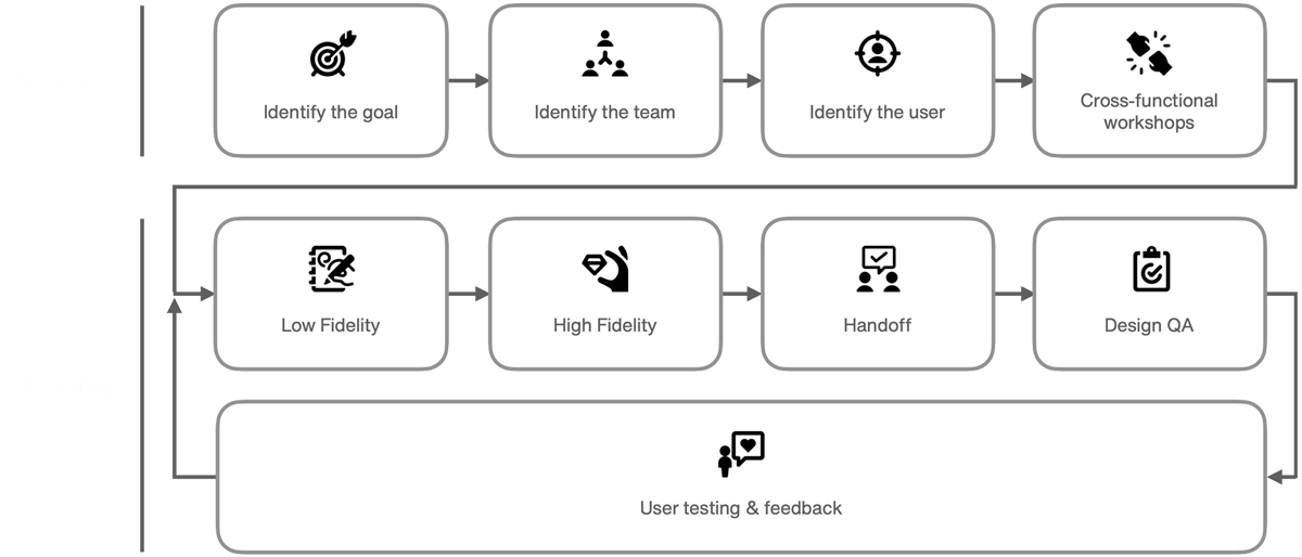
To answer these questions, I documented, delivered, and worked within a brand new design process that was custom-built for the company’s needs. The new process focused heavily on the front end of design, enabling the team to better understand the problem space, the team involved, and the users who would benefit from the solution.
A high-level diagram of the new design process can be seen below:
Breaking it down
The new design process was comprised of two phases – discovery and iteration. Discovery helped the team ask the right questions and iteration ensured excellent execution on those answers. Within each of these phases, the individual steps were defined and detailed.
Having clarity around the entire process brought understanding to the organization and alignment on expectations. Furthermore, the process gave designers a flexible framework on which to build their designs and ensured consistent design output across a squads.
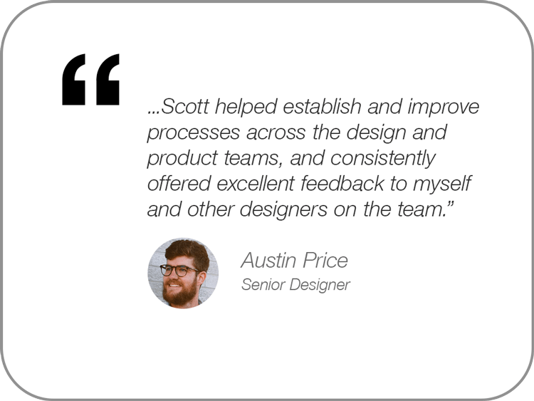
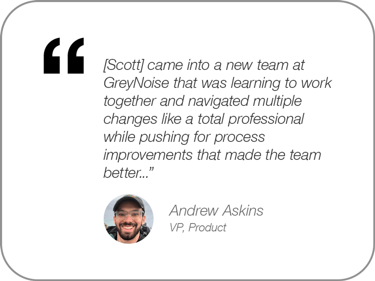
Some actual feedback from the team around the new process can be seen below:
A spy on the inside
Imagine being a defending guard, stationed on the ground perimeter of a castle wall.
You have the tools at your disposal to defend against an attack, but until an attack happens, you must remain on constant alert; attacks may come at any moment, and from any direction. As a defender without intelligence, there is no choice but to simply defend everywhere, at all times.
Now imagine if you had a spy on the inside of enemy lines. This spy regularly delivers detailed notes on enemy discussions and relays any plans for coming attacks. With this intel, you’d know exactly where the attack was coming from, when to expect it, and you’d be able to focus your defense efforts accordingly. This is what the GreyNoise Trends tool aimed to provide for cyber security defenders.
Confusing and broken
GreyNoise uses the term “tags” to represent topics of interest for attackers and the relevant details therein. If a tag is trending, defenders can reasonably assume an attack is forming and take proactive steps to stay ahead of enemy movements. For example, if a tag called “Microsoft Office software” is trending, defenders can assume that hackers intend to exploit the software, determine if the software is being used in their organization, and take early defensive action to prepare for the attack.
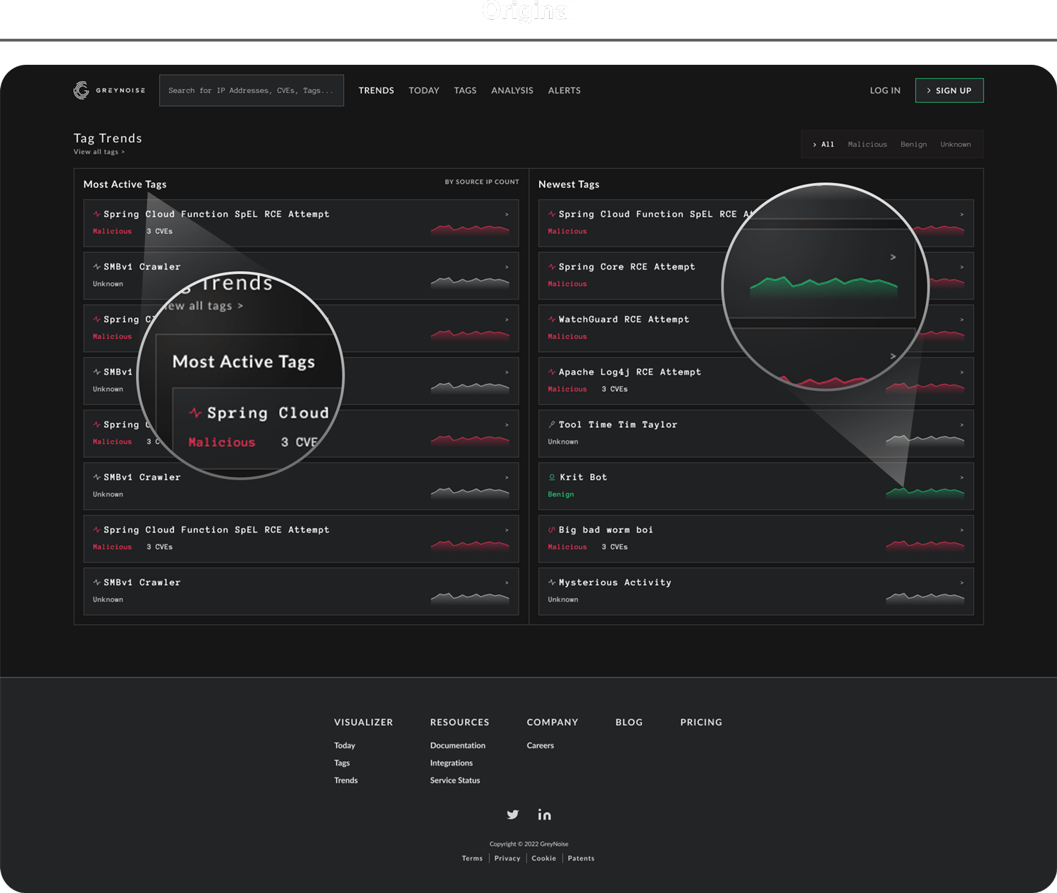
The original design (pictured above) was a decent proof of concept, but lacked enough substance to be a truly useful tool. For advanced users, the information presented was elementary and lacked any unique value. Novice users found themselves asking the question “What is this, and what do I do with it?”. Additionally, trend graphs (positioned on the far right side of each tag row) were actually static images as opposed to live representations of traffic.
Not only was the page confusing, it was also truly broken.
Informative and useful
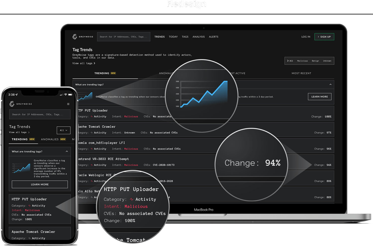
The next iteration of the trends page focused on clarity and functionality.
The new design added explainer boxes at the top of each traffic-type tab. These explainers contained a text description as well as a simple graph illustration to instantly answer the question “What am I looking at?”. The boxes also include a link to documentation and next steps for defenders, answering the question “What do I do with it?”.
The original, non-functional graph lines were removed and replaced by a useful “percent change” value. If the percent change was high, this meant the topic was gaining significant traffic and likely warranted immediate defensive action.
Finally, we created a mobile-specific solution that condenses the most important information into a digestible and scannable format for small screens.
Improved performance
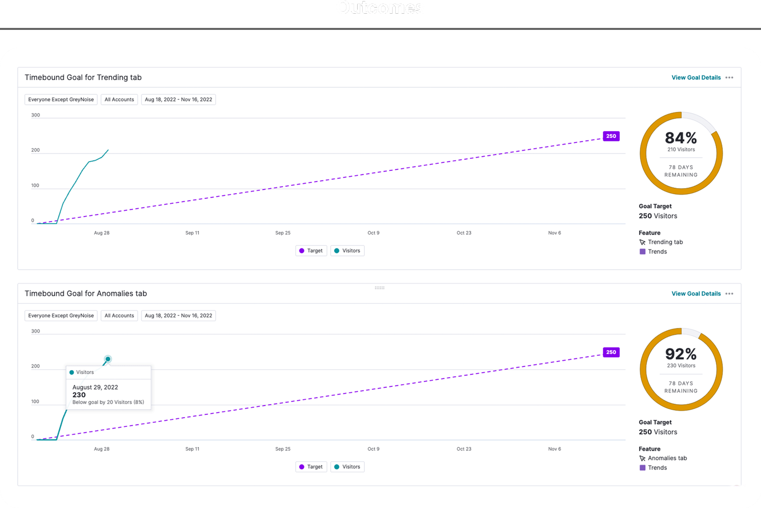
Aside from solving the functional problems on the page, we also wanted to monitor how these enhancements improved performance. Were more users actually visiting and using the page as a result of our work? Initially we set the goal of achieving 250 unique visitors to each of our new tabs in the 90 days post-launch.
Based on previous page performance, this seemed like an aggressive yet achievable goal. What we didn’t expect was to completely blow our goal out of the water. During the first week after launch, we had achieved nearly 90% of our total goal. How did this happen?
The explanation can’t be tied directly to a single factor. The cyber security community tends to share information at the speed of light. As users experienced the value of the new and improved tool, news spread like a virus and quickly became one of the most frequently visited pages on the GreyNoise web interface. A special blend of original value, effective design, organic marketing, and community love created this success story.
Eye in the sky
If a cyber attack can be related to a crime scene, think of threat intelligence defenders as the detectives on the case.
When cyber attacks happen, threat intelligence seeks to understand the “who” and “why” behind hacker activities. With these insights, threat intelligence can make informed recommendations and prioritize defense movements based on the bigger picture.
Until the release of GreyNoise’s IP Similarity feature, threat intelligence professionals simply didn’t have effective tools to make these connections. IP Similarity reduces the legwork by allowing users to simply enter an IP address and see an entire list of IP addresses behaving similarly. This tool enables the detective to quickly understand whether an attack was specific and targeted or just one crime in a string of serial activities.
Collaboration is key
As designers, we aim to be the voice of the customer throughout the design and delivery process. A successful feature, however, incorporates not only the customer voice, but also those of members across the entire cross-functional team.
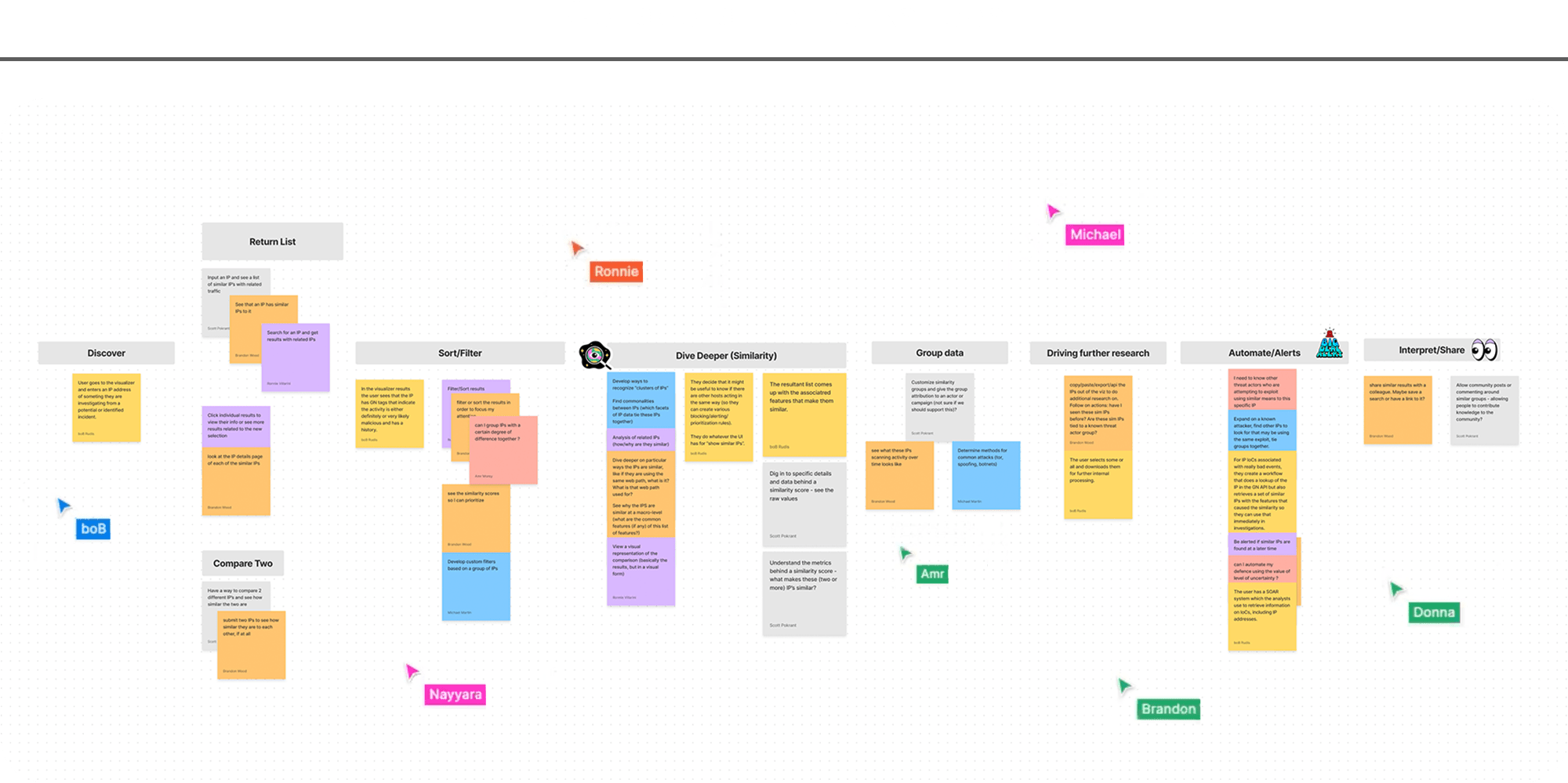
To create this blend of perspectives, I ran a series of collaborative workshops. Participants ranged from members of the technical data science and research teams to customer-facing sales representatives. In these sessions, we defined user actions, wrote user stories, and ultimately painted a comprehensive picture of the potential value we could deliver to customers.
Finding the edges
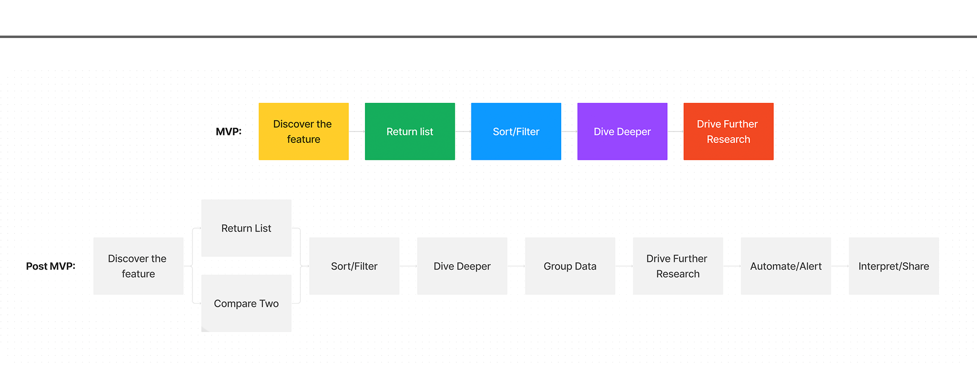
Now that we had a clear picture of the comprehensive feature, we needed to get tactical and plan for our first release. Customers were extremely eager to get their hands on this tool, so speed to delivery was essential. I worked with the team to trim down our list of features to a true “MVP”.
By continually asking the question “Does the feature break if we don’t include _____?”, I helped our team refine the user story from nine functions down to a total of five. This list of five actions became our vision for the initial release and guided the team towards fast, targeted work.
Filling in the gaps
As answers emerged, so did additional questions. Our MVP definition gave the team a clear picture of function and scope, but where did the feature live? What pages would be affected or created? Most importantly, what areas within the tool could be considered for measuring success and testing user engagement?
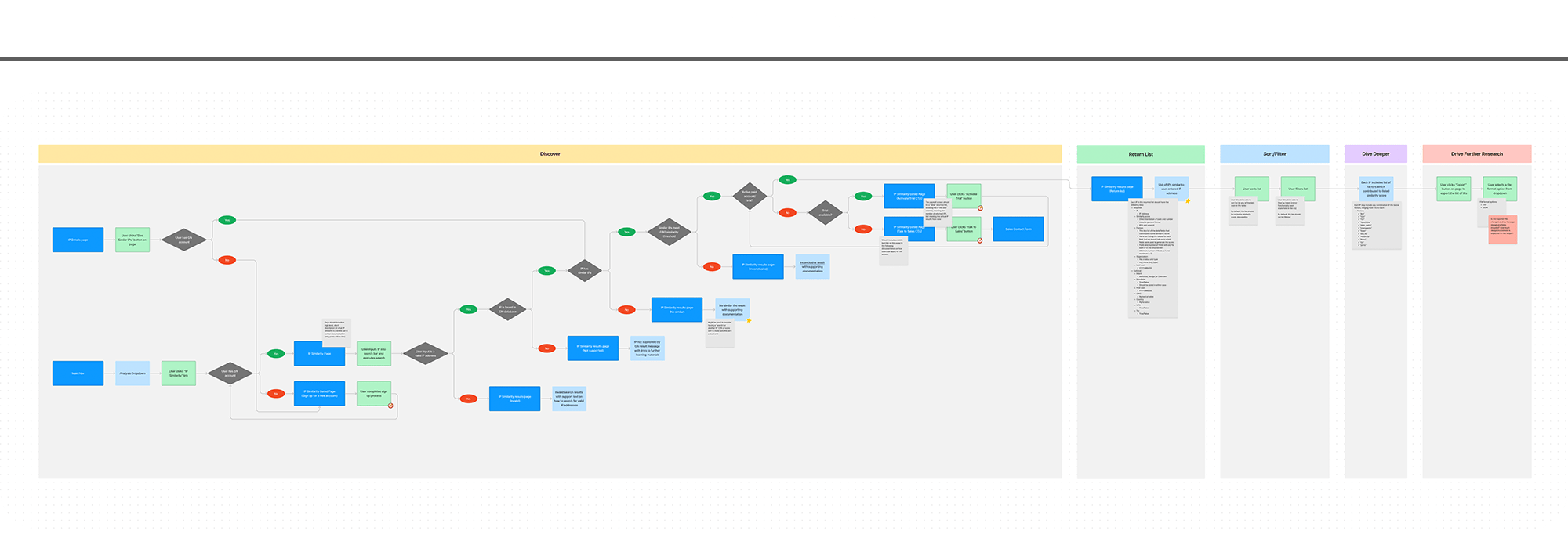
Not only did our user flows answer the questions above, they also unearthed new answers to questions that hadn’t been asked yet. The complexity around IP similarity return logic was discovered and detailed. The permission and paywall conundrum was revealed and solved. This step of the process took our simple MVP framework and made it real for the team, enabling further collaboration and vetted decision making.
Mapping the solution
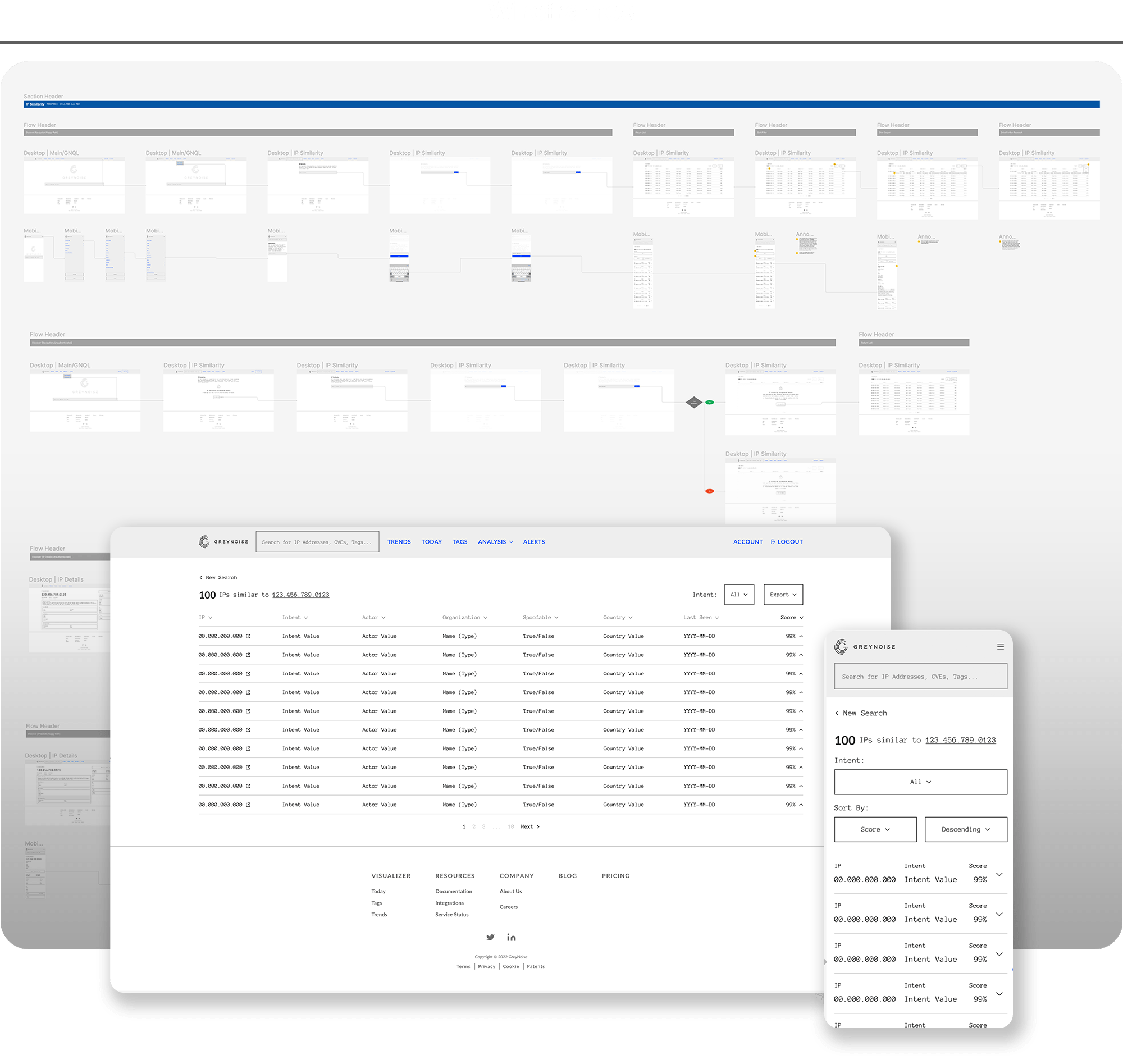
As we moved into wireframes, showing the full picture of the feature was of higher importance than diving deep into individual screens. Our timeline for the project was short and the engineering team needed to start their work as soon as possible to achieve our deadline. To help engineering get unblocked, design mapped the full scope of the feature and each of the pages that would be affected or created.
Below you’ll see the high-level flows dictating the steps required for a user to complete their tasks. A key element of these wireframes was the functionality included within the return list page (highlighted below). The return list page includes a table of similar IP results, important details for each IP, a dynamic accordion function used to expose additional details for advanced users, and a set of controls enabling users to refine their view and export results for further research.
Alignment and translation
For design, there were two main focal points as we delivered in high fidelity – the design system and the mobile experience.
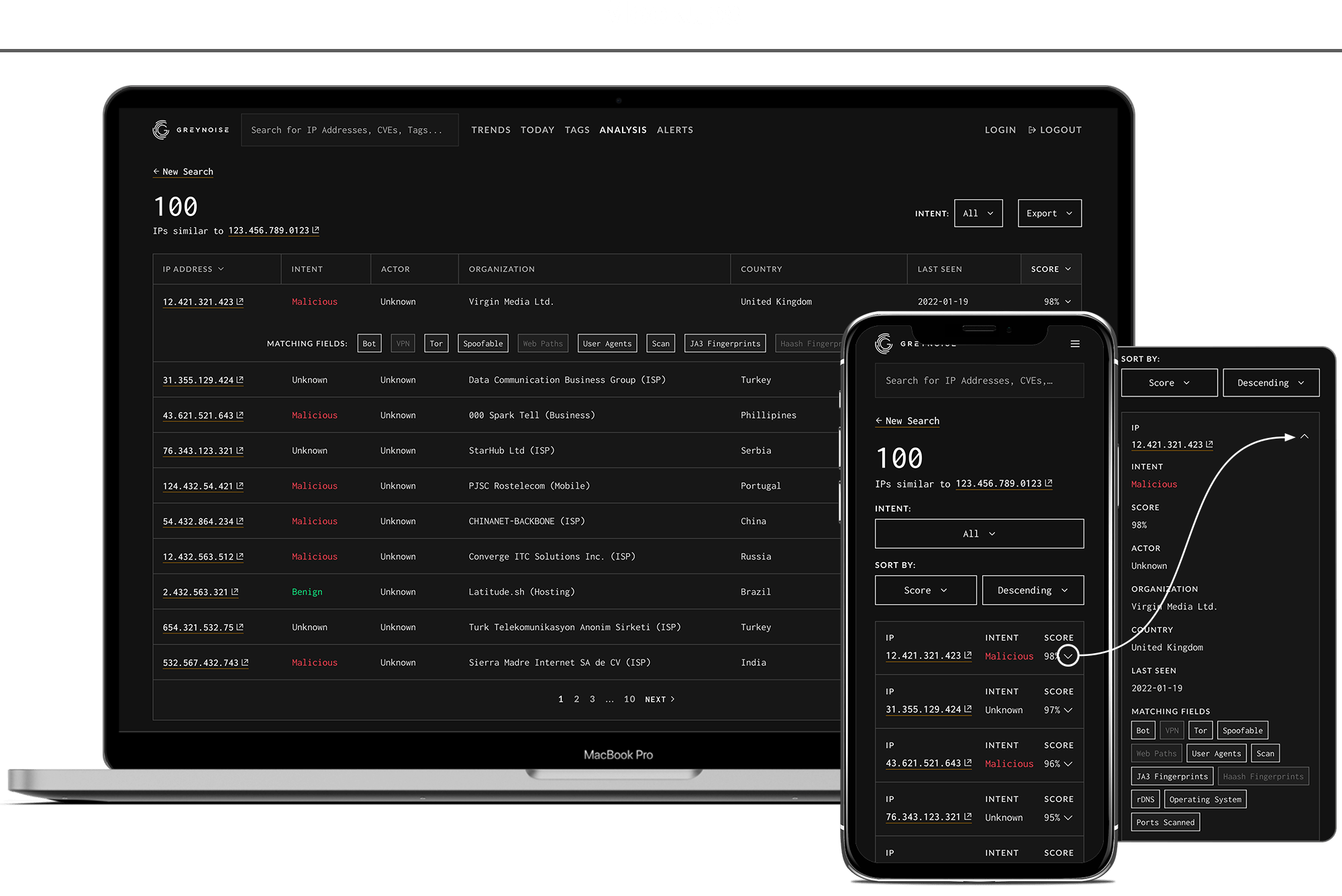
On the design system side, this feature contained the first true entry for a table component. As I moved the feature forward in fidelity, I worked closely with designers on the platform team to ensure the table conformed to ongoing design system work and fit neatly within the upcoming stylistic refresh, effectively future-proofing the design.
For the mobile experience, the challenge was condensing an information-rich, horizontal table into a useful experience on a small screen. Which data was essential and which could be hidden behind the accordion function? Which page controls aligned with a mobile use case and which could be omitted in favor of more screen real-estate? The answers to these questions are found in the simple, intuitive mobile experience that accompanied our desktop release.


