Spikeball
Category — Print, Illustration
Date — November 2018
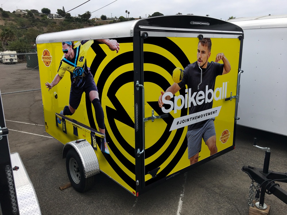
I worked with Spikeball to give their product packaging design a facelift, produced a trailer wrap for the Utah Roundnet Association, and illustrated the official promo poster and site map for the 2019 Roundnet Nationals Tournament.
Packaging redesign
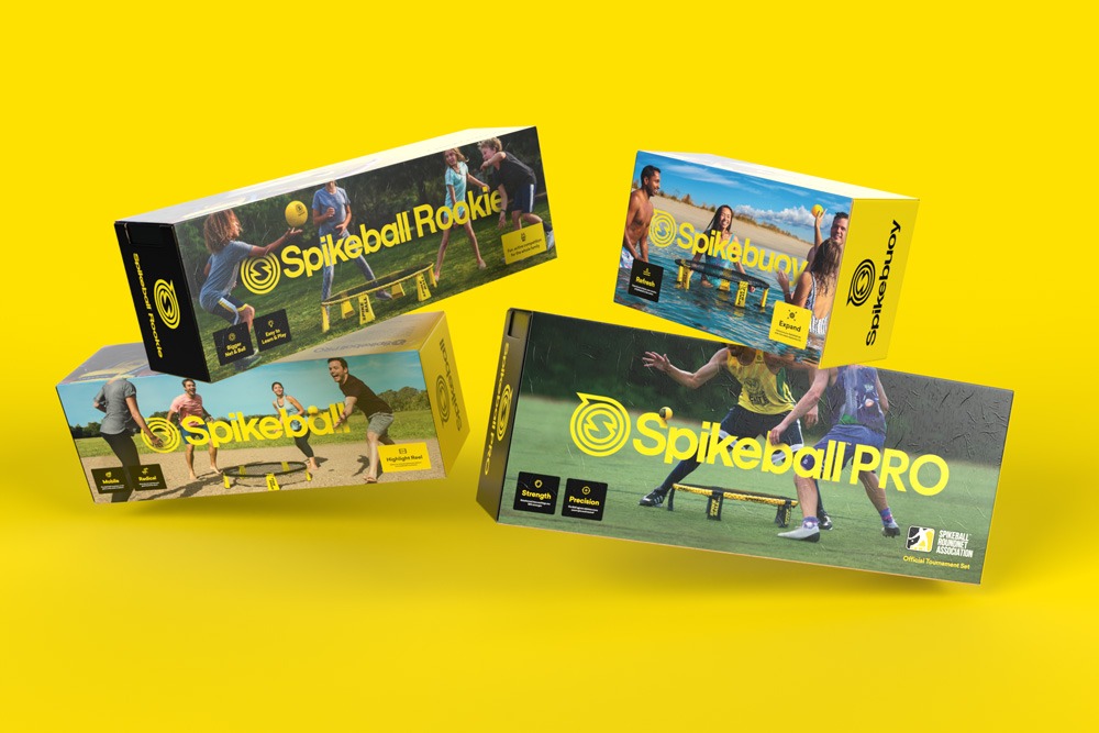
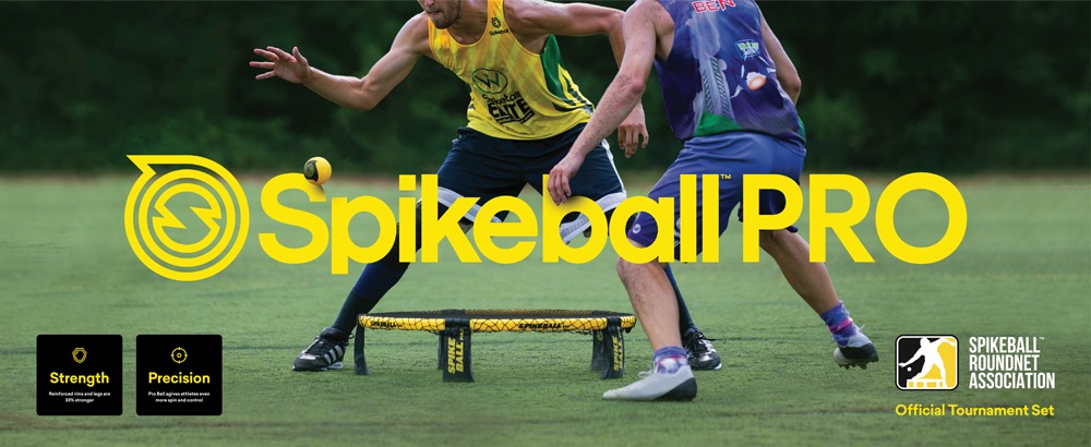
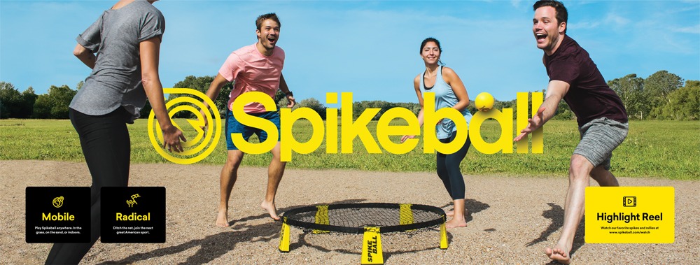
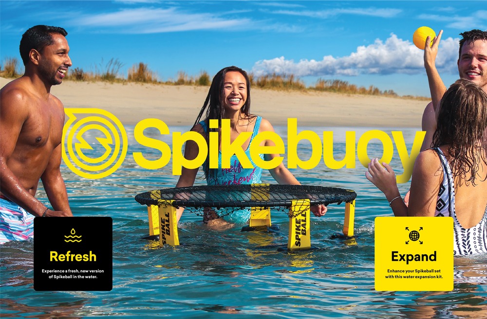
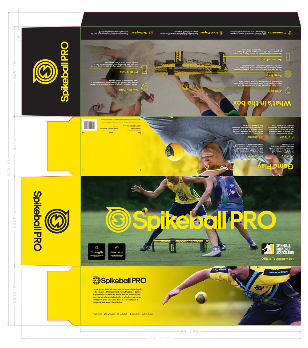
When seeing the product in action, visiting the corporate website, or scrolling through the company’s social media account, it’s obvious that Spikeball has a vibrant and energetic brand culture. Unfortunately the original packaging design did not reflect that vibrant energy. The goal with the redesign project was to give the packaging a fresh, modern aesthetic and create a consistent look and feel between the four Spikeball products.
The process of redesigning the Spikeball packaging involved a lot of photo retouching, and use of dynamic photo elements positioned above and behind the product logos to give the packaging a sense of depth and shelf appeal. Keeping the front panel designs simple and consistent helped to present a unified brand while using product highlight bubbles with icons enabled consumers to understand Spikeball more easily without ever needing to pull the box off the shelf.
Limited edition packaging
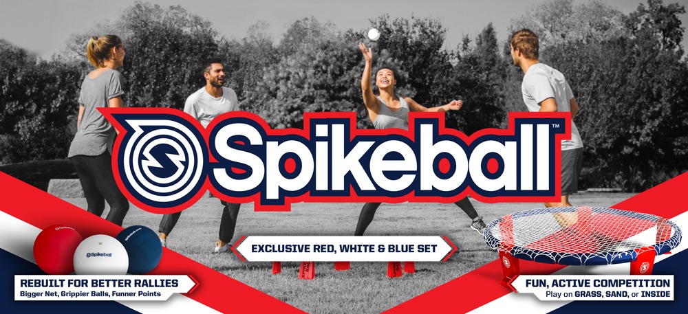
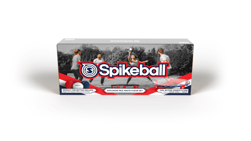
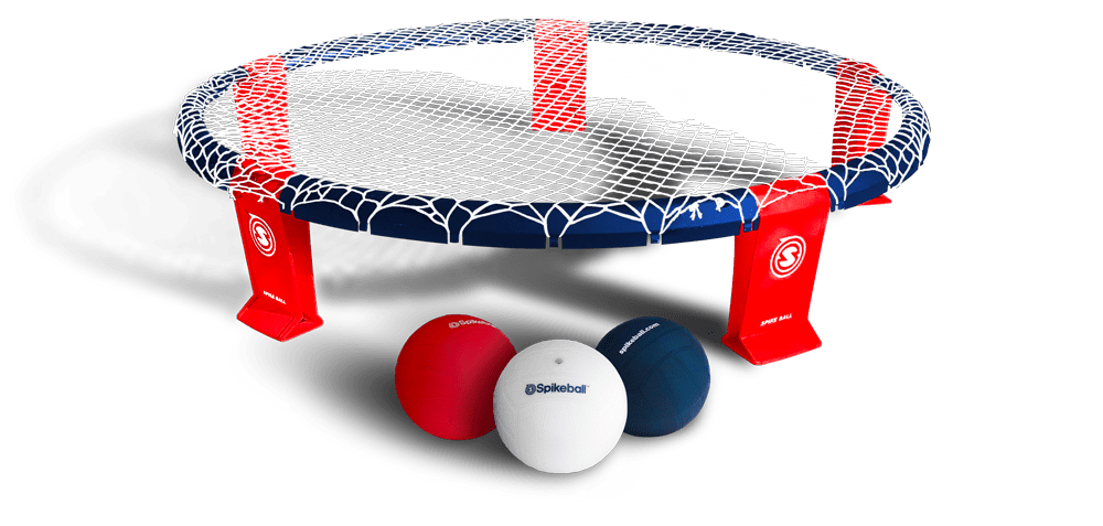
After my work on the standard packaging, Spikeball reached out about a special edition packaging for the Fourth of July Holiday. This design needed to look like classic “Spikeball”, but also needed to clearly emulate the festive holiday colors and showcase the new, special edition set on the packaging (which at this point had yet to be finalized). For this project I created a realistic render of the upcoming red, white, and blue set while also designing on-brand, holiday themed packaging.
2019 Roundnet Nationals
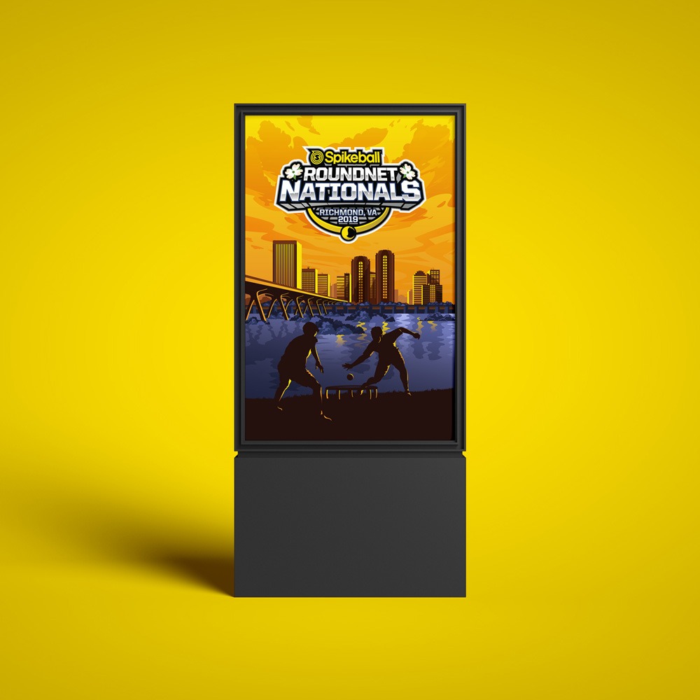
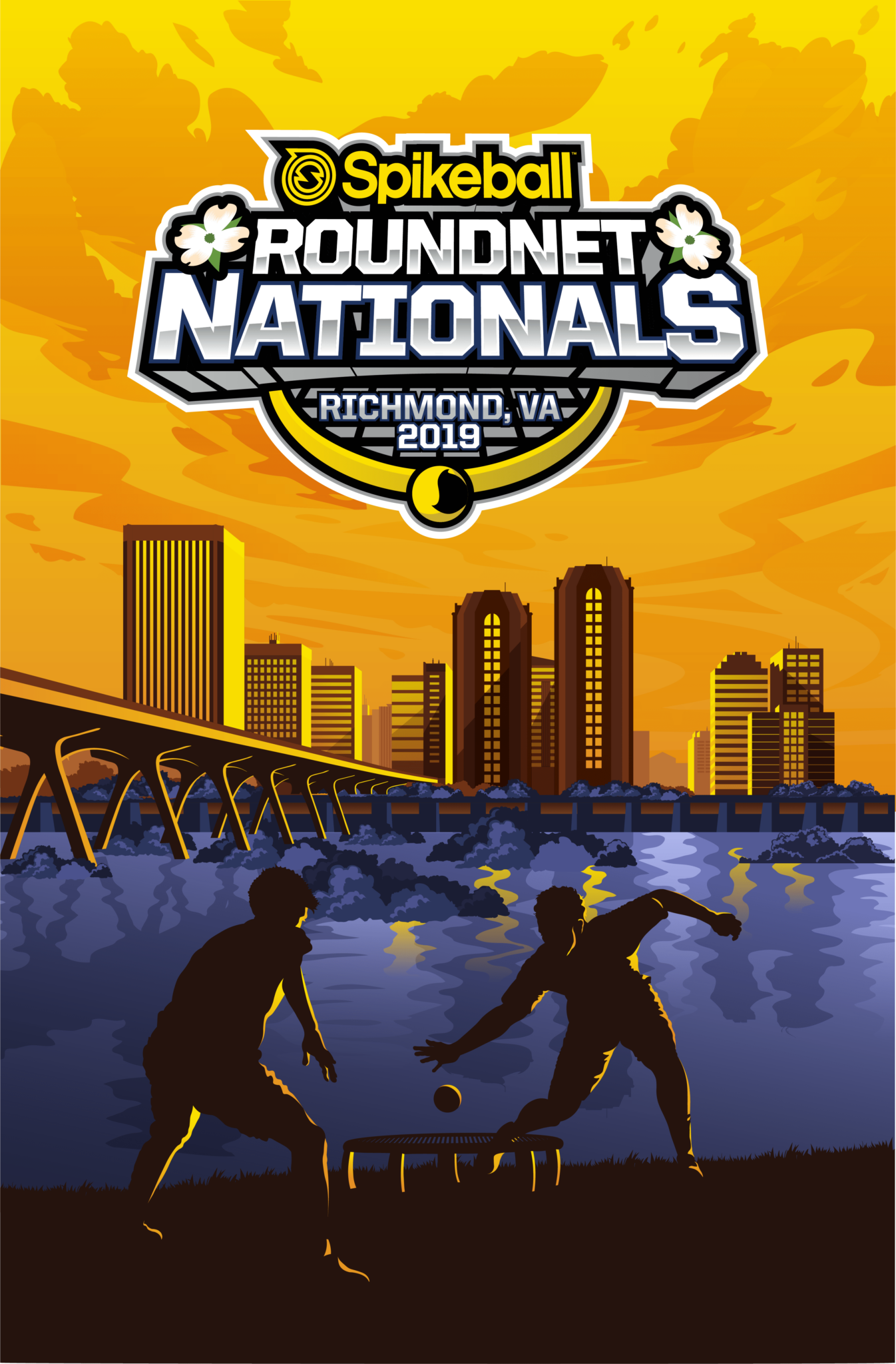
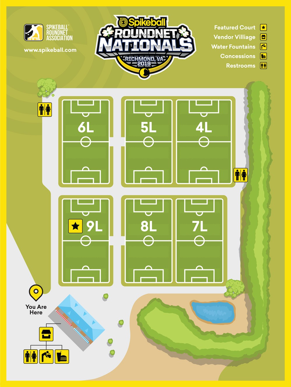
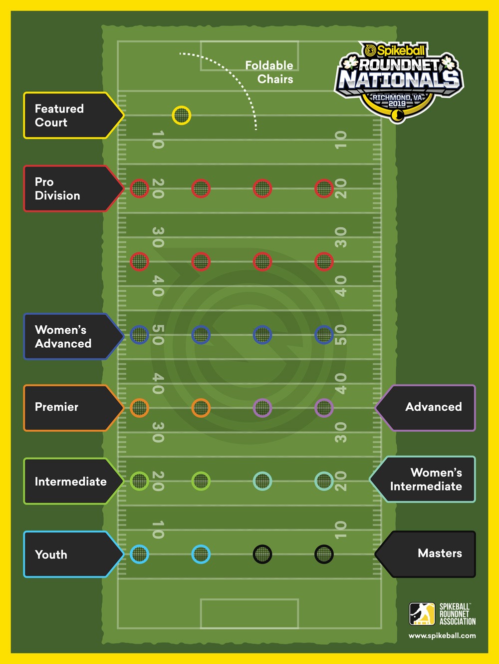
The Roundnet Nationals is the biggest event of the year for Spikeball. Professional players and fans come from across the country to see the intense games and compete for the ultimate title. I was asked to design the official promotional poster design for the 2019 tournament, as well as the field maps that helped participants navigate the tournament grounds and understand which divisions were competing in the areas.
The tournament poster features a custom, vector cityscape with landmarks from Richmond, VA where the tournament was held and pulls heavy inspiration from the National Park poster designs of the 1930’s and 40’s.
Utah Roundnet Association trailer wrap
The Utah Roundnet Association had purchased a cargo trailer to haul all of their tournament equipment. They wanted to wrap the trailer to help promote their organization and the Spikeball brand. The objectives of the project were to design a cool looking trailer graphic, build awareness of Spikeball as many people still don’t know what the game is, and build awareness of the Utah Roundnet Association and Spikeball as a brand.

