Locally inspired, passion-infused branding for surfboard shaping company.
Client
Tower 4 Surf
Year
2019
Services
Branding
Timeline
1 week
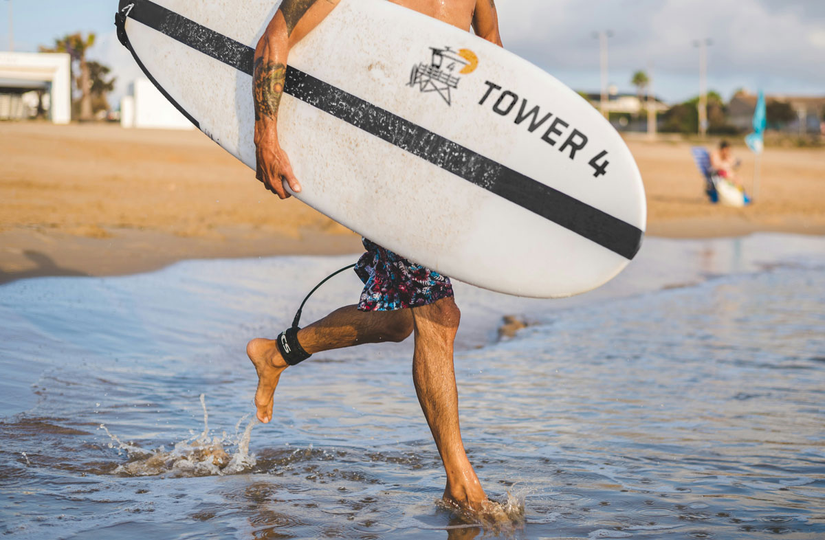
Adopting and capturing the local surf culture.
When I moved out to San Diego, I found myself immediately drawn to the local surf culture. As I became further involved in the surf community and learned how to surf, I met a local shaper who was looking to kick off his business and brand his work.
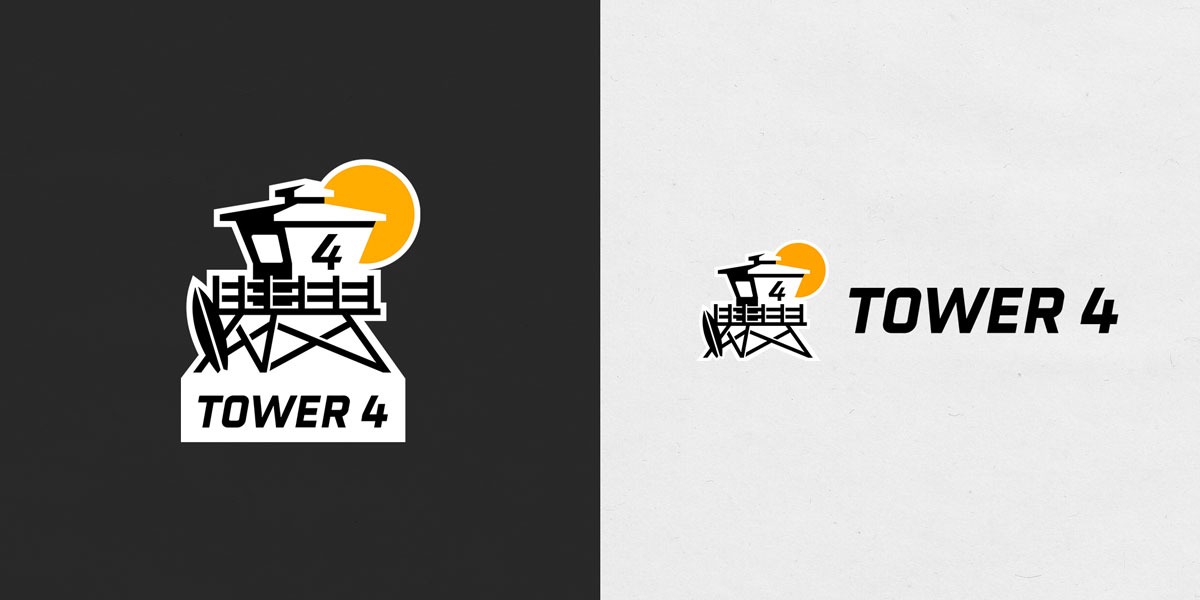
The owner of Tower 4 was looking for something that felt local and grass roots, but also fell in line with modern surf brands and the industry at large. The design was inspired by the Ocean Beach tower where we would often meet before our early morning, sunrise surf sessions.
Conclusion
The Tower 4 logo effortlessly combines big picture design thinking with small and intricate details. The logo maintains a modern, sporty, and industry appropriate feel while still including specific, personal elements that anchor the brand’s story and individuality.
It was such an exciting opportunity to work with an up and coming, local surfboard shaper to help him develop his brand and aesthetic. I’m excited to see this design plastered on even more surfboards spreading out across the Southern California surf scene.